Gauge Visual is a great visual for KPIs, however, the Gauge visual in Power BI doesn’t have the sentiment colors as an option. Sentiment colors make a gauge much more understandable, you can easily find out is the value high, low, or in the mid-range. Fortunately, there is conditional formatting that can help. In this post, I’ll show you how to use the default Gauge Visual in Power BI (not a custom visual) with sentiment colors.
Gauge Visual in Power BI
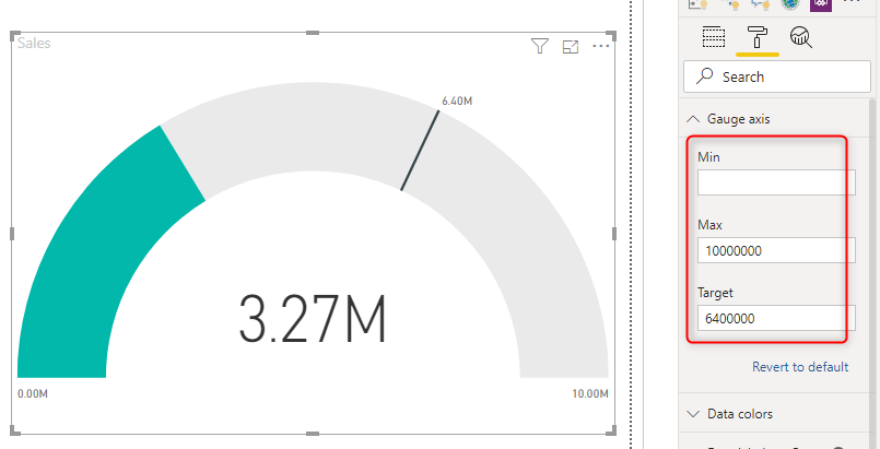
The Gauge Visual in Power BI simply shows a value. if you set up a maximum or minimum in the Gauge axis, or from the data fields, it looks like the below screenshot;
Unfortunately, there is no option to say, if the value was less than something it falls in the Red range, or if it is more than something it falls in the Green range or even the yellow range. However, nothing to worry about, we have Conditional Formatting in Power BI to help.
Conditional Formatting
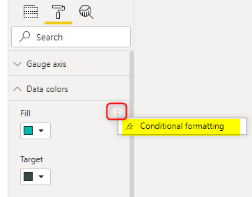
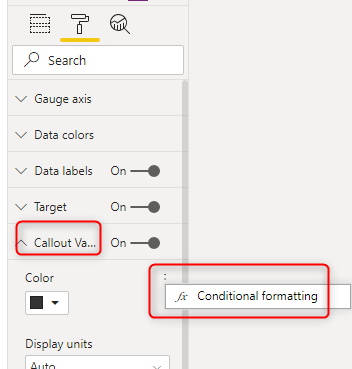
You can click on the Data Colors in the Format tab, and then besides the Fill color, click on the three dots, and then the Conditional Formatting appears. (You won’t see the three dots, unless you hover your mouse pointer on or around the Fill area)
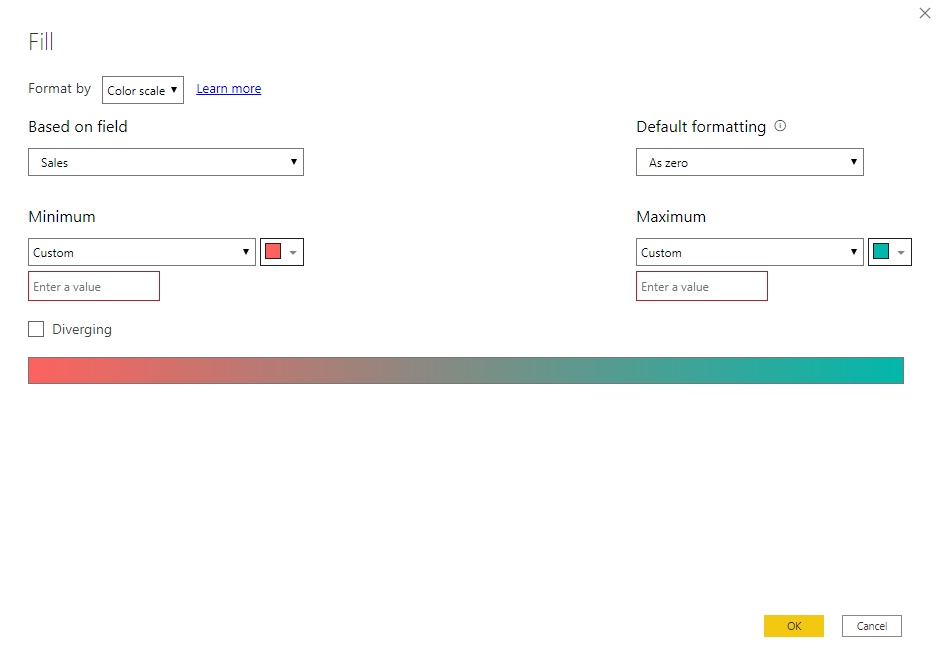
This gives you the ability to set the formatting.
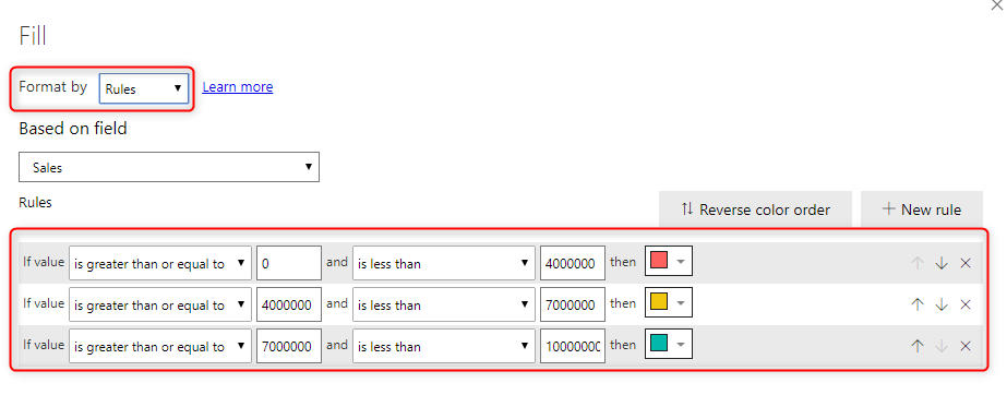
you can do something like the below configuration to get the three ranges;
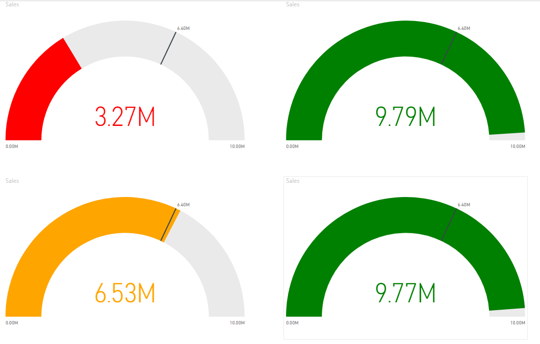
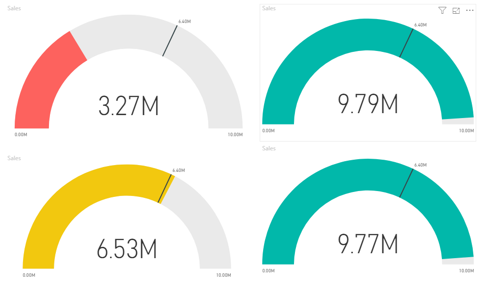
Note that in the above configuration, I set the Format by to Rules, and add rules one by one. You can even add more than three ranges using this approach. Here is how the result looks like:
Callout Formatting
Conditional Formatting is not just for the Fill Color, you can even apply it for the Callout font color (Callout is the big number value that you see in the middle of the gauge visual).
And you can apply the same conditional formatting to achieve both callout value and the gauge fill color matching. However, When it comes to duplicating the logic, I always prefer an easy-to-maintain method.
DAX Can Help
I have explained previously that you can use DAX to have better conditional formatting. You might ask then why using DAX? there are many benefits; using DAX, you can write complex logic rather than just the value is bigger than this or less than that. Another reason is that if you want to apply the same conditional formatting in multiple places, then you write the logic in DAX statement, and re-use it in multiple places. This way, when it comes to changing the logic. all you need to do is to change the DAX expression.
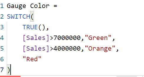
I have explained about SWITCH function in DAX which is a great way of writing multiple conditions, Using Switch, I can write a statement like below as a Measure;
Gauge Color =
SWITCH(
    TRUE(),
    [Sales]>7000000,"Green",
    [Sales]>4000000,"Orange",
    "Red"
)
You need to use your measure name instead of the [sales] in the above expression.
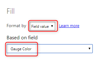
Then you can use this DAX measure in the conditional formatting, this time, you need to select Format by Field Value, and then select the Gauge Color measure here.
The beauty of this method is that I can now easily use the same approach for the Callout conditional formatting, and they are all using the logic of this measure. Maintaining this code is much easier. Whenever you need to change the colors or logic, just change the DAX code. Here is the outcome, this time with callout formatting too;
Summary
I believe in the coming future, sometimes, the gauge visual will have sentiment colors as an option. However, in the meantime, using the conditional formatting, you can achieve that really simply. And you are not just limited to three ranges, you can add more ranges if you want in the conditional formatting rules. Using DAX measure for conditional formatting also makes your code much easier to maintain and gives you the ability to implement complex logic for the conditional formatting. Conditional Formatting is not just for Gauge visual, It is available in many other visuals, Here I explained how you can do that in Table or Matrix visual, and Card Visual.



Thanks for sharing,