
Anomaly detection is one of the popular topics in machine learning to detect uncommon data points in the datasets.
For example, in a greenhouse, the temperature and other elements of the greenhouse may change suddenly and impact the plant’s health situation. Identifying the anomaly data in a credit card transaction, or in health data received from a patient, and so forth, helps us to detect the issues as soon as possible and address them.

Microsoft Power BI AI team announce that we can access Time series anomaly detection with Line chart inside Power BI
See Microsoft Blog for more information.
Anomaly detection in Microsoft Power BI is for time series data means it able to find this anomaly in data based on the time horizon.
Enable Anomaly Detection :
1- need to download latest version ( now is November 2020)
2- Select File ->Option and settings–> Option–> Preview Features

3- Close Power BI and reopen it ( after enabling any preview feature you need to do)
You have !!
Visual:
Anomaly detection is active in a Line chart. to see it first import the data set
you can download the data set from below link:
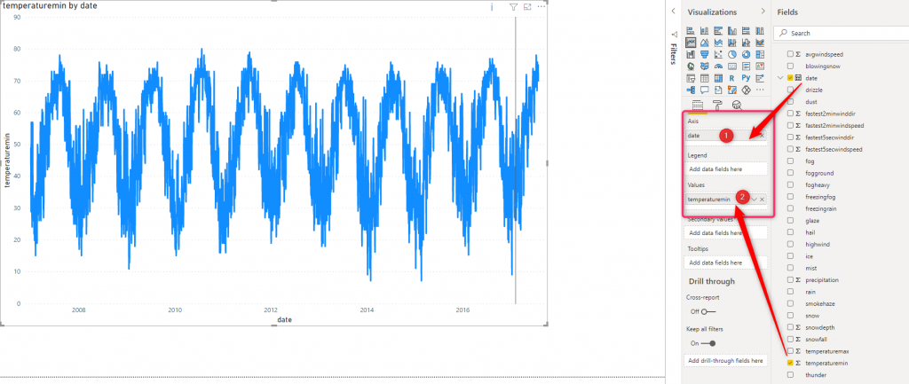
1- Open Power BI and load the data into Power BI desktop.
2- Click on the line chart in the visualization panel and select the date for Axis and temperature into Values.
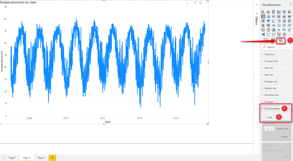
3- Next click on the Analytics Tab
4- Then click on the Find Anomalies and click on Add option
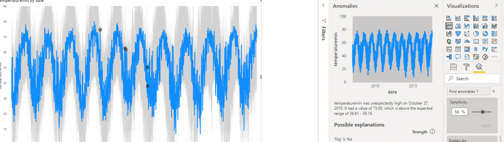
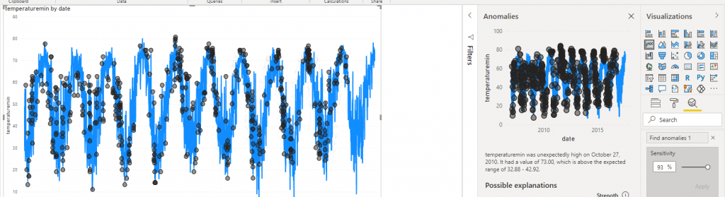
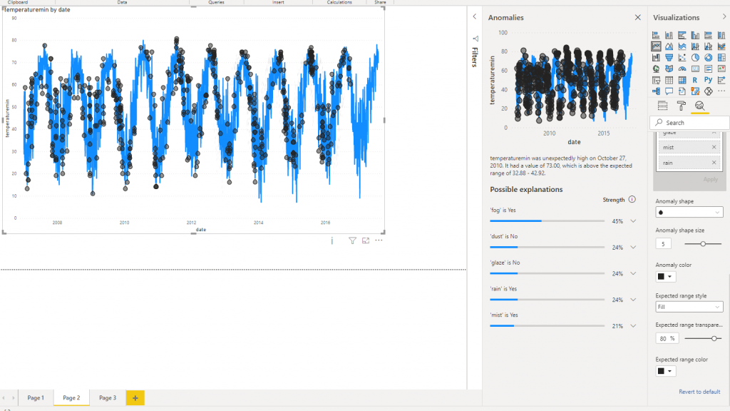
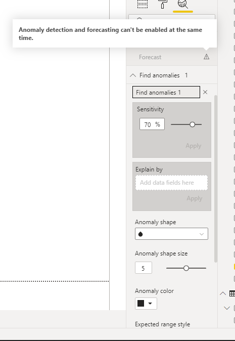
5- You should see the below chart, the pint in the chart show the detected anomaly with 70% sensitivity
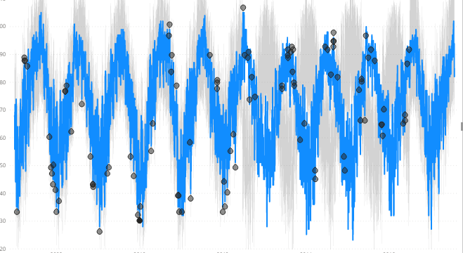
6- You can change the sensitivity to higher or lower. if you decrease sensitivity you may see more data point, also if you increase sensitivity you may see more anomaly data point.

You may decrease sensitivity ti 56% to see less point on data then increase it to 93% to see more anomalies
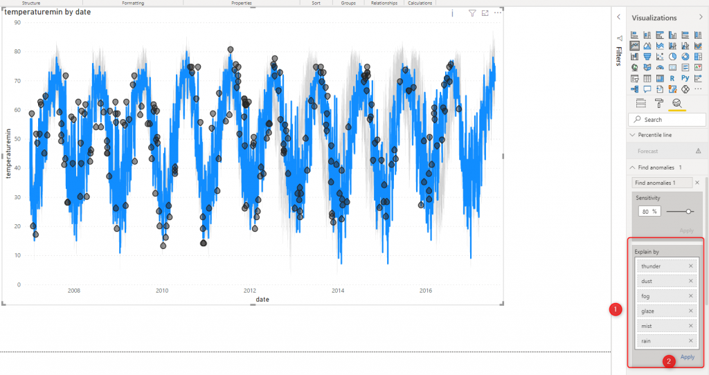
7- In the next step, you may add some ore values that can help to better describe the reason for anomalies. I just added some attributes such as rain, mist, fog, and so forth.
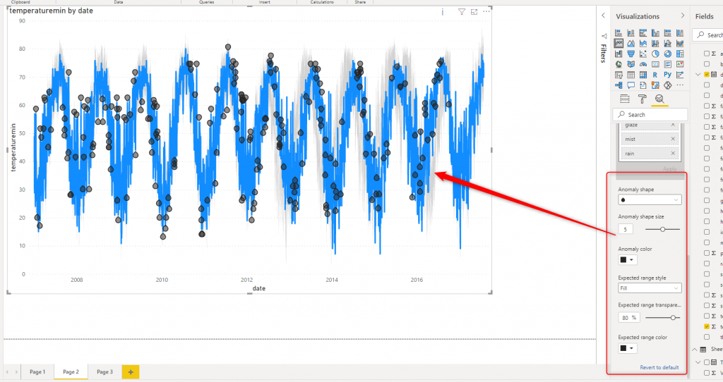
8- Also you can change the shape of the anomaly data point size and shape.
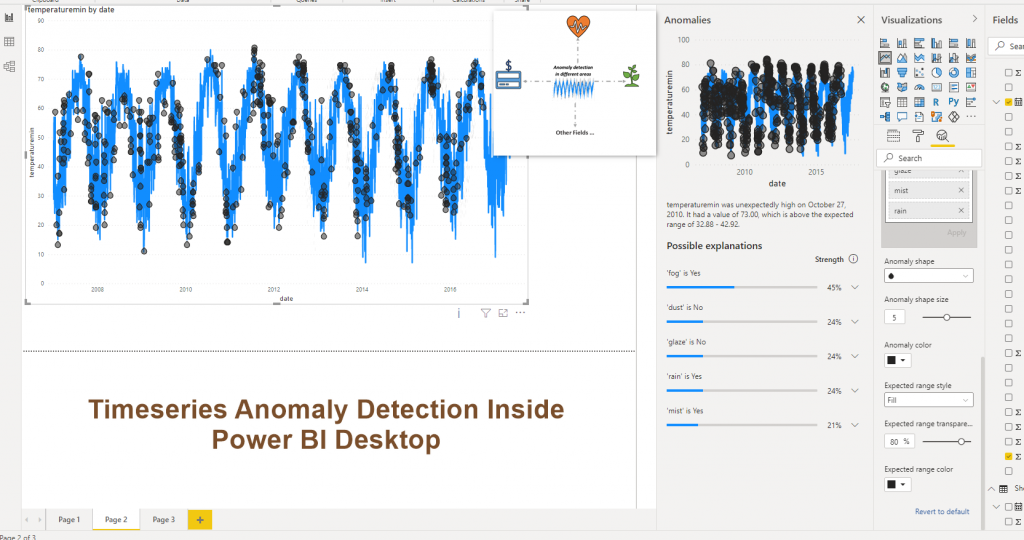
9- you can see the explanation for each anomaly data point, by clicking on them. A new page will show up, named Anomalies page, first some explanation will be shown regarding what is the expected value. Next, some more explanation on which factors may impact this anomaly. just note, there may be some explanation exist for one point and not for all data point.
For instance, in the below picture, the data point has an anomaly is 73 degree that the expected value is 32. Moreover, we have a foggy weather that date that has 45% more impact on the weather temperature.
The final point is that you could not have Forecast and Anomaly in same time!
See video from here


