Grouping and Binning; Step Towards Better Data Visualization

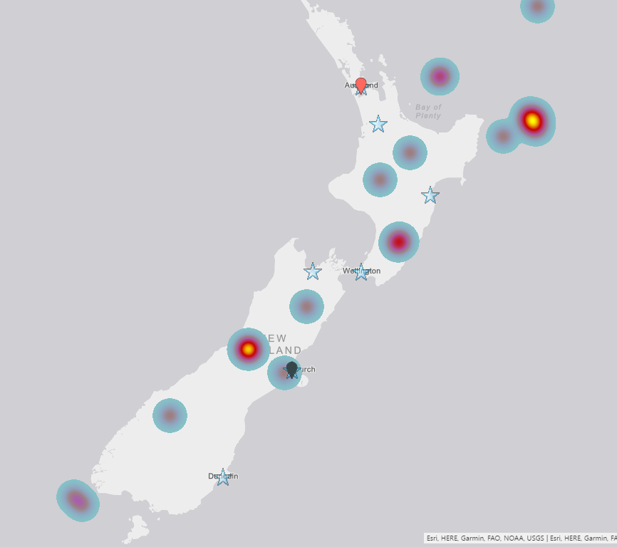
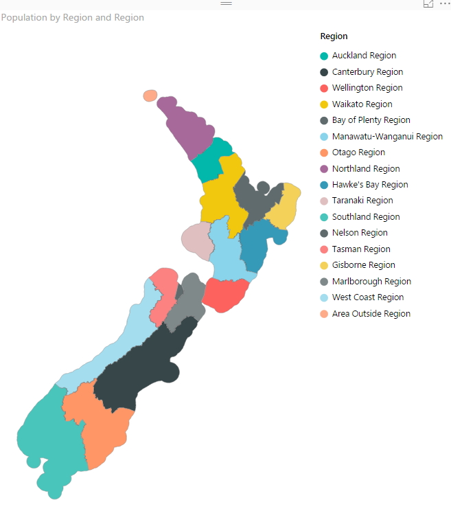
The latest update of Power BI Desktop (October 2016) has many features. Two of these features are grouping and binning. These features used to create groups of items and visualize them better in the report. Previously you could do that by Power Query or DAX calculated columns, now it is all possible simply through the Read more about Grouping and Binning; Step Towards Better Data Visualization[…]

Slides of my sessions at PASS Summit 2016

Thanks to everyone who attended at my sessions in PASS Summit 2016 this year. I have uploaded session slides here in this post with links to references inside it. Please contact me if you have any questions. It was my pleasure to speak this year for the 4th time in this conference which I believe Read more about Slides of my sessions at PASS Summit 2016[…]

PASS Summit 2016 – Day 2 Keynote

PASS Summit Day 2 started with Keynote of Dr. Dewitt from MIT. I personally am so exited to hear this keynote. Sitting again on blogger’s table will write highlights of today’s keynote here in this post. Please refresh this post to get updated information. 8:18 – Grant Fritchey stepped up in stage 8:21 – Over Read more about PASS Summit 2016 – Day 2 Keynote[…]

PASS Summit 2016 – Day 1 Keynote

PASS Summit 2016 started Monday 24th of October 2016 with some pre-cons on day one and day two. The third date which is Wednesday 26th of October 2016 is the regular conference start day and for today the first keynote is with Joseph Sirosh Microsoft CVP of Machine Learning and Data Platform. I am sitting Read more about PASS Summit 2016 – Day 1 Keynote[…]

Dashboard vs Report; Differences At a Glance – Power BI

This question is one of the main questions that people ask when they are at the preliminary stages of building a Power BI solutions. There is a misconception that Report is a detailed tabular report, and dashboard is interactive visualizations with chart. However this definition isn’t what Power BI reports and dashboards stands for. There Read more about Dashboard vs Report; Differences At a Glance – Power BI[…]

Loop Through On-Premises Files with Power BI and Schedule it to Refresh Automatically

Previously I’ve explained a method of looping through number of files in a folder which used Custom Functions. This method is preferred method buy not always working with Schedule Refresh and gateway setup, because scheduled refresh doesn’t always support custom functions in the code. So I this post I show you a second method that Read more about Loop Through On-Premises Files with Power BI and Schedule it to Refresh Automatically[…]

Filtering Slicer Resolved in Power BI

You can filter all visuals in Power BI except Slicer! In fact slicer itself is a type of filter, however there are some times that number of items in slicer is too many. So this is normal that we want to filter the items in the slicer itself. Unfortunately current version of Power BI Desktop Read more about Filtering Slicer Resolved in Power BI[…]

Stream Analytics and Power BI Join Forces to Real-time Dashboard

Few weeks ago, I’ve written how REST API can be used for real-time dashboard in Power BI. Another method for real-time dashboard is using Azure Stream Analytics. This can be combined with Azure IOT and Event Hub to get data from IOT devices. In this post I’ll explain to you all steps necessary to push Read more about Stream Analytics and Power BI Join Forces to Real-time Dashboard[…]

Power BI Story in PPT Slides with Comments

This is not story of Power BI in Power Point slides. This post is about how to use Power Point integration with Power BI for story telling of Power BI reports and dashboards through slides, and also give some users features such as commentary. This features is not a new feature, it has been released Read more about Power BI Story in PPT Slides with Comments[…]

Power Behind the Line Chart in Power BI; Analytics

Line chart is one of the most basic charts that you can see in every visualization tool. Power BI like other visualization tools has the line chart visualization which is good for showing one or two measure’s value across an axis which can be a category, time period and etc. Recently Power BI line chart Read more about Power Behind the Line Chart in Power BI; Analytics[…]