
In the last 3 posts ( introduction to Azure ML Service, AutoML Environment and how to deploy the models), some demonstration on how we able to access Automated Machine learning and how to deploy a model has been discussed.
In this short post, I am going to show a section that helps you to understand your data better, name Data Profiling.
How to Access Data Profiler
how we can access data profiler before applying Automated Machine learning?
Let’s review how we access the AutoML,
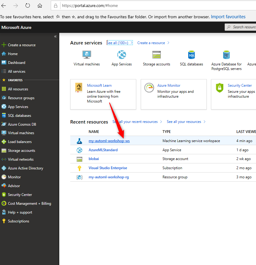
1- Login to Azure portal ( if you do not have a subscription you can get a free one)
2- create Azure ML service workspace or use the one you have
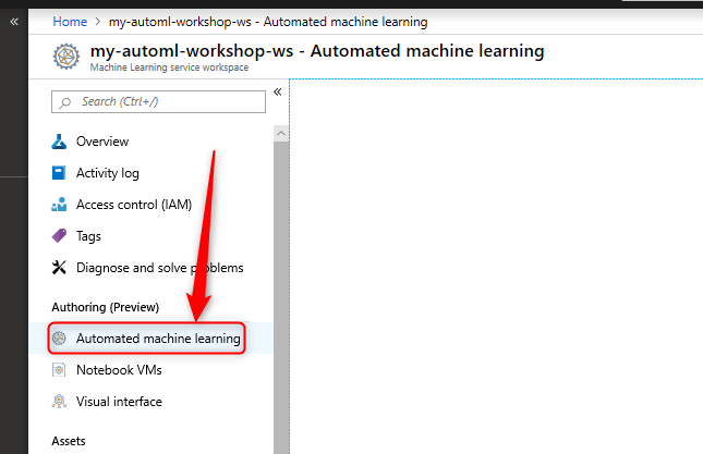
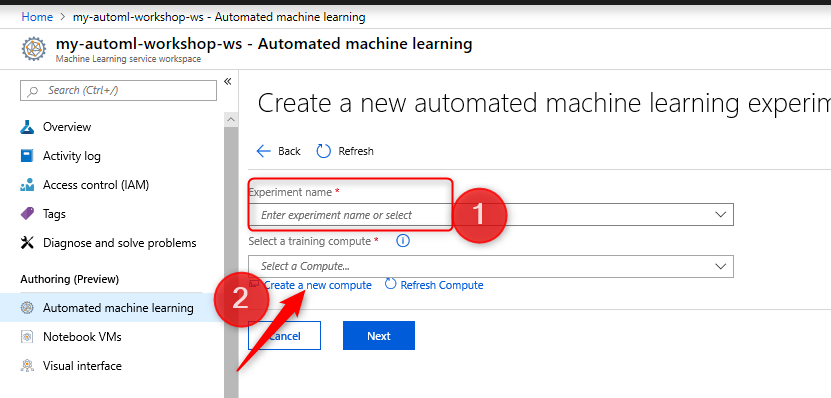
3- The in the left panel, click on the Automated machine learning
Next
4- you need to create a new Create Experiment
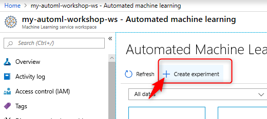
5- You need to put a name for the experiment name for the AutoML
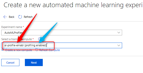
Now you be able to access the Data Profiling you need to create specific Compute
6- You need to click on the New Compute at the bottom of the page
to do that you need to create specific Compute, I name it aiauthomlcompute
Then, click on the additional settings, to have access to the data profile, the “Minimum Number Nodes” should be at least One
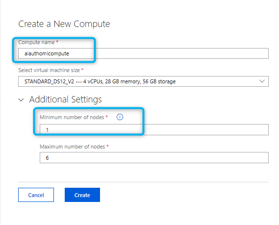
Next, you need to put a name for Compute and create it.
Right after that, you able to see a profit appear as (Profiling enables)
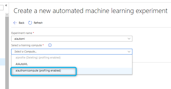
that means, the Compute you will run the model on it, now support data profiling.

Now, just upload a new dataset, or used the one you already have.
In this demo, I am using the Titanic dataset, I am using the Titanic dataset, that I have used before for AutoML.
after loading the dataset, you will see the Profile,
the option is active
Note: if you do not specify the number of the minimum number of nodes, you not able to see this option
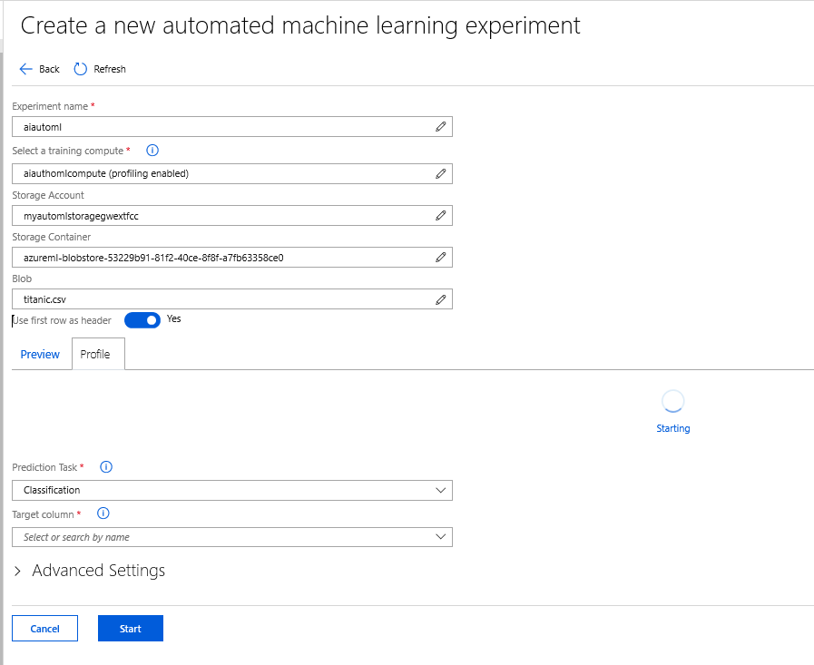
In this stage, click on the Profile table, it will take a couple of minutes to load the profile.

After a while, you able to see the data profiling available for all columns of data.
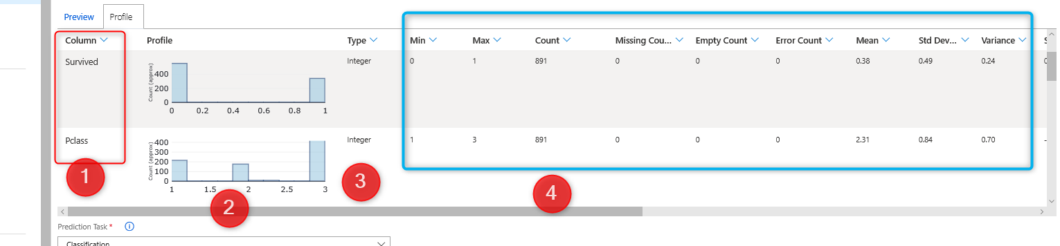
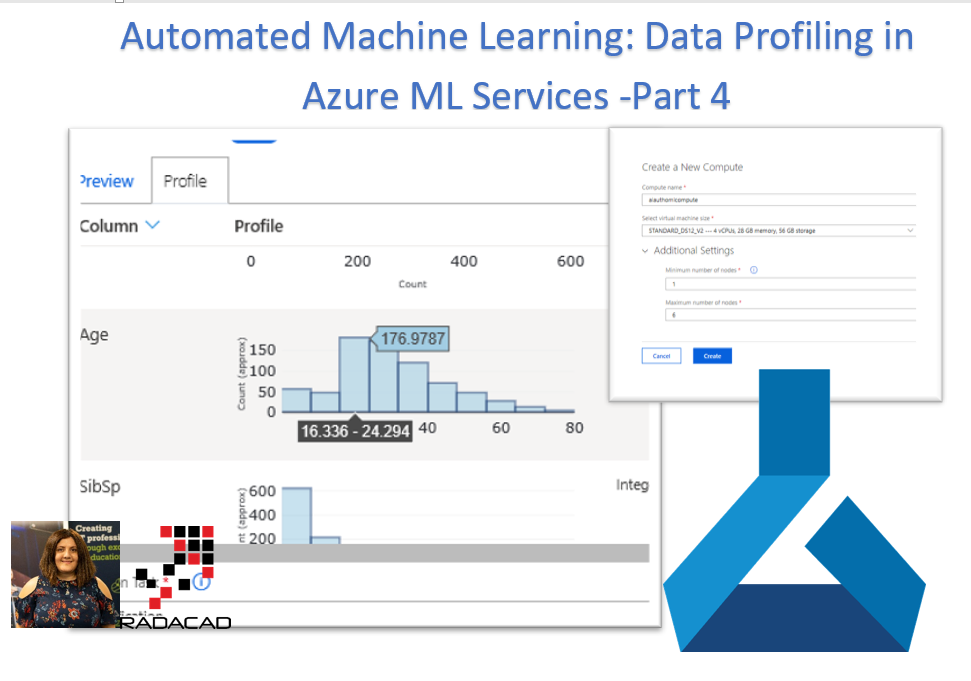
Data Profile
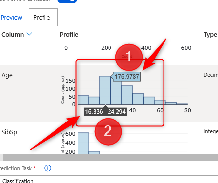
As you can see in the below picture, for the age column,
1- There is a histogram that shows the data distribution of age
2- There is another column, that shows the adat type of the dataset.
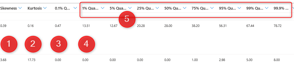
3- in other columns, you able to see some information such as Minimum, Maximum, Count of data, Number of Missing values
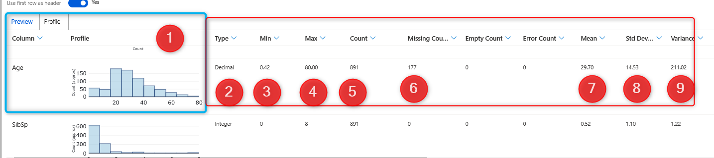
4- Also, you able to see some information such as mean, median, variance, standard deviation and so forth.
In the histogram chart for the age of people, you able to see the age range and other information.
Data profiling helps data scientist to have some understanding of the data.


