
In the last post, an introduction to Azure Map was presented.
Azure Map has considerations and limitations as below( that may resolve later as now is in preview)
You can use it in
Power BI Desktop, Power BI Service, and mobile application
But, not available
Power BI publish to the web, Embedded and service embedding.
Also not available yet in China, South Korea, and Azure Government
Also this visual supports up to 30,000 data points( see https://docs.microsoft.com/en-us/azure/azure-maps/power-bi-visual-getting-started)
also according to Microsoft Documents, in the future besides latitude and longitude, address and location may support.
In this post, we are going to check other features in AzureMap
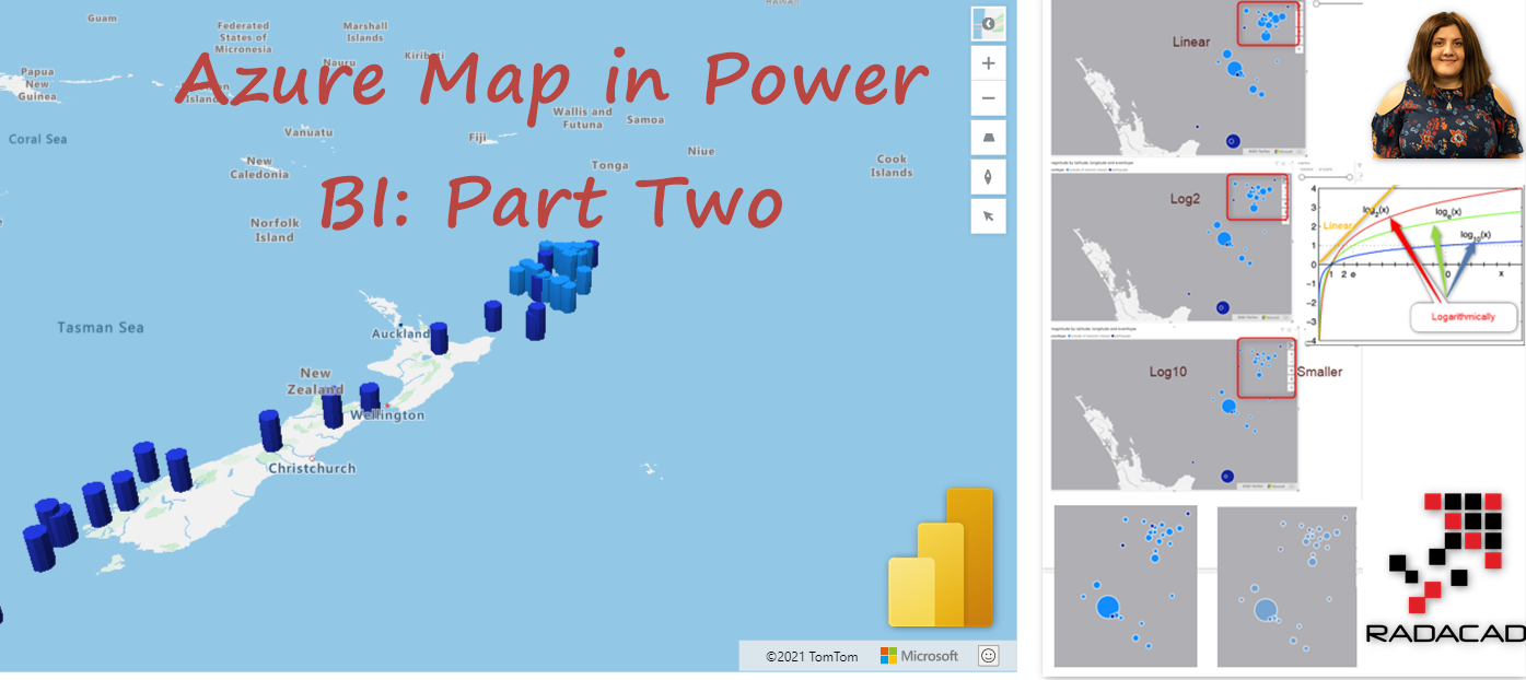
1- Bubble and Bar Chart
2- General Layer Settings
Bubble Chart
From the previous file and Dataset, we are going to check bubble chart features.
Download file and data from below
Quakes (34632 downloads ) Azure Map Power BI Part One (31081 downloads )Click on the Map visual, and under the format, check the Bubbles,
Bubbles are the default status to the chart, to change the chart to Barchart you need to disable the Bubbles.
Scaling
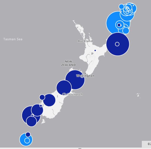
In bubbles, you can specify the range size of the bubbles. To differentiate the smaller data from the biggest one, we can change the minimum bubbles size and maximum one. to differentiate that gaps, for example, I set the Min Size to 5 and Max Size to 30
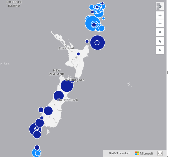
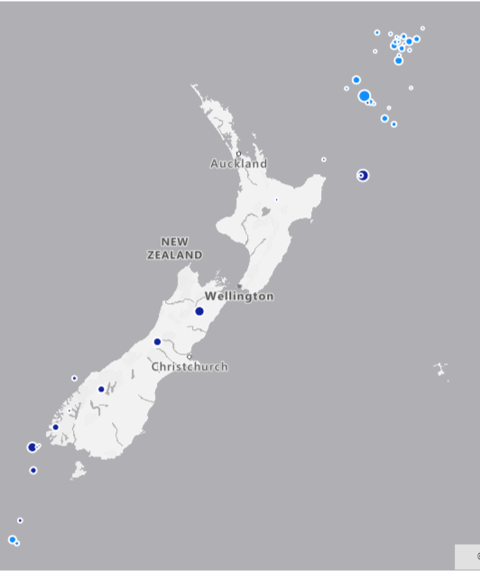
The size gap between large bubbles and small ones should reflect the size of each of them, but should not be extremely high or low ( see an example of extreme high and low below)
This scalling can be linear, logarithmic, or Cube Bezier ( that is a smoothing scale approach).
The default is Linear, when is linear, means the input range of the value between minimum and maximum is mapped linearly. Same situation for log ( the data range between min and max will map logarithmically).
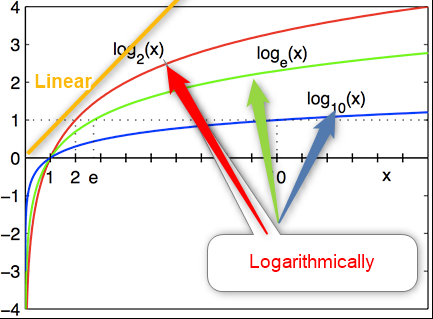
As you can see in the above picture, for input data in the y-axis, for linear one, the output is 1, but for log2, if the input is 1, the output is 2, so the gap gets bigger.
If you select Size scaling be Log, then you need to specify the log scale, that the default is 2, and if you set it to 1, it is the same as linear.
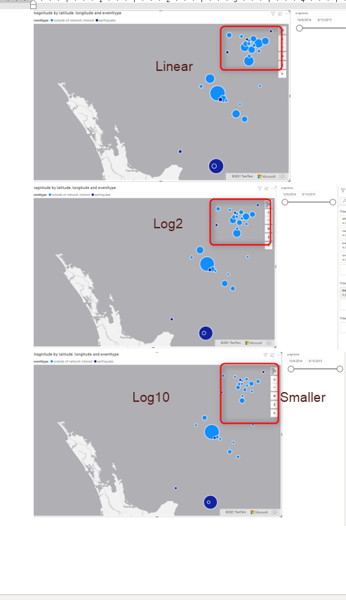
In blow screenshot, I set the scaling to be linear and then set to be log 2 and then log 7for the biggest bubble ( to practice this, make sure auto-zoom is off, under the map setting) As you can see the biggest bubble did not change that much but the smaller open gets small and smaller.
Contrast and Trasnparency
As a filled bubble chart, you can set the transparency of the bubble to be high or low for different visualization view.
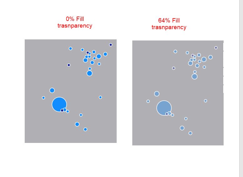
Besides, you can set the outline to be transparent or not, or change the width using Outline width.
Pitch Alignment
One of the interesting parts of the bubble chart is a Pitch alignment
using a Bubble chart, if you like to see the map in the horizontal state ( pitched) can change
• Viewport – Bubbles appear on their edge on the map relative to the viewport. (default)
• Map – Bubbles are rendered flat on the surface of the map.
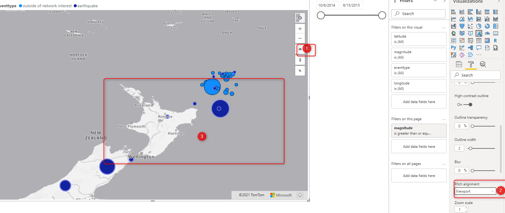
or the map
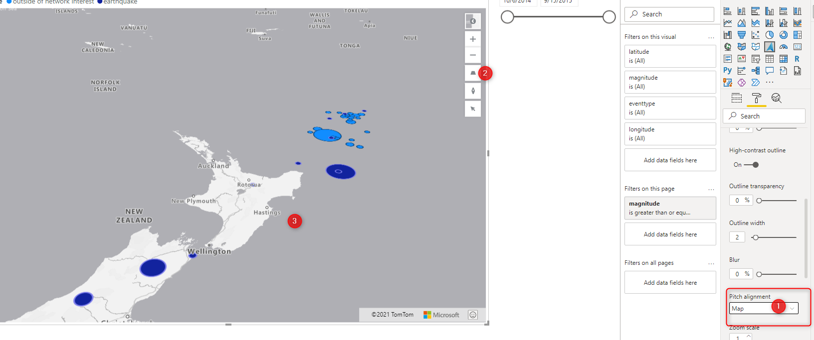
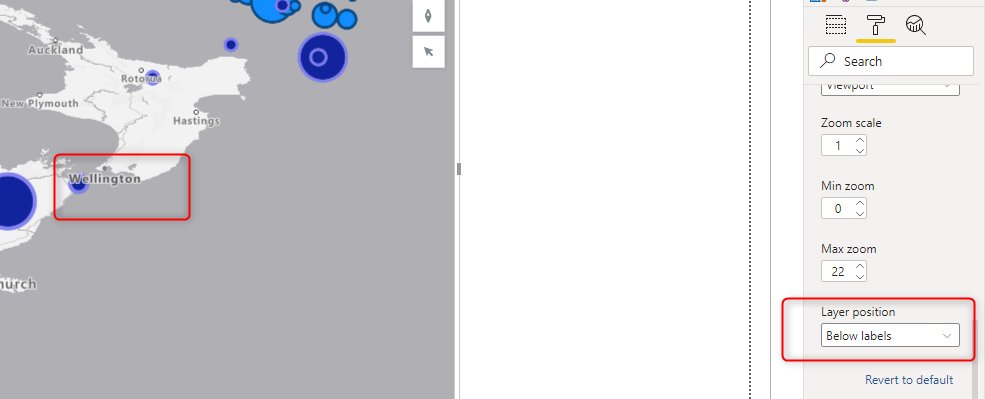
The bubble may cover the other layers, in the map, for example, the bubble for wellington cover the Wellington Name, in the current zoom state ( a layer that shows the Name)
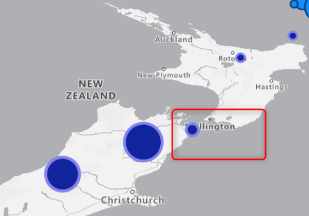
I am going to change the Layer Position to be Below Lable to make it more clear. of some bubble cover the road in the map, you can set the Layer position to be below road.
Bar Chart
In Azure Map, instead of showing the data in bubble format, you can show it in Bar chart ( you can have both of them at the same time as well)
you need to enable the bar chart, then you can choose the bar style to be cylinder or box. The bar chart is a 3D visualization that can be good be used with Pitches to better see the data, the size of the Bar is related to the numerical value you choose for the Size ( here is magnitude)
One recommendation, use Barchart when the data has much difference from each other, in this example, there is not much difference between earthquake data.
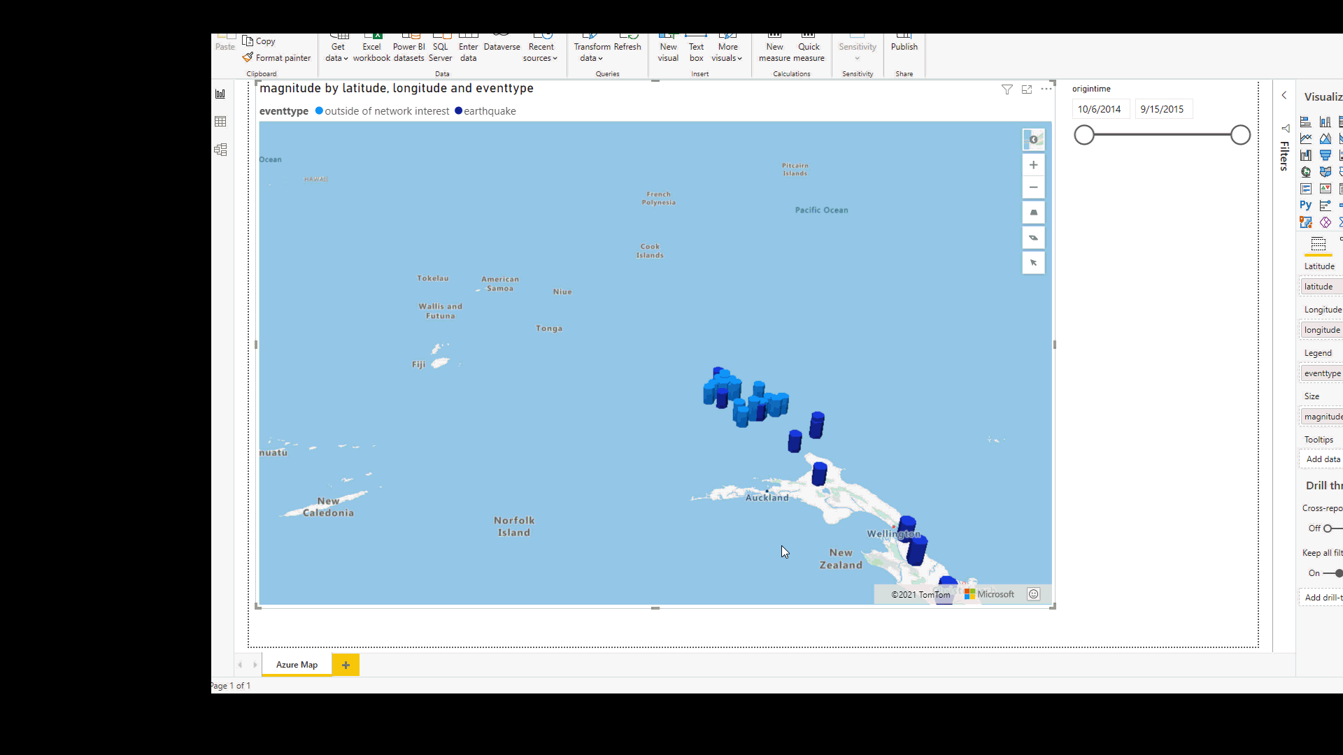
Other setting in Bar chart is the same as the Bubble chart
In the next post, I will explain how to set the reference and traffic layers.


