
Reza rad already wrote some articles about Map visuals in Power BI such as ArcGIS, Shape Map, and Filled Map. In this blog post, I am going to talk about Azure Map Visual in Power BI.
a definition from Microsoft website:
“The Azure Maps visual for Power BI provides a rich set of data visualizations for spatial data on top of a map. It is estimated that over 80% of business data has a location context. The Azure Maps visual can be used to gain insights into how this location context relates to and influences your business data.”
Azure Map visual has been added to the visualization panel recently. in this article ( first Part), you will learn how to
1- Setup Azure Map Visual
2- How to visualize a simple location data
3- Setup the Map setting
Setup Azure Map Visual
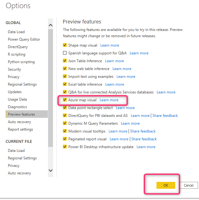
Azure Map visual still is in preview (2nd September), so to access it, and make it enable, you need to go to File, then Options and settings, Options, then select Preview Feature. in preview features list, select Azure Map Visual. then close your power bi and reopen it
Now you can see it in the Visualization Panell
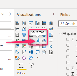
Reay to use it !!
How to visualize a simple location data
First, you need data with Latitude and Longitude.
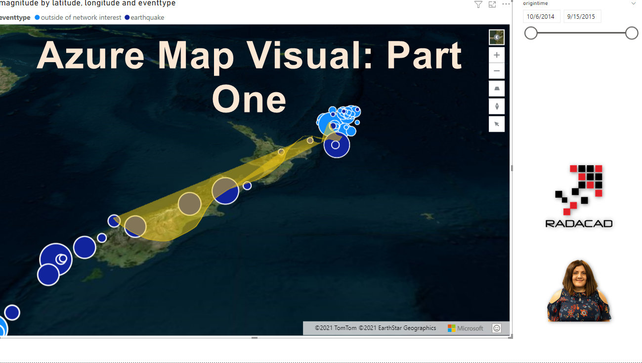
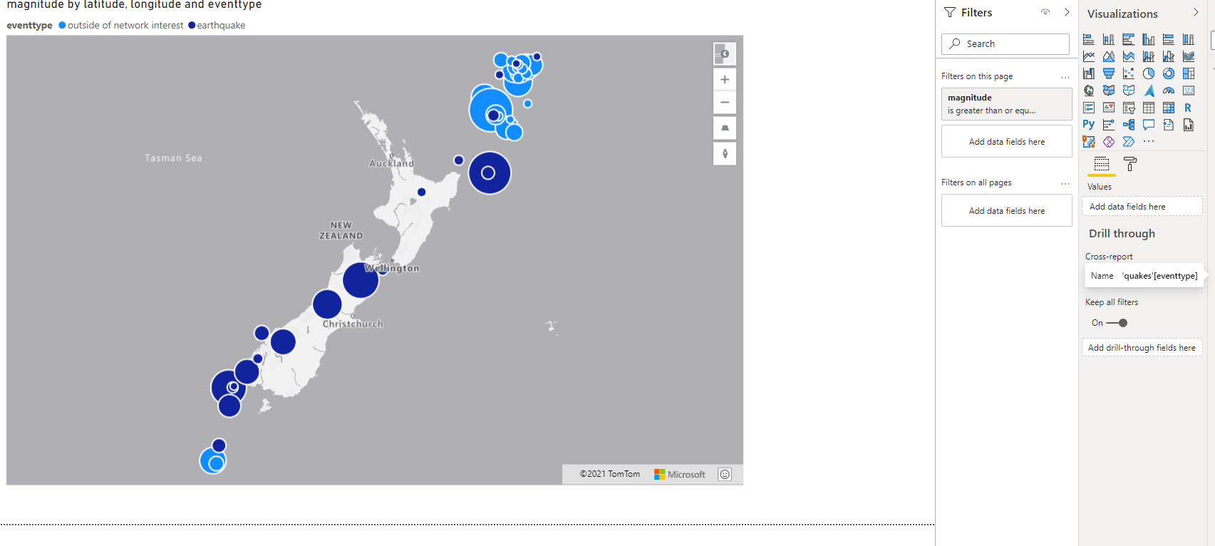
I am going to use New Zealand earth quicks data for this demo, you can download it from
Quakes (35497 downloads )Click on the Azure Map visual, then you get a message that this visual is powered by TomTom, make sure you read it and are happy about how it is. ( However, the ordinary map also, send data to Bing or google engine)
Drag and drop Latitude, Longitude to the data field, then, magnitude to size.
This is information about the earthquakes that happened in New Zealand, lets filter in the page level to show earthquake bigger or equal to 5.
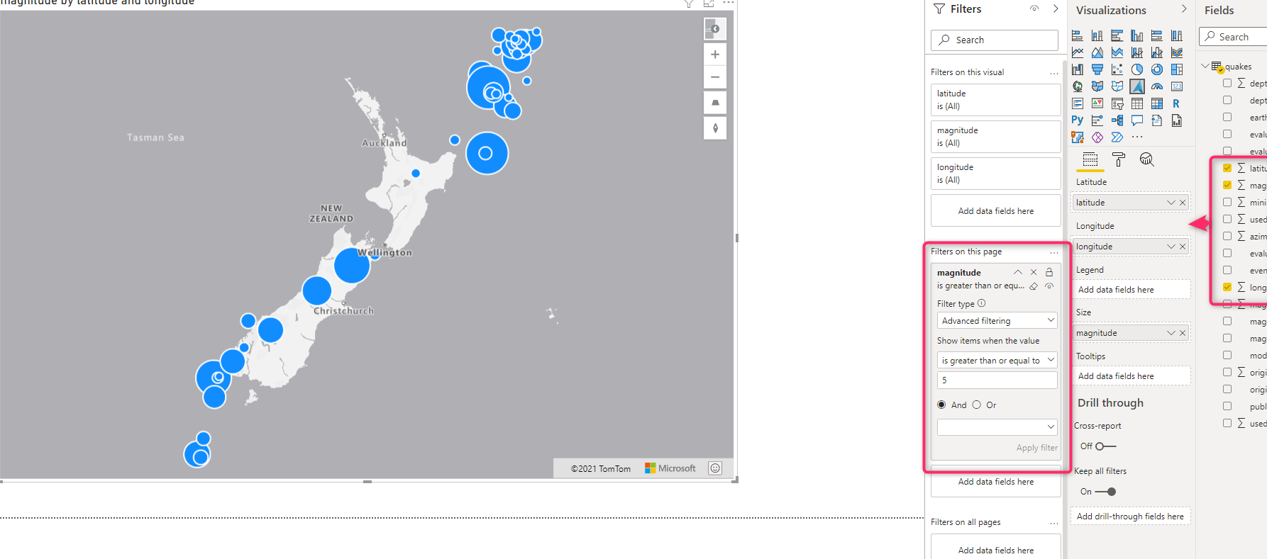
Sames as other maps you can set Size to sow a bigger bubble with A legend. for this chart, you can add the event type as the outside of the network interest or earthquake.
Till here, most of the features was in previous Maps, let’s check other features here
Click on the Azure Map visual and then select the format, under Format select the Map Settings Option.
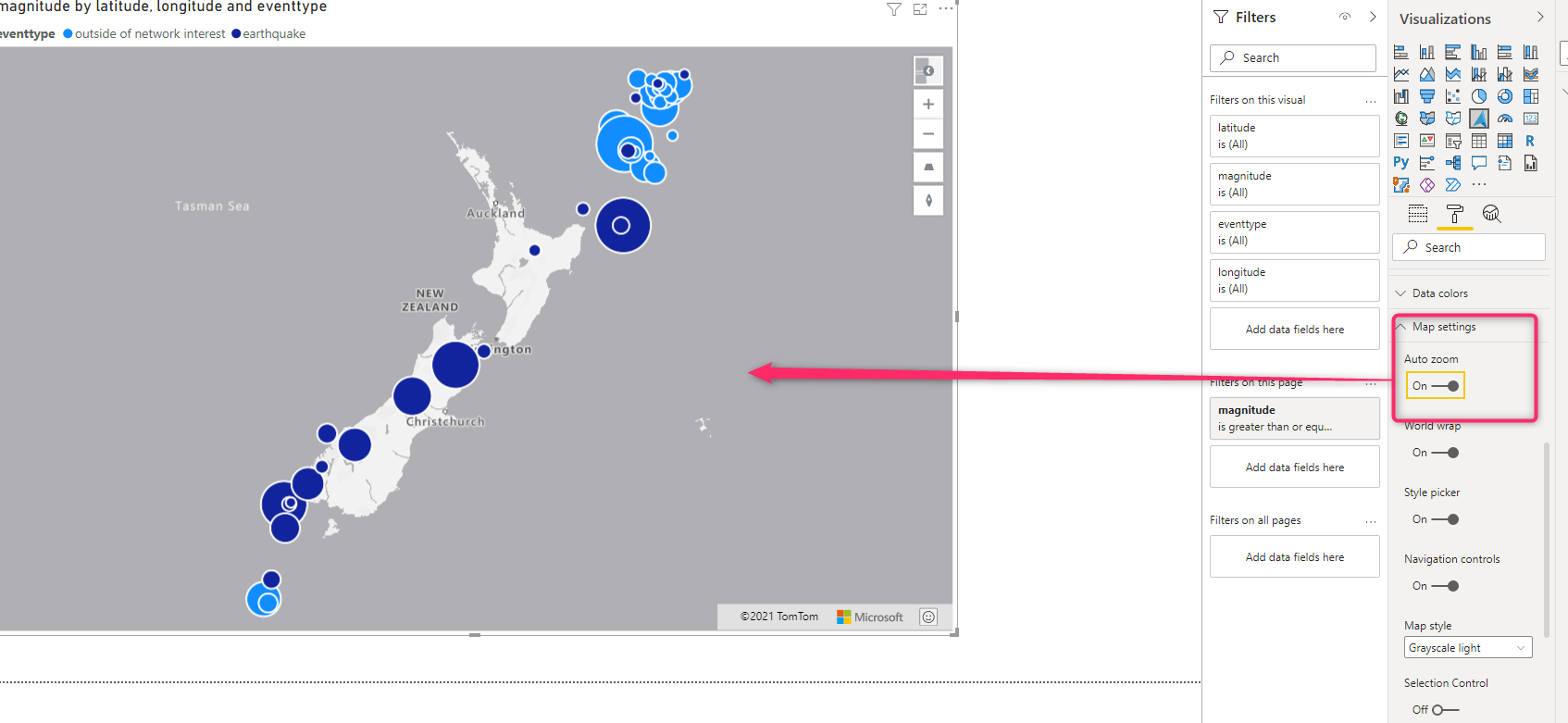
Auto Zoom
When is not selected, it is going to show the whole world map regardless we have data on that or not
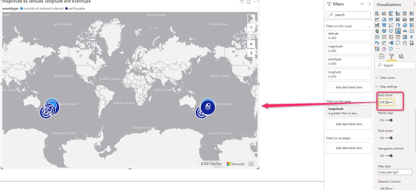
But if you enable the Auto Zoom, it will zoom on the area that data is available, in this scenario data is related to New Zealand, so it zooms in that area. w have this feature in Map visual as well.
World Map
When the World map is enabled, it is going to repeat the map.
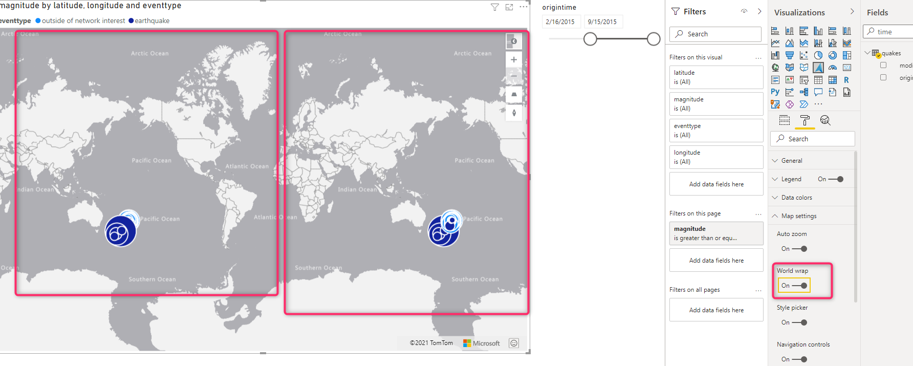
This will help if you looking at the edge of the map, for example, some parts of data can be cut off if I disable the World Map, as you can see in the below picture, I disable the World Map, and some parts of data related to earth quakes not showing in the right side, as the map is not repeating, it shows the rest on the othersides.
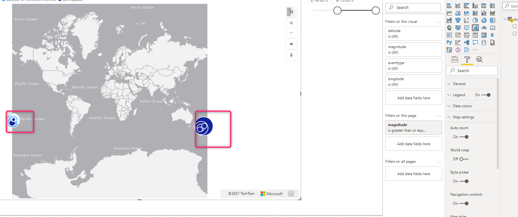
I normally make is enable as I do not want to miss some part
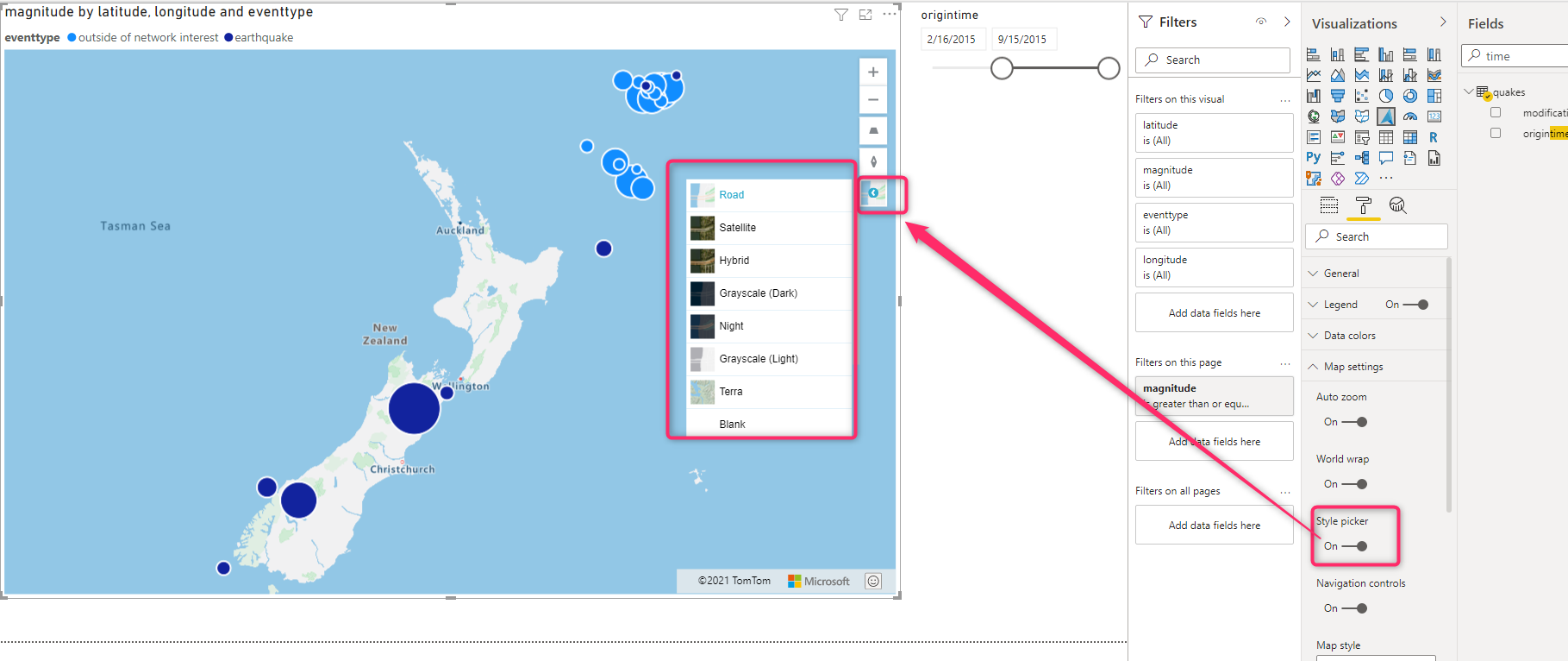
Style Picker
You can choose the map style, if you enable this option, an icon with a small arrow appears at the ribbon menu on the Map. By default, the Style Picker is enabled and you can pick any style from it, Road, Sattelite, Hybride, Night, and so forth. You can disable it if you do not want to change the style by the user.
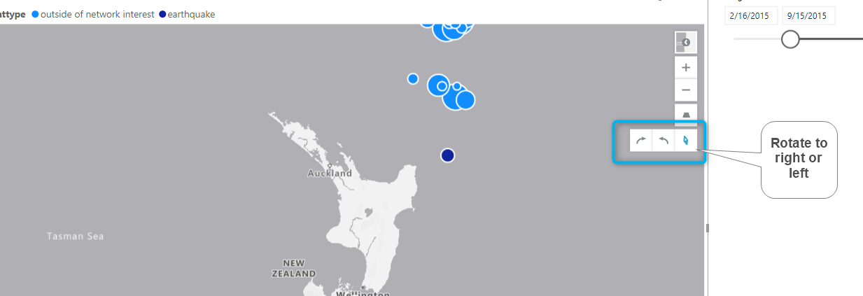
Navigation Control
there are many cases you want to better see the map by zoom, rotate, change the pitch of the map, and so on. By enabling this option, on the map you should see four controls as below
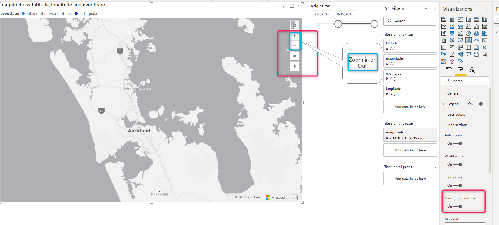
Or you can rotate left or right
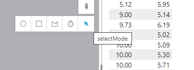
Selection Control
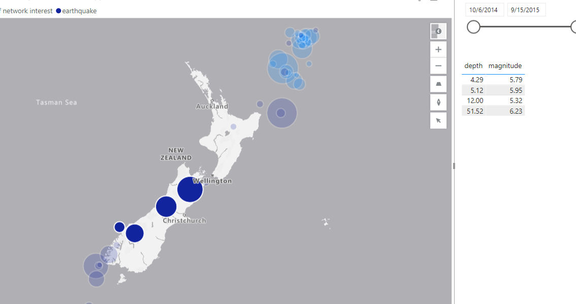
it happens that, we want to analyze some parts of the map, and we need to select only that part. Under the Map setting, there is a control name Selection Control that allows us to select a cycle, rectangle, or a customized area in the map.
Enable the Selection control then, in the ribbon at the right side of the map you should see an arrow at the bottom, click on that, you see four options.
I am going to select an area with the rectangle shape as below images
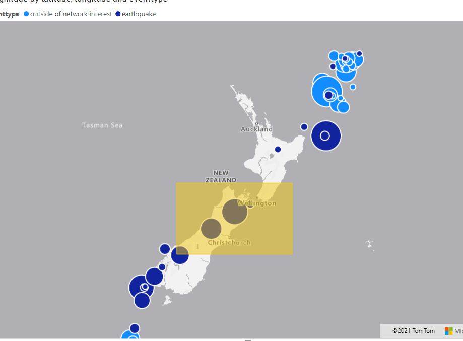
I only selected places closed to the Wellington area and three major earth quakes happened there, in the table at the right side of the report only information about these three heart quake shown

You can try cycle one in the same way.
The exciting part is to select an area with a custom shape as below
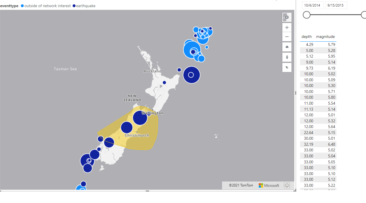
So, if in any condition, the circle and rectangle could not cover the area you want, you can draw a custom shape to select your desire areas.
In the next blog, I am going to show how to set up Bubble, Bar Chart set, and combination with Pitch, and General Layer Settings.
Download the related Powe BI file from below
Azure Map Power BI Part One (31913 downloads )


