Shape Map Better than the Filled Map

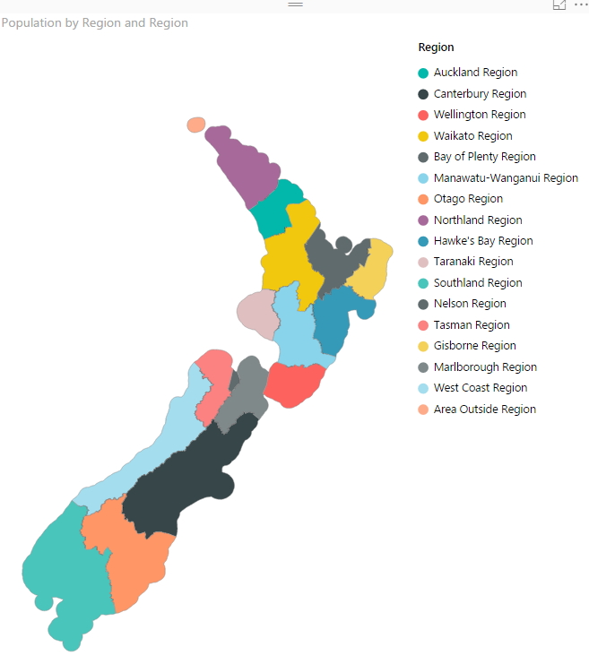
I have previously written some blog posts about Map visuals in Power BI. One of them was specifically about Filled Map, titled as Filled Map; the Good, the Bad, the Ugly! Why? you need to read that post to find the reason. In this post I want to explain the power of Shape Map which Read more about Shape Map Better than the Filled Map[…]

Materials and Q&A of PASS BA VC Session: Take Power BI Visualization to the Next Level

Thanks for all attendees of my webinar yesterday in PASS Business Analytics Virtual Chapter (Group). It was a pleasure to present to you all again. The session time spent all for me speaking and there was no time for answering questions at the end, so here I’ll answer all questions, and you will have access Read more about Materials and Q&A of PASS BA VC Session: Take Power BI Visualization to the Next Level[…]

Stacked Chart or Clustered? Which One is the Best?

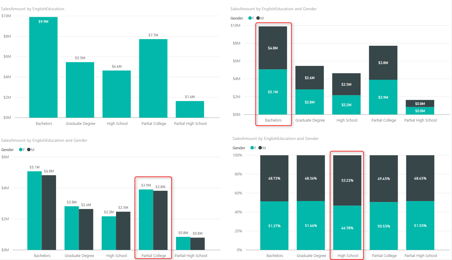
Column chart and Bar chart are two of the most basic charts used in every report and dashboard. There are normally two types of these charts: Stacked, and Clustered. At the first glance they seems to do same action; showing values by categories ans sub categories. However, they are different. Your storytelling of data would Read more about Stacked Chart or Clustered? Which One is the Best?[…]

Sort By Column in Power BI

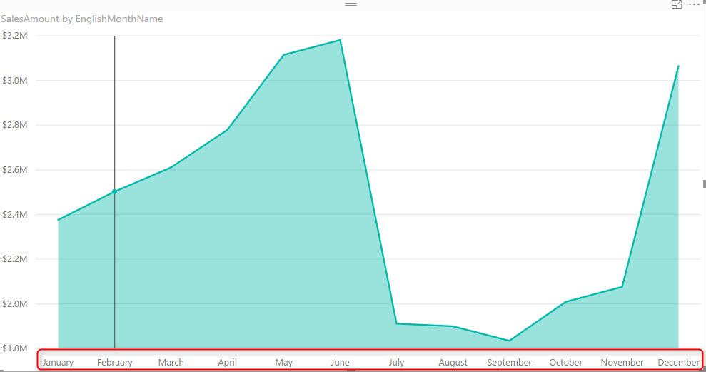
Power BI users Sorting in most of the visualizations, you can choose to sort ascending or descending based on specified data fields. However the field itself can be sorted based on another column. This feature called as Sort By Column in Power BI. This is not a new or advanced feature in Power BI. This Read more about Sort By Column in Power BI[…]