
The Waterfall chart is a good visualization to show you changes on value over a sequence, The sequence can be time, or date or workflow steps, etc. There is also an ability in this chart that may not be visible to everyone, and that is the breakdown option of this chart. You can use the chart without the breakdown option, However, if you use this option, it gives you fantastic ability to compare values on a period over period basis. You don’t even need to write DAX measures for a year over year or a month over month, this chart, gives you that easily. Let’s see how this works.
What is the Waterfall Chart
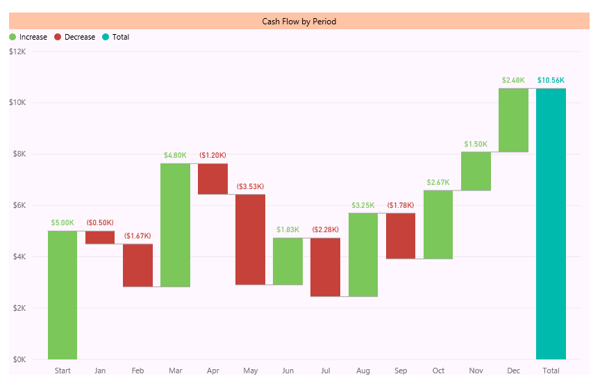
The waterfall chart is giving you the ability to analyze the changes of a value over a sequence. This can be used for cash flow analysis, for example, showing the cashflow changes over a period of months;
I have written about the waterfall chart in another blog post, and I highly recommend reading it here to understand how it works.
Sample Data Model
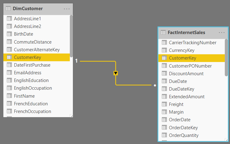
I have a sample model from AdventureWorksDW source which includes two tables: DimCustomer, and FactInternetSales, and the two tables are connected using the CustomerKey;
Analysis over time
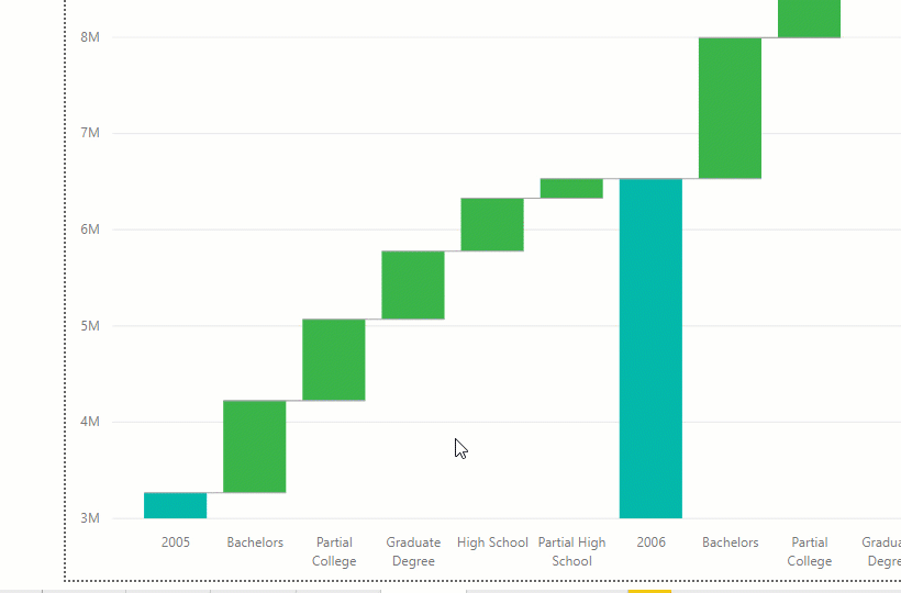
Let’s say using the waterfall chart, I do have the analysis of SalesAmount (from the FactInternetSales) table by the OrderDate (from the FactInternetSales);
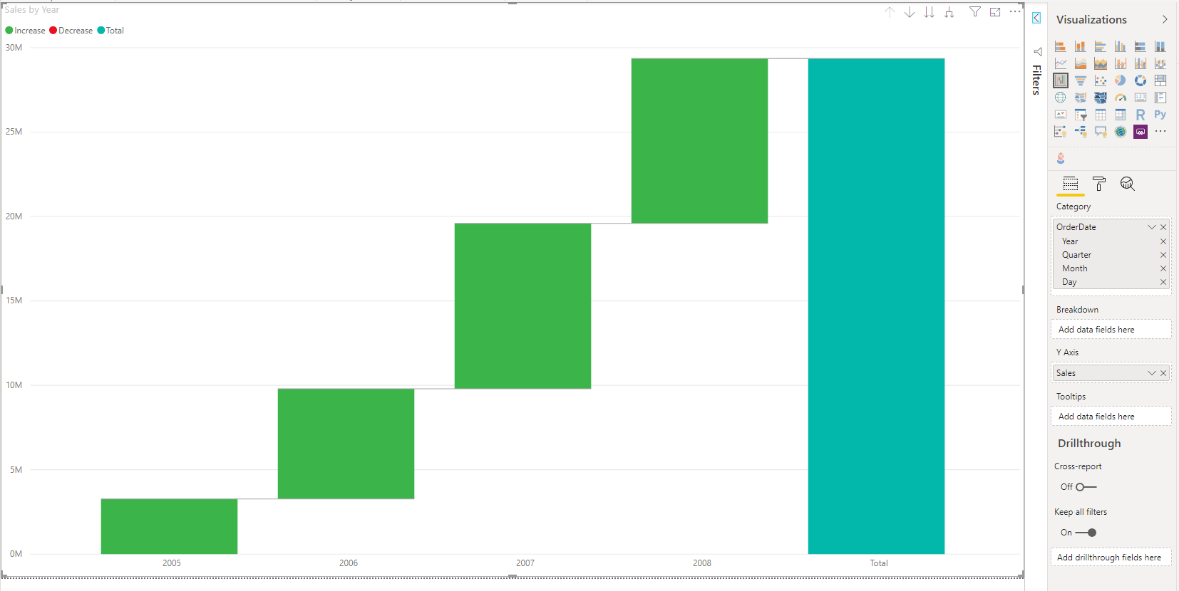
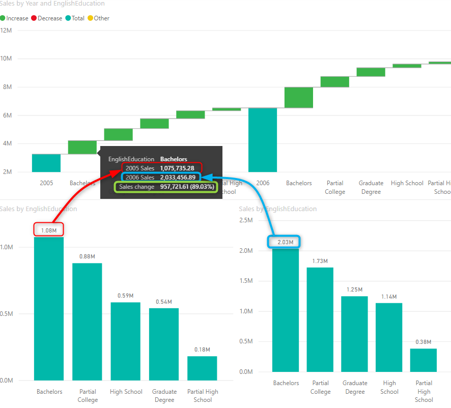
This simply shows me the sales amount in each year and the total after the last year in the dataset. Now, Let’s say I want to see a BREAKDOWN of these sales by EnglishEducation (from DimCustomer), and see how much sales we had in each education category in that period.
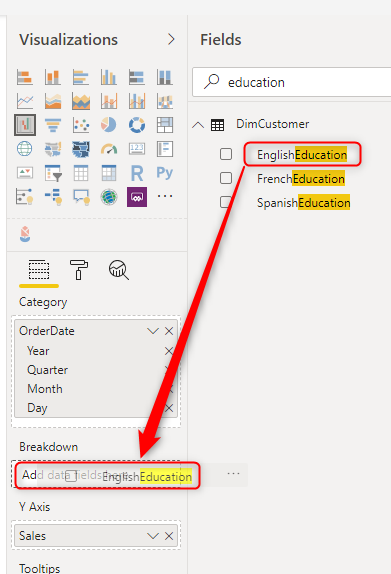
Adding Breakdown
You can add a field to the Breakdown simply by drag and drop it to the breakdown section
This now gives you the sales amount for each period with the education breakdown;
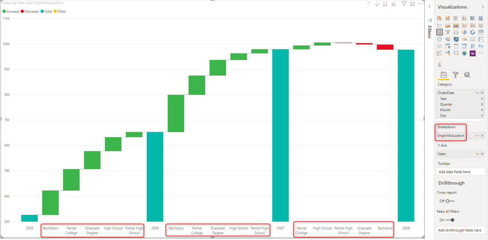
The chart, of course, shows you the sales of each education category in a given period. However, the chart shows you information more than that. It gives you information for a period over period values.
Understanding the Chart; Period over Period Breakdown
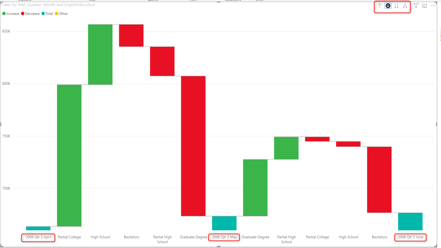
The key to using the breakdown feature is to understand how it works. When you have the breakdown in the waterfall chart, you can get the period over period breakdown. Let’s focus only on a part of the chart, and see how is the sales of Bachelors in 2005. In the tooltip, you can see that the information provided is not only for the 2005 Bachelors, but also for 2006, and the variance of the two periods, and the percentage of that variance!
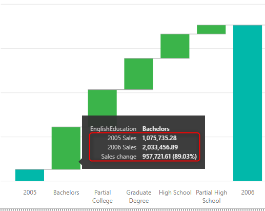
This information is very useful. If you wanted to achieve this using DAX, you either needed to write a calculation to calculate the year over year change or use a quick measure to calculate it for you. Then subtract the value of this period from the last period (or the next), and then calculate the percentage. All of that is done for you just by using this visual! (Of course, measures are not created automatically, everything happens behind the scene)
To help you to understand the chart, even more, I have added a couple of column charts for each year as below;
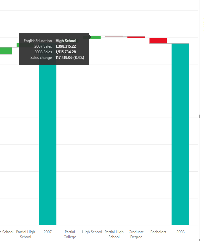
The value in every period is compared to the value of the next period, and if there is no next year, then that year won’t have any values. For example, in my dataset, 2008 is the last year of the sales, and I don’t see any values for that year. I see values, however, in the year of 2007, which is compared to 2008.
Sorting is based on the Variance
You might wonder what is the sorting of the breakdown field is based on? it is not alphabetical, and it is not based on the Sales value either.

The sorting is based on the variance (not the percentage). for example, in the below graphics, you can see that the sales value of High School is higher than the Graduate Degree in 2005. However, the variance of the change compared to 2006, for the Graduate Degree is higher than the High School, and that is why Graduate Degree comes earlier in the sorting.
You can drill down to Quarter, Month and Day
And don’t forget that you can also use a hierarchy in the Category field of the waterfall chart, and that gives you the ability to drill down or drill up as you wish. here is a drilled down experience of that data for months in a quarter;
Breakdown Setting
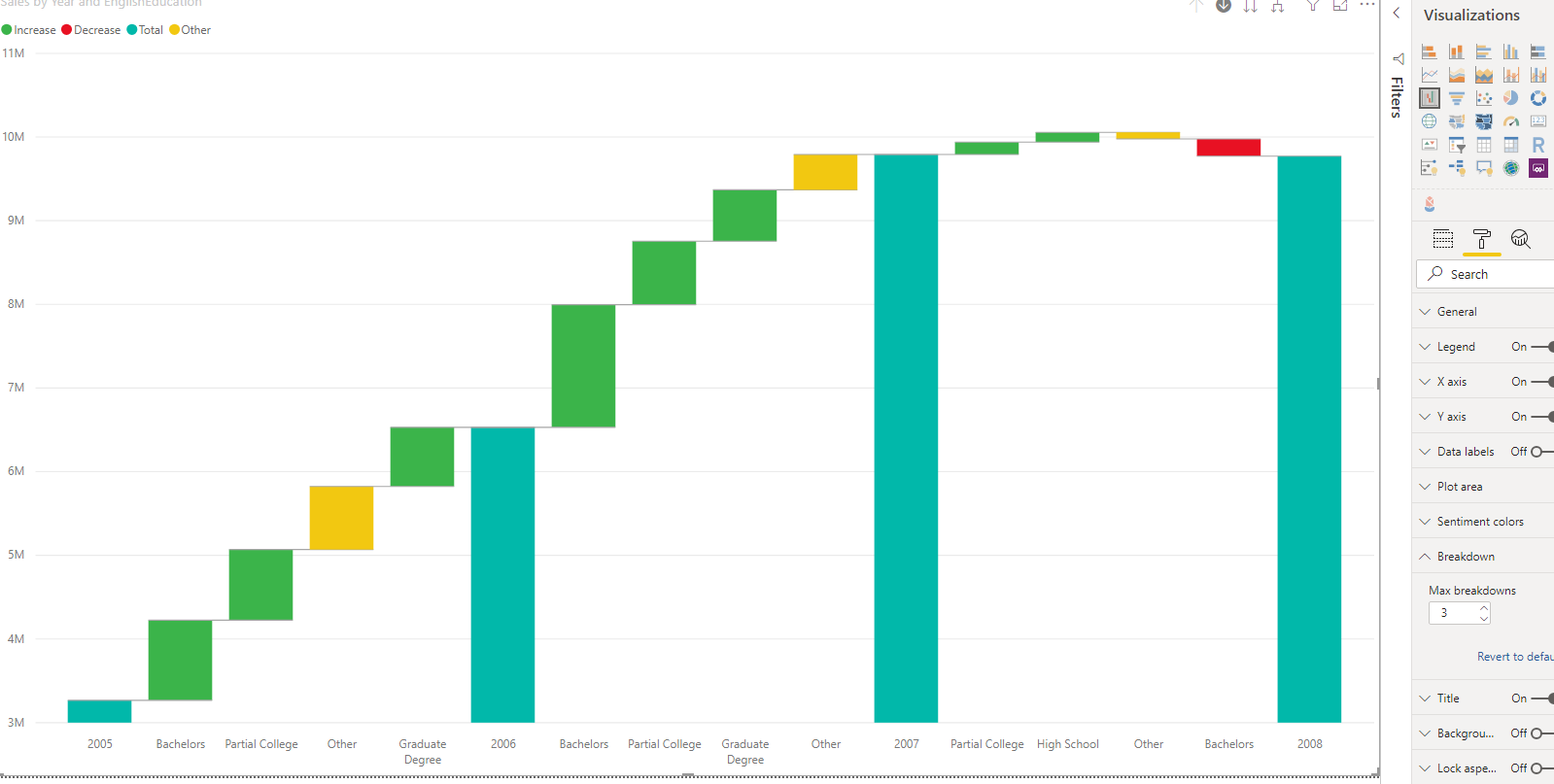
By default the breakdown setting is showing five items, if you like to show more, you can change it in the Format of this visual;
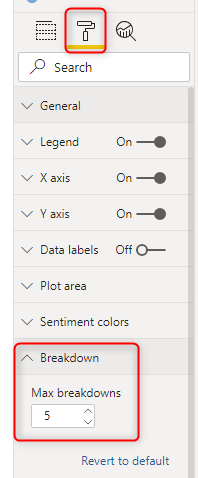
This means that if you have more than five items to show, there will be an “OTHER” option which is accumulated of all the remaining values.
Summary
Altogether, the waterfall is a great visualization to show changes in value over time and date. Using the breakdown option will get you even one step further, and you can compare values in two different periods.
Video


Reza is author of more than 14 books on Microsoft Business Intelligence, most of these books are published under Power BI category. Among these are books such as Power BI DAX Simplified, Pro Power BI Architecture, Power BI from Rookie to Rock Star, Power Query books series, Row-Level Security in Power BI and etc.
He is an International Speaker in Microsoft Ignite, Microsoft Business Applications Summit, Data Insight Summit, PASS Summit, SQL Saturday and SQL user groups. And He is a Microsoft Certified Trainer.
Reza’s passion is to help you find the best data solution, he is Data enthusiast.
His articles on different aspects of technologies, especially on MS BI, can be found on his blog: https://radacad.com/blog.