
In the last Post, I have explained some parts of creating Custom visual such as how to create an icon, name of visual, and the how-to allocates fields to a custom visual.
There are some other settings that need to be set up beforehand as well.
the number of data fields you able to pass to each field is matter.
what is mean? in Power BI, sometimes we able to pass as many as data fields to a visual field. But in the most of the cases, we just need to pass one column. Look at the below image:
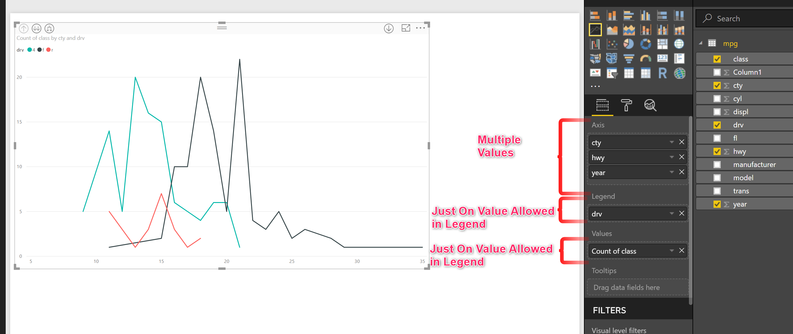
so how could I manage my visual to accept only one or many values?
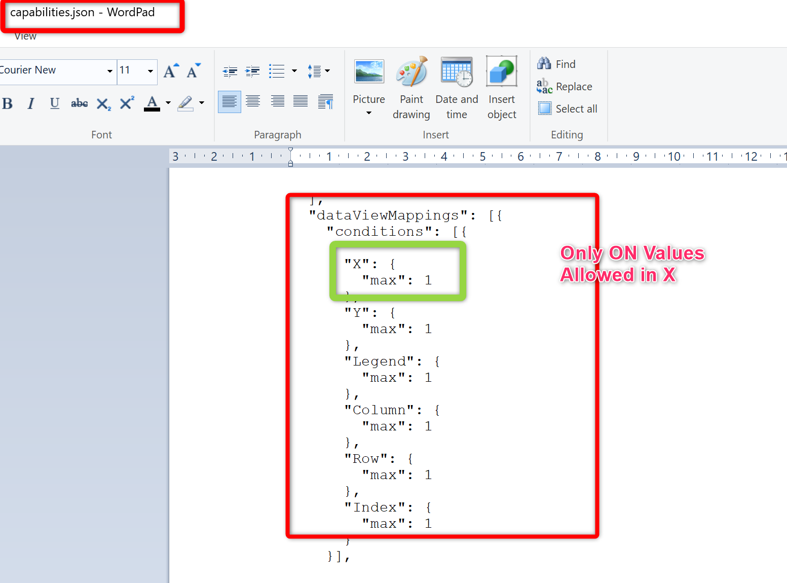
back to the folder that we have from creating custom visual, we need to change the “capabilities.json” and add other elements. name data view mapping object to specify the maximum number of variable that each field able to accept. As you can see in the below image, each variable just able to accept one variable no more.
Now, imagine, we want to add some more settings., For me, I want to provide a possibility, that the user able to change the chart type such as”Bar chart”, “Scatter chart” or “Boxplot”.
I need to change some setting. for now, I do not have any setting in my visual.
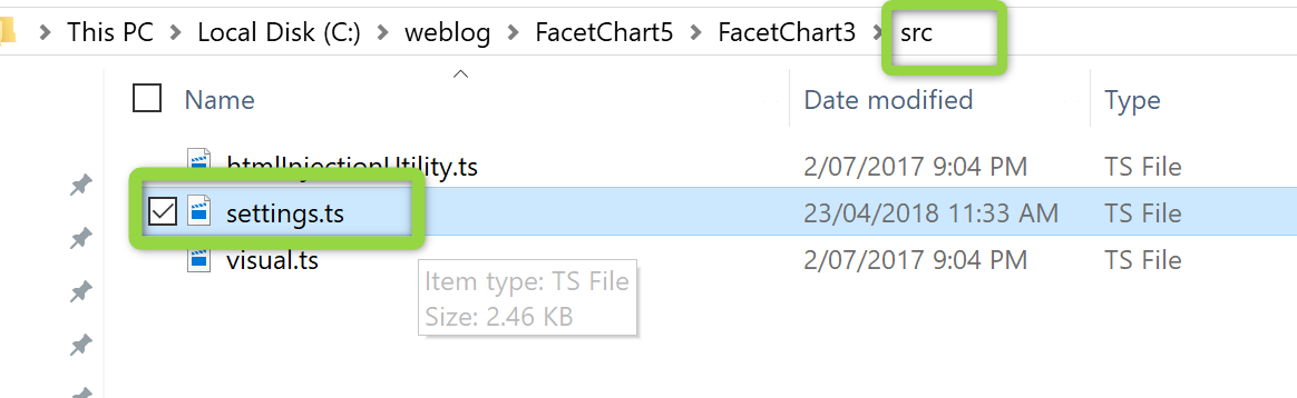
to add a more Visual setting, we need to change capabilities.json file, script.r, and settings.ts file in “src” folder.
First, we need to change the code in capabilities. under the object node, we need to create another node “settings_ChartType_params”. as you can see in the blow image, I create an enumeration for chart types.
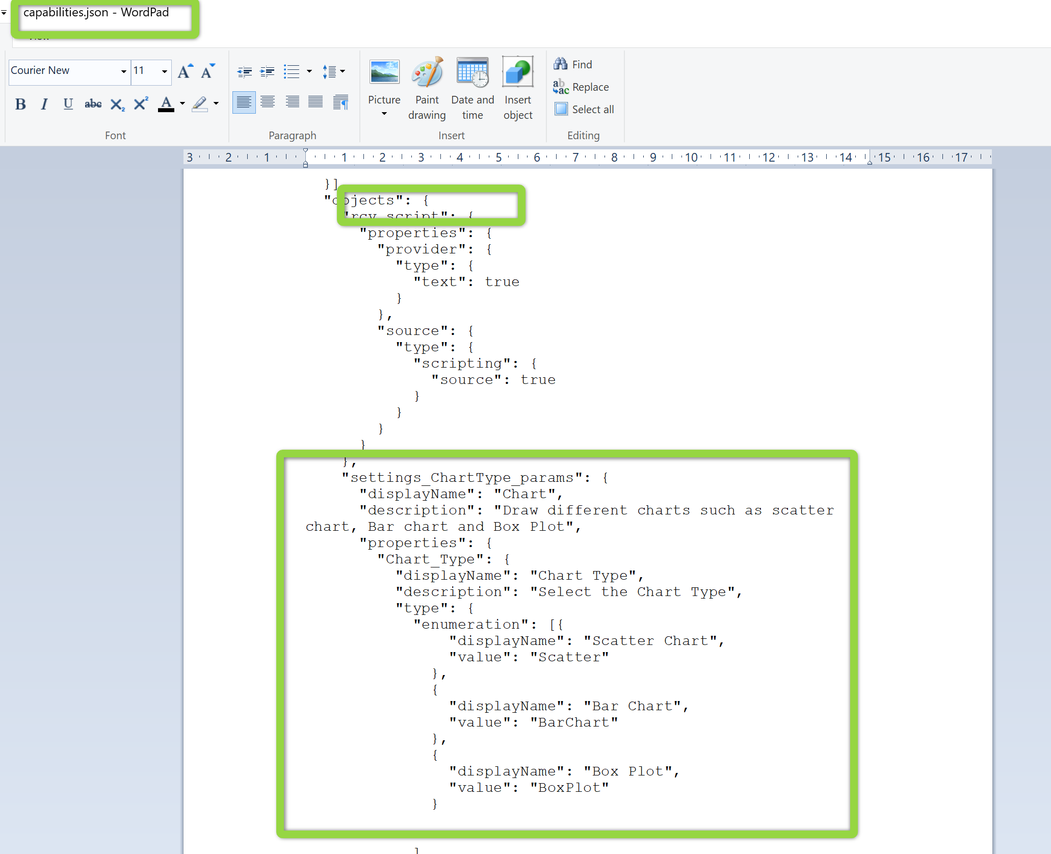
"settings_ChartType_params": {
      "displayName": "Chart",
      "description": "Draw different charts such as scatter chart, Bar chart and Box Plot",
      "properties": {
        "Chart_Type": {
          "displayName": "Chart Type",
          "description": "Select the Chart Type",
          "type": {
            "enumeration": [{
                "displayName": "Scatter Chart",
                "value": "Scatter"
              },
              {
                "displayName": "Bar Chart",
                "value": "BarChart"
              },
              {
                "displayName": "Box Plot",
                "value": "BoxPlot"
              }


            ]
          }
        }


      }
    },
Next, we need to add some code to the script.r file
I add some codes to read data from setting in my script.r file as below
#CHART TYPE, SCATTER CHART, BOXPLOT, AND BARCHART
ChartType="Scatter"
if(exists("settings_ChartType_params_Chart_Type")){

  ChartType = as.character(settings_ChartType_params_Chart_Type)
}
Then, I need to change the code in the setting.ts file.
module powerbi.extensibility.visual {
  "use strict";

  import DataViewObjectsParser = powerbi.extensibility.utils.dataview.DataViewObjectsParser;

  export class VisualSettings extends DataViewObjectsParser {
    public settings_ChartType_params: settings_ChartType_params = new settings_ChartType_params();

    /*public rcv_script: rcv_scriptSettings = new rcv_scriptSettings();*/
  }

  /*export class rcv_scriptSettings {
    // undefined
     public provider     // undefined
     public source     }*/

  export class settings_ChartType_params {
    public Chart_Type: string = "Scatter";


  }

}
Now you need to customize your R codes regarding the chart type. In R code also we need to change the code to provide some if then else setting as below.
 if( ncol(Values)==6 && ChartType=="Scatter")
  {
    names(Values)[4]<-paste("W")
    names(Values)[5]<-paste("M")
    #Values[3]<-as.factor(Values[3])
    g<-ggplot(Values,aes_string(names(Values[1]),names(Values[2]),color=names( Values[3])))+geom_jitter()+facet_grid( M ~  W)

  }

  if(ncol(Values)==6 && ChartType=="BarChart")
  {
    names(Values)[4]<-paste("W")
    names(Values)[5]<-paste("M")
    g=ggplot(Values,aes_string(names(Values[1]),names(Values[2]),fill=names(Values[3])))+geom_bar(stat="identity")+facet_grid( M ~  W,scales = "free")#+labs(fill = "Cylinders")
  }
  if(ncol(Values)==6 && ChartType=="BoxPlot")
  {
    names(Values)[4]<-paste("W")
    names(Values)[5]<-paste("M")
    names(Values)[3]<-paste("color")
    g=ggplot(Values,aes_string(names(Values[1]),names(Values[2]),fill=factor(Values$color)))+geom_boxplot()+facet_grid( M ~  W,scales = "free")
    g=g+guides(fill=guide_legend(names(Legend)))
  }
Finally, we need to compile the package again as always to see the result. in command prompt just write “pbiviz package”.
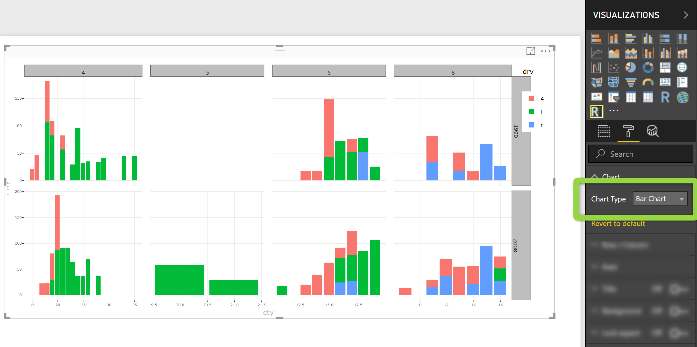
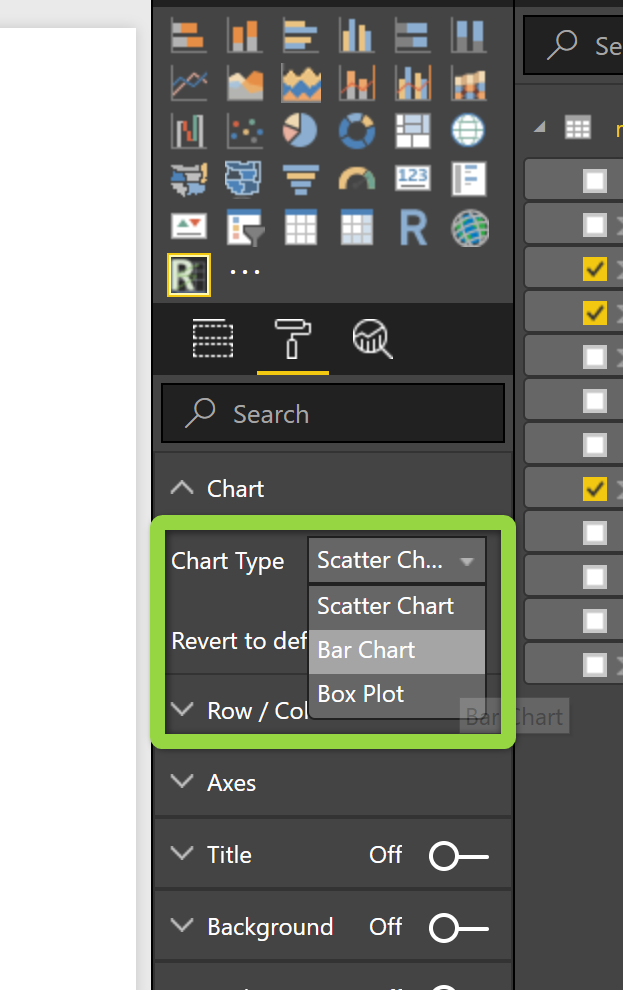
As you see in the above image, in Visual, I have a setting called chart, and under it, I have a field that let me change the chart type.
Still many things that can be covered in this subject, Creating custom visual can be so easy or can be so complicated by adding different settings, like how to pass the error message, and some other information, hope so in other posts I am able to cover them all. Also, check the https://github.com/Microsoft/PowerBI-visuals/blob/master/RVisualTutorial/TutorialFunnelPlot/tutorialScript.txt by Microsoft team data scientist.
also, check the one I created from below link


