In this blog post of Mobile friendly Power BI report development series I would explain how to design dashboards for mobile devices. Fortunately this has come right at the time of the recent update on Power BI service with ability to design dashboard page specifically for mobile device. The dashboard design for mobile does work with all mobile sizes and shapes as long as it is one of the supporting mobile operating systems; IOS, Windows Phone, and Android. If you have worked with Mobile report publisher of SSRS 2016 you will see very similar experience here. If you are interested to learn more about Power BI, read Power BI online book; from Rookie to Rock Star.
Change Dashboard View
With the latest update of Power BI service, you can now change the view of Dashboard for mobile device. For using this feature you should login to Power BI, and then on a selected dashboard click on ellipsis button on the top right hand side of the dashboard (below your account’s profile photo), then choose Phone under Edit View.
The default view is Web view, and when you change it to Phone view you will see a message about switching to phone version.
Don’t worry about this message, you won’t loose any configuration on your web version of dashboard. In fact your dashboard would have two different views; Web view, and Phone view. After entering to Phone view you will see a phone view with tiles of dashboard added to it automatically.
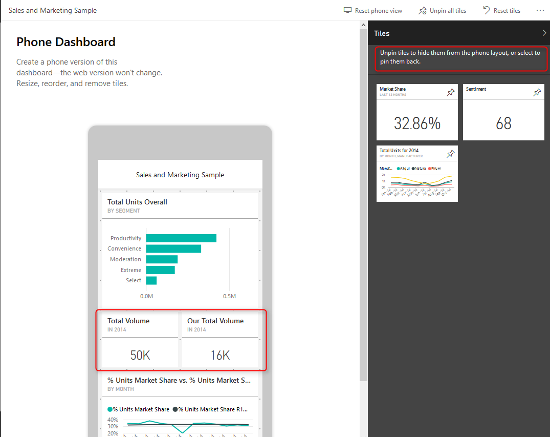
As you can see this is a view of smart phone, and the good thing about it is that this is size independent. so works with all phone sizes. You can change size or order of a tile as you want with drag and drop or moving their borders to resize it.
This feature is a great step forward for mobile dashboards, because previously dashboards only designed for web, and they automatically set for phone view. Now we have the ability to design exactly what we want to show. We can event unpin some of tiles from phone view’s dashboard. unpinned tiles will stay in the Tiles pane in the right hand side, and you can add them to the dashboard whenever you like.
As you can see in above screenshot now you can arrange the view to have two or more (if you can fit in the screen of phone) tiles in same horizontal position. This is great view specially when you have only numbers to show, and uses whole width of the phone rather than having blank spaces around.
You can reset the view anytime you want and design a new dashboard from the beginning
View Reports on Mobile Device
The reports view on mobile devices still needs some more tips and tricks to work with. If you like to learn more how to design reports which are mobile friendly read my blog post here.


