
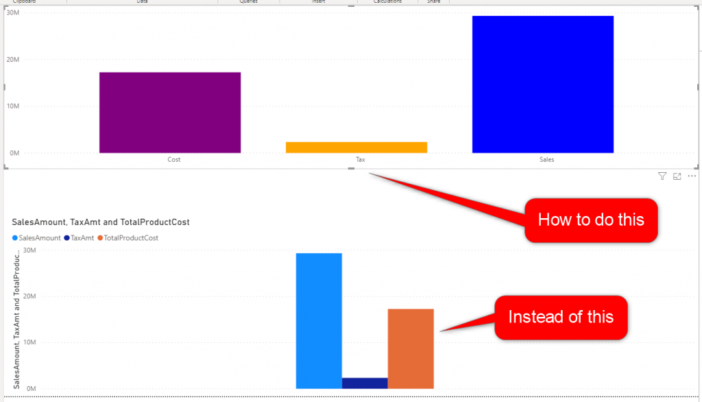
If you even need to show your DAX measures in a chart without a dimension to slice and dice it, you won’t get a great experience in the visual. In this blog post, I’ll share a trick that you can use to have a nice visualization like what you see in the above screenshot.
How the measures in one chart looks like
In my sample dataset, I have a table called FactInternetSales, with three columns that I used in the visuals below: SalesAmount, TaxAmt, and TotalProductCost.
If you don’t slice and dice your measures (or column values) by any dimension, then your charts would like like below. which none of them are great visualizations.
You can, however, create a disconnected table and use it like a dimension. here is how it works.
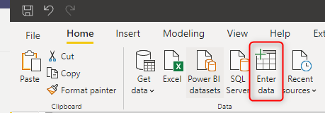
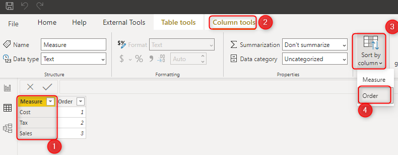
Create a Measure List table
I have previously explained the patterns of creating a measure list table in this article. Here in this post, we can see another usage of this. The measure list table is a table with labels for the measures. This table is best to be created outside of Power BI in a data source (for easier maintenance). However, in this article for simplicity, I do it inside the Power BI.
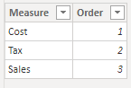
Add the measure labels as a column. I always recommend an Order column as well. which can be used as the sort order for the label column. Here are the two columns I have created:
Sort Measures
The reason to add the Order column is to use it to sort the Measure labels in the way we wanted. You can sort this column like below. Here is more information about sort by column.
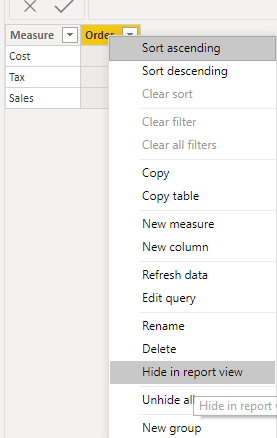
It is always good to hide the column you used for the sorting as a best practice after this step. You can hide the order column like this:
To find out best practices of what columns to hide, read my article here.
Create a measure for values
The next step is to create a measure that can be used as the value in the chart. You can create this measure using Switch, and the SelectedValue DAX functions.
Measure Value =
SWITCH(
SELECTEDVALUE('Measure List'[Measure]),
'Sales',SUM(FactInternetSales[SalesAmount]),
'Cost',SUM(FactInternetSales[TotalProductCost]),
'TAX',SUM(FactInternetSales[TaxAmt])
)
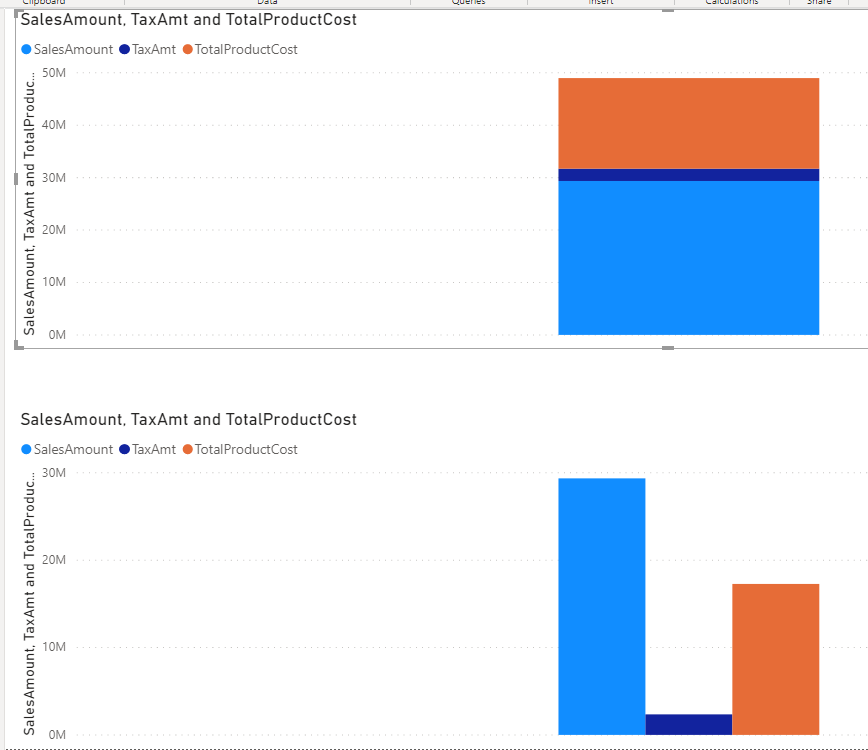
You can now have a stacked column chart visual, and use this measure as the value, and use the Measure column from the Measure List table as the Axis.
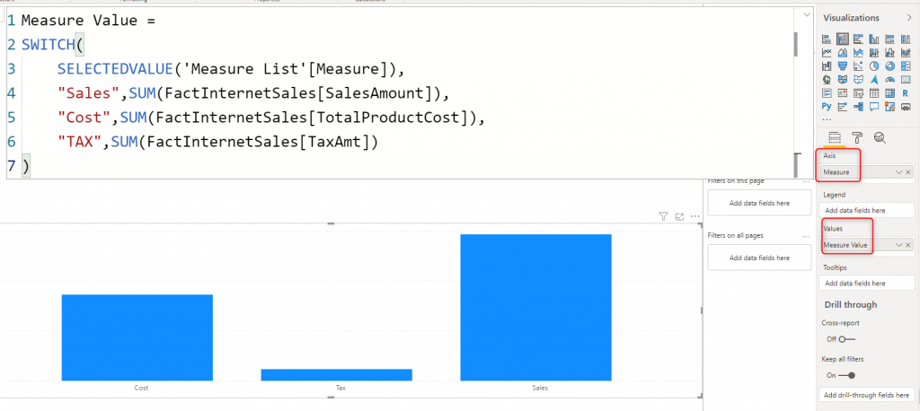
You would get the same result with the clustered column chart as well.
The colors of each measure can be changed in the format of the visual for each measure, but you can do something better, you can create a measure for colors and use it for conditional formatting.
Create a measure for color
I have previously explained how DAX measures are powerful in conditional formatting. You can use the same approach here. Create a measure for the color, like below;
Measure Color =
SWITCH(
SELECTEDVALUE('Measure List'[Measure]),
'Sales','Blue',
'Cost','Purple',
'TAX','Orange'
)
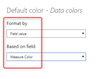
Now use this measure in the Format, Color, conditional formatting.
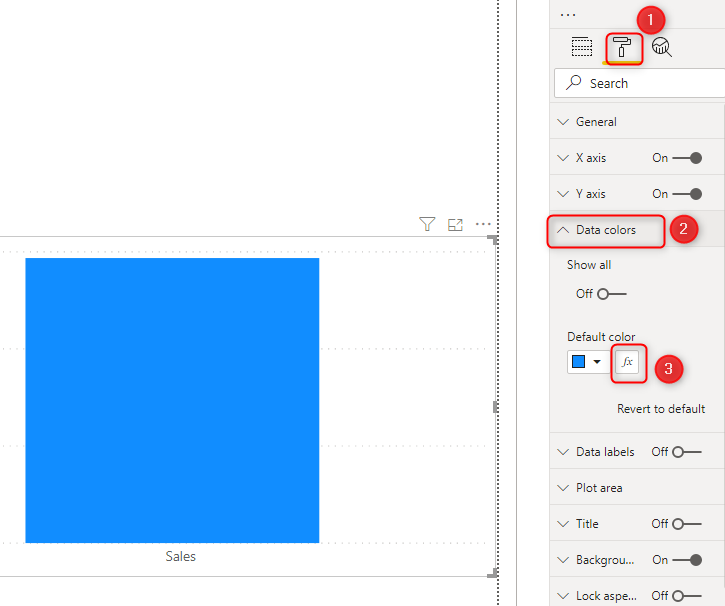
In the conditional formatting configuration window, set the format by to Field Value, and then select the Measure color in the drop down.
and the result now looks like this:
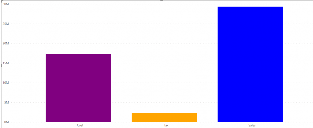
Please note that I have removed the title from the visual, and both axis. However, if you want the title, you can add it even with another conditional expression.
Summary
I didn’t really used measure in the Axis of the Power BI visual. This is a trick that looks like that in fact. I have created a disconnected table, and used measures to return values based on the values of that table. This pattern has many other use cases in the slicers and filters as well.
Download Sample Power BI File
Download the sample Power BI report here:
Video


Reza is author of more than 14 books on Microsoft Business Intelligence, most of these books are published under Power BI category. Among these are books such as Power BI DAX Simplified, Pro Power BI Architecture, Power BI from Rookie to Rock Star, Power Query books series, Row-Level Security in Power BI and etc.
He is an International Speaker in Microsoft Ignite, Microsoft Business Applications Summit, Data Insight Summit, PASS Summit, SQL Saturday and SQL user groups. And He is a Microsoft Certified Trainer.
Reza’s passion is to help you find the best data solution, he is Data enthusiast.
His articles on different aspects of technologies, especially on MS BI, can be found on his blog: https://radacad.com/blog.
Worked perfectly – thank you!