
Machine Learning and AI can be advanced areas, however, there are some easy to use methods for that especially in the Power Platform and Power BI. Leila has written tons of blog articles about AI in Power Platform. However, as a visualization point of view, I want to show you a feature that you might not have seen, but it has been in Power BI scatter chart for a long time. Let’s see how you can use this feature to do simple clustering in Power BI, and how you can use it in your reports. To learn more about Power BI, read Power BI book from Rookie to Rock Star.
Sample Dataset
The sample dataset used here is the AdventureWorksDW Excel file which can be downloaded from here. The tables that you need to load are:
FactInternetSales, FactResellerSales, DimProduct, and the diagram below shows how they are all connected:
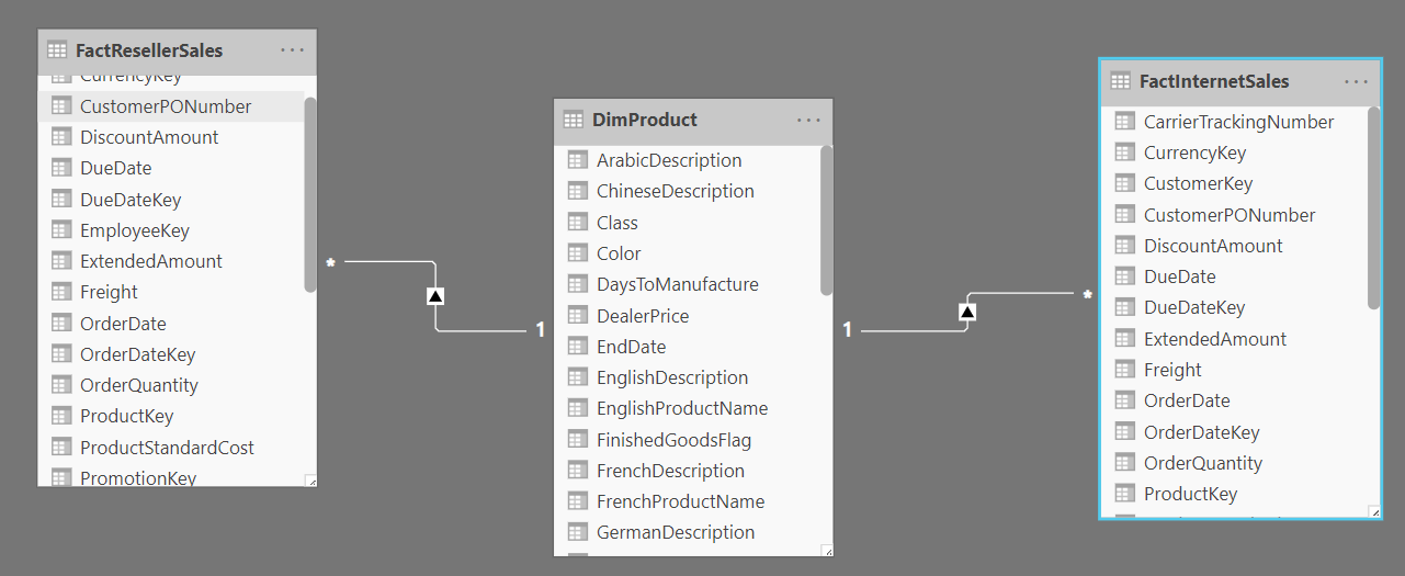
DimProduct is a shared dimension between the two fact tables.
I also renamed the SalesAmount column of both fact tables (because it was the same name in two different tables) into Internet Sales and Reseller Sales.
Scatter Chart
I have written previously about benefits of Scatter Chart and the very special feature of that which is playing values through the time, as a brief explanation: you can use scatter chart for many purposes, but one of the most common use cases is when you have two measures, one in X-axis, and the other one on Y-axis. In addition to showing the correlation between the two, this chart will give you some other useful information, which we are going to explore in this article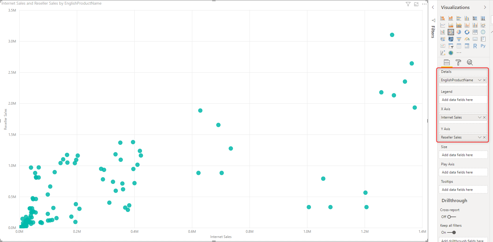
In the chart above, I have Internet Sales as X Asix, Reseller Sales as Y Axis, and EnglishProductName as the Details.
Every circle (or dot) that you see in the above chart, is showing one product, and the location of that represents the revenue gained from the two channels of Internet or Reseller sales.
By looking at this chart, you can realize some facts:
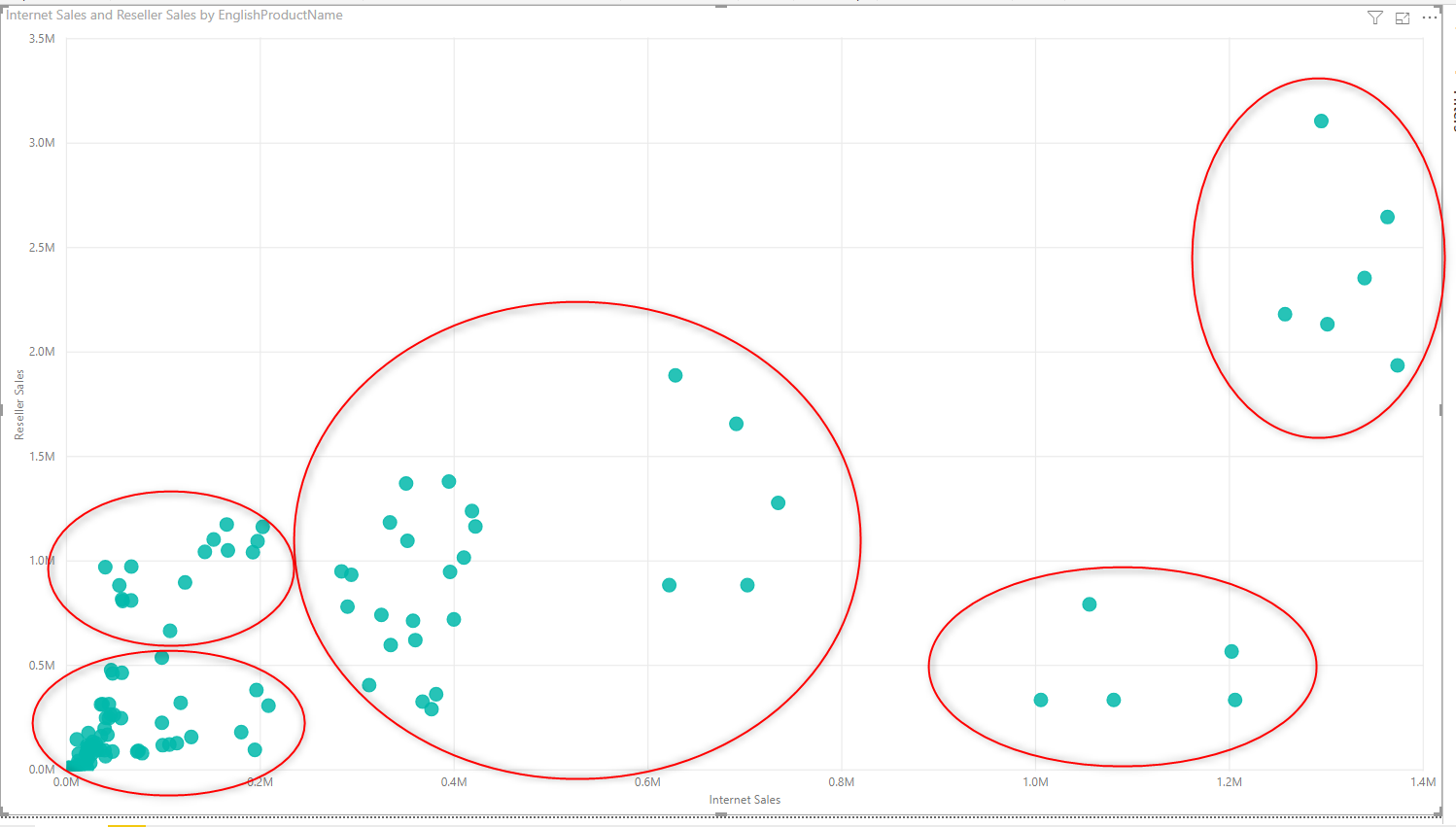
- Some products are very good at their revenue. These are products located on the top right corner of the chart
- Some products are good at their Internet sales, but not that much good at Reseller sales. These products are located on the bottom right corner of the chart
- Some products are good at their Reseller sales, but not that much good at Internet sales. These products are located on the top left corner of the chart
- Some products are not selling good in any of the channels. These products are located at the bottom left corner of the chart
- some products are selling always somewhere in the middle. These products are in the middle section of the chart
The areas below show what I explained:
* Depends on how the values are spread in the scatter chart, you might come up with more or fewer areas and groups.
However, the fact is that we have identified these regions mainly by looking at it from a human perspective. What if Power BI can automatically do that for you? the good news is that Power BI can do that! Let’s see how.
Clustering in Scatter Chart
If you click on the more options (…) on the top right corner of the scatter chart, you will find the menu option includes a specific item named as: Automatically find clusters.
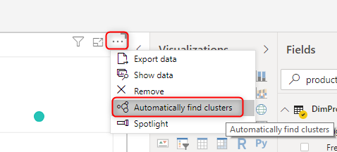
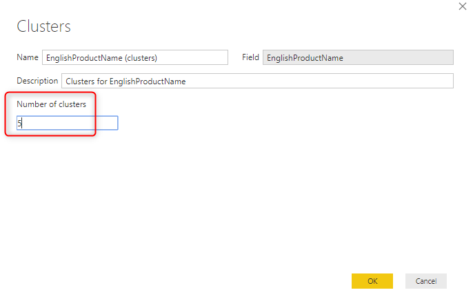
When you use this option, you can either specify how many clusters you want for the output or leave it to the algorithm to decide about it. For example, I set it to Five clusters;
With just that two clicks, now I get my visualization changed as below:
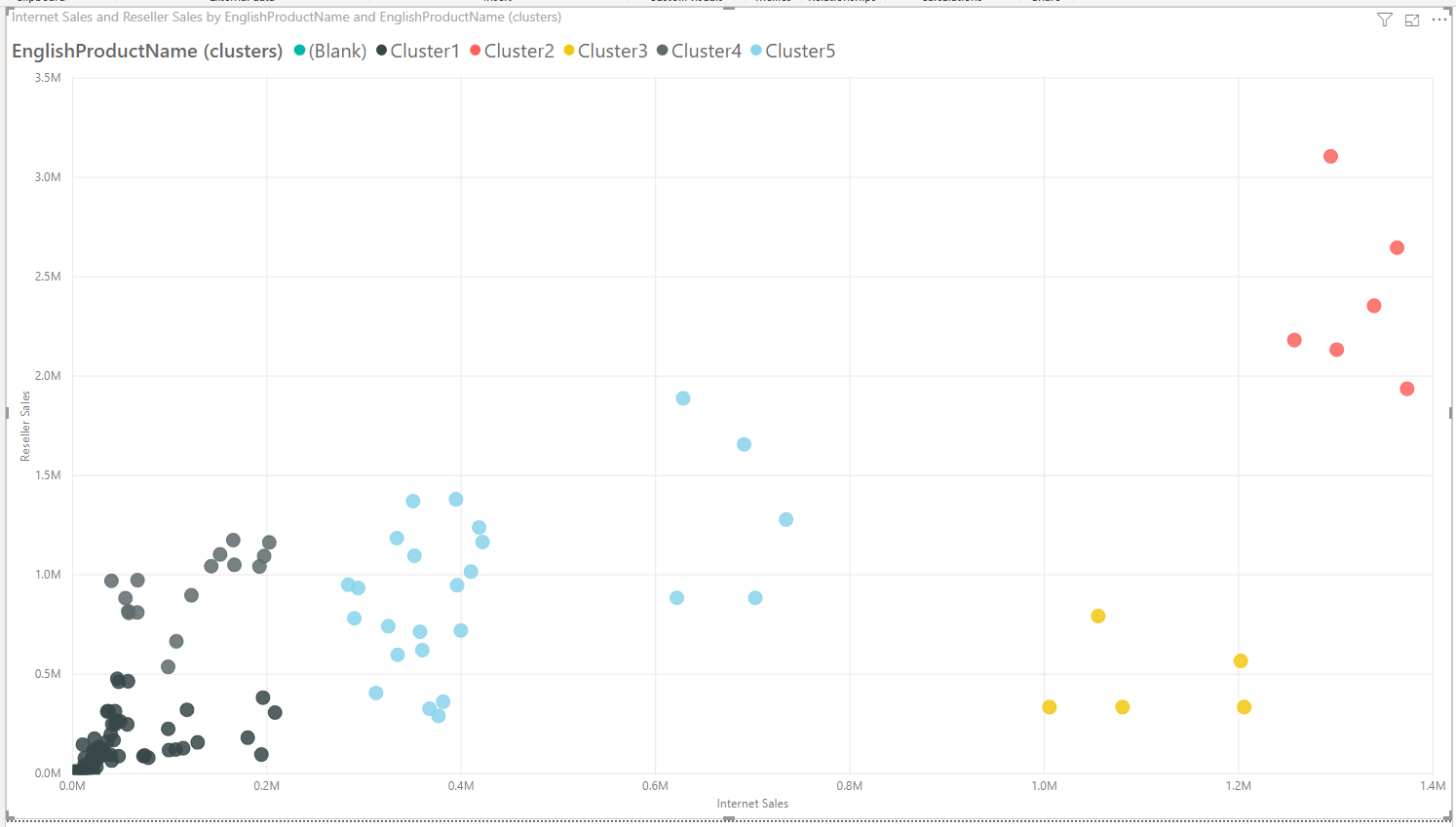
Isn’t it wonderful? with just a couple of clicks, Power BI managed to find exactly those areas that we have identified ourselves! The more good news is that this clustering is now part of your dataset. Now you have a field in the dataset called EnglishProductName (clusters):
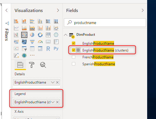
This is the same field that is already used in the Legend of the scatter chart, and that is why the colours are changed with that. If you hover with the mouse on top of any of the products, you can see the cluster information for that.
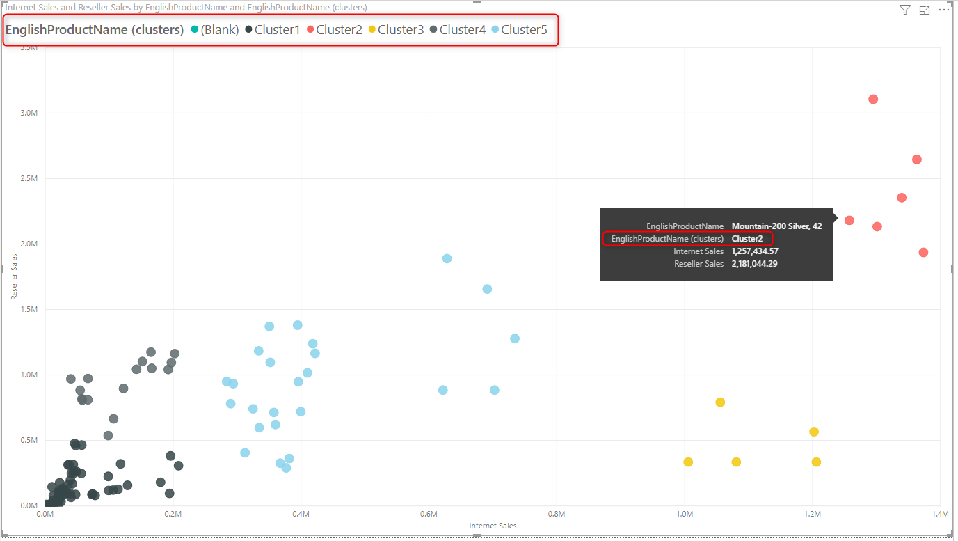
This shows that all products that are best sellers in my dataset are in Cluster2.
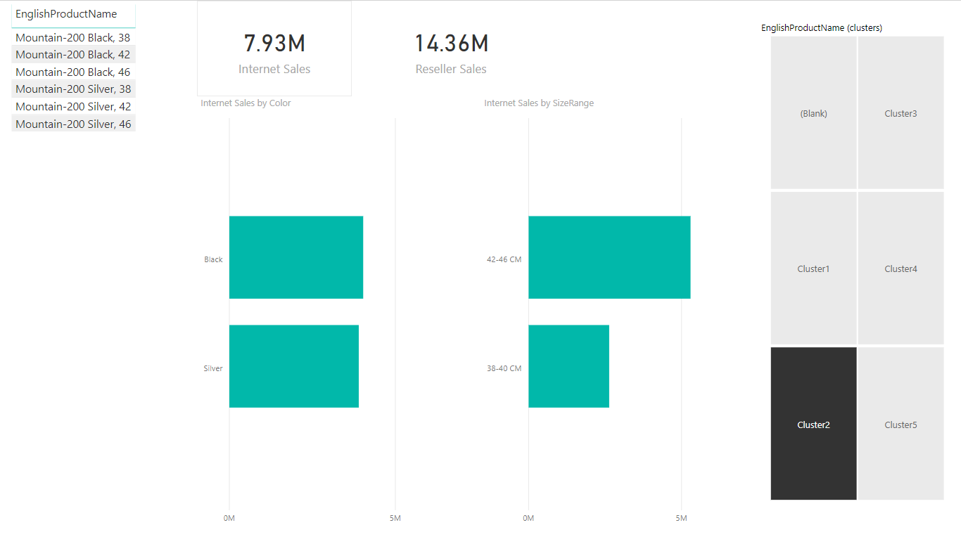
Using Clusters in Other Reports
If I want to create another report page, only focusing on those products, All I need to do is to put a filter on this field to be for Cluster2.
Or if I want to focus my analysis on any other clusters, In fact, the Clusters field can be used as a slicer or filter for my other pages now;
The page below, for example, shows me that the products that are my best-sellers are in Black and Silver colour, and what are their other attributes, I can change the cluster in the slicer and compare it with other clusters:
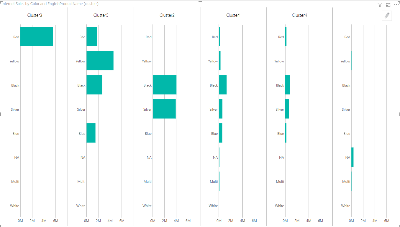
We can even use a chart such as Infographic Designer that has visual multiples and compare all cluster’s characteristics in one:
Summary
Clustering in Power BI is simply available through the scatter chart. You just have one configuration option, which is the number of clusters, If you want, more advanced and customized options, I suggest you have a look at Leila’s articles on the Clustering subject. However, even this simple clustering, brings your Power BI visualization to the next level. You can now analyze things that you could not do previously.
Are you using this feature of the Scatter Chart? if yes, please share your story that how it helped in your scenario. If not, I highly recommend considering it.


Reza is author of more than 14 books on Microsoft Business Intelligence, most of these books are published under Power BI category. Among these are books such as Power BI DAX Simplified, Pro Power BI Architecture, Power BI from Rookie to Rock Star, Power Query books series, Row-Level Security in Power BI and etc.
He is an International Speaker in Microsoft Ignite, Microsoft Business Applications Summit, Data Insight Summit, PASS Summit, SQL Saturday and SQL user groups. And He is a Microsoft Certified Trainer.
Reza’s passion is to help you find the best data solution, he is Data enthusiast.
His articles on different aspects of technologies, especially on MS BI, can be found on his blog: https://radacad.com/blog.