
In the last post different ways of creating custom, visuals have been explained.
In this post, I will show how to use Charticulator for creating a custom visual in Power BI.
As mentioned, first navigate to the below link:

Next, you need to click on the Launch Charticulator. This will navigate you to the main studio to design the chart.

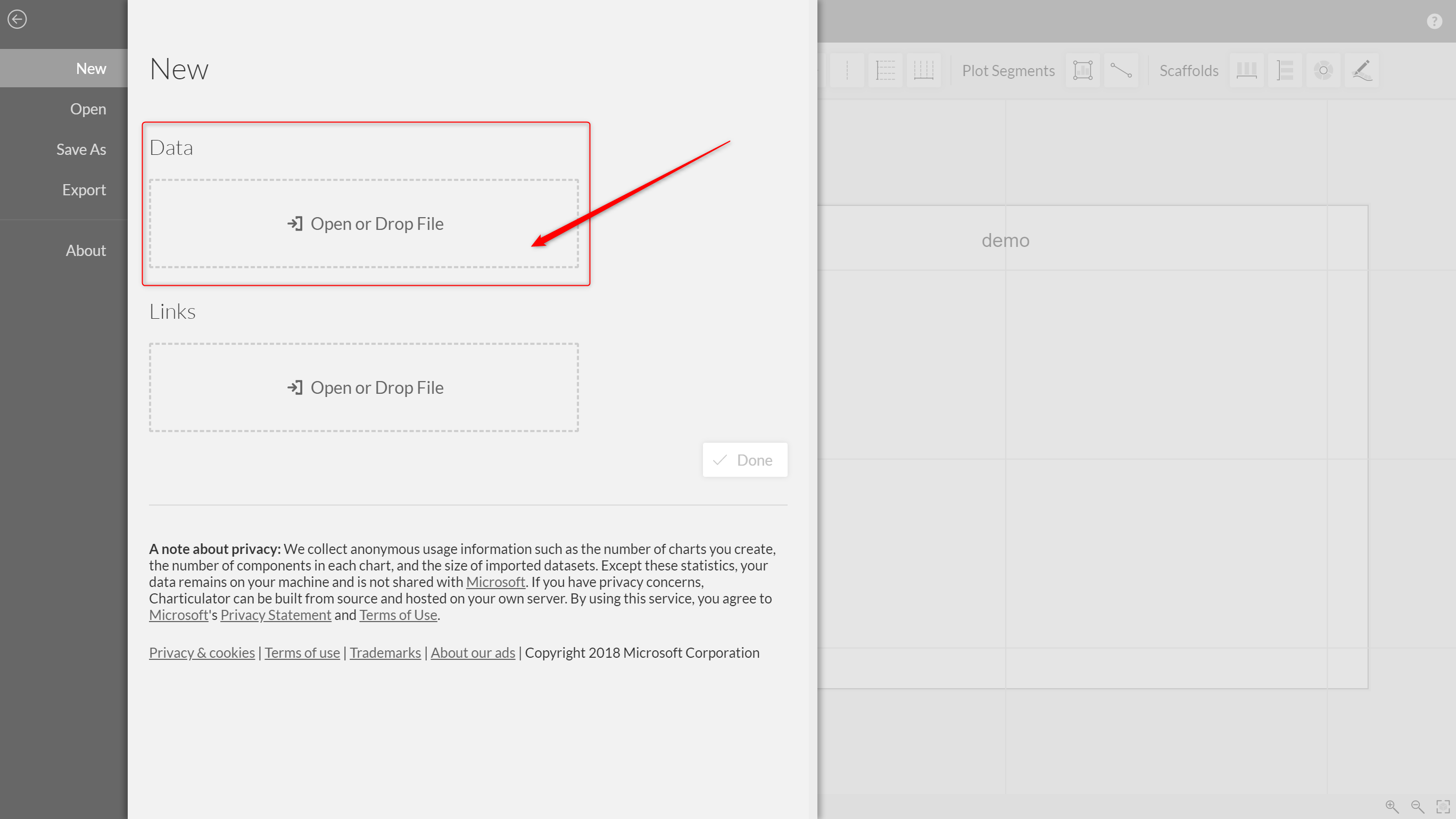
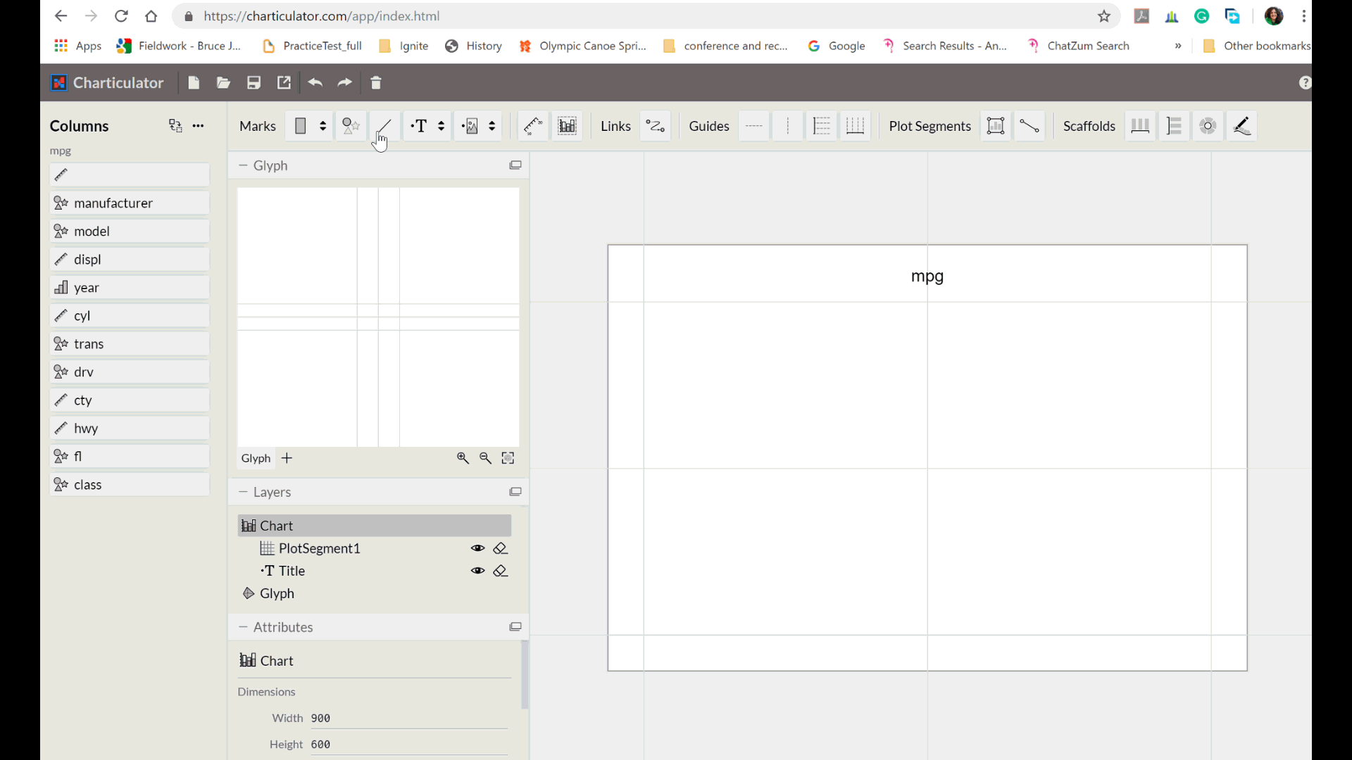
In the next step, you need to upload a dataset to create a sample chart. As you can see in the below picture, there are two ways to upload your data.
Link or browse the data from your local PC. In this example, I will upload the data from my local machine.
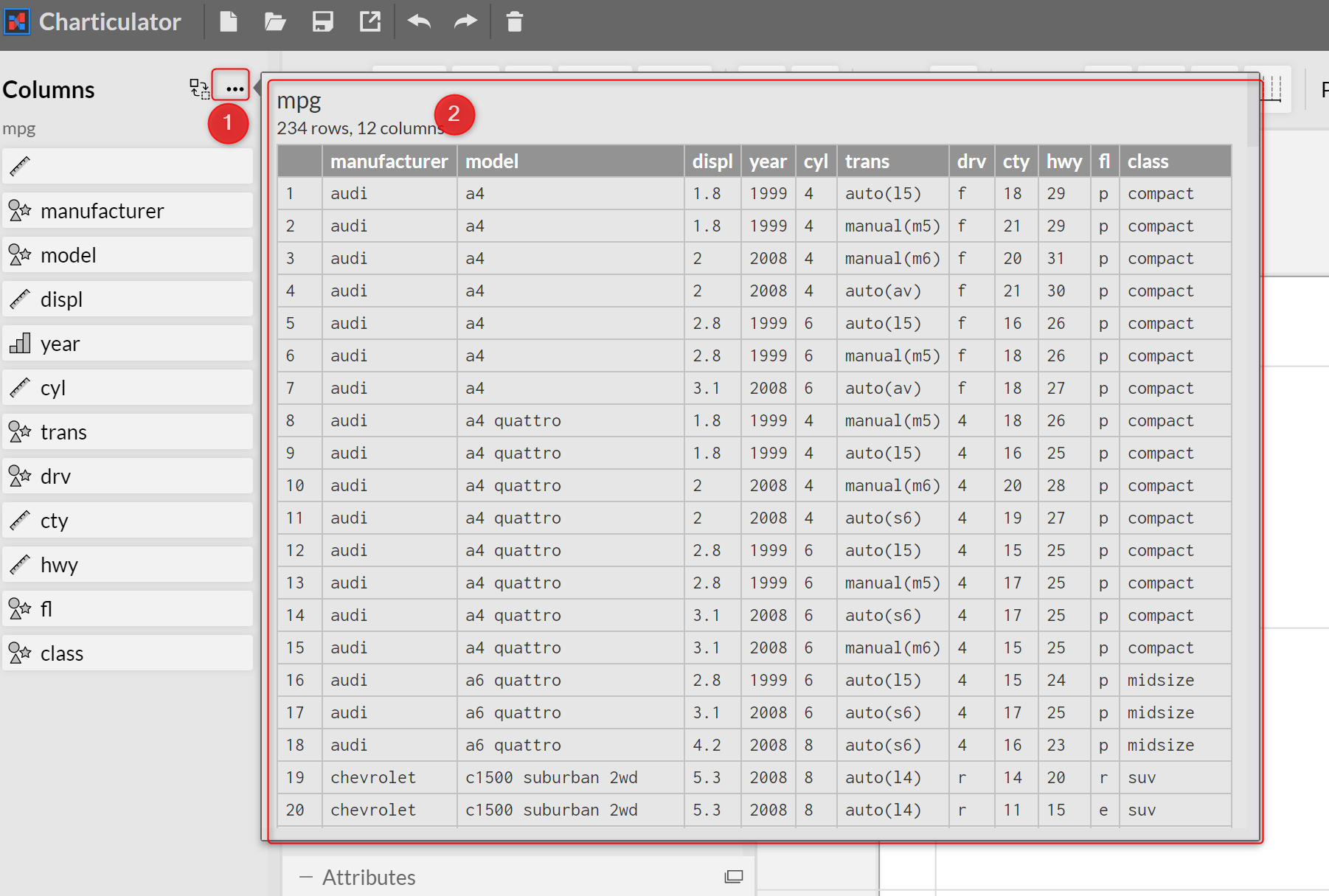
Load Data
The data is about the Car, information such as:
Speed in city and highway, number of cylinders, type of drive, year of made and so forth.
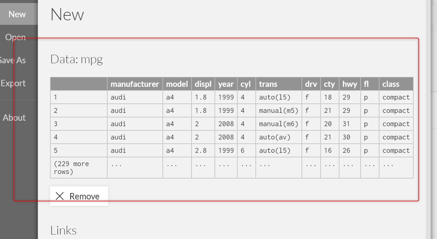
Click on load so data will be loaded to the Charticulator Studio.
You are able to remove the data and load a new one.
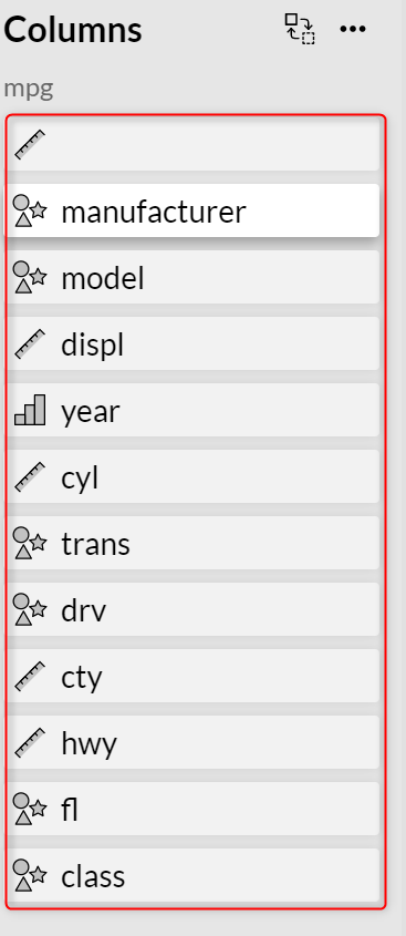
After you load the data, the available columns will be shown on the left side of the page. As you can see, there is a specific icon beside each column. The ruler is for numeric data such as speed in city and highway. The text columns have been shown with cycle, rectangle and star icon like a model of the car and categorical variable have been shown with a bar chart such as year of production.
if you like to see the preview of the dataset, click on the three dots at the top of the page, it shows you the number of rows and column with some sample of data.
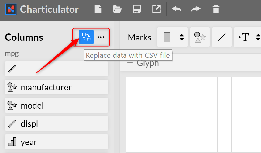
Next, if you decided to change the directory, you need to click on the change icon in the top of the page. This navigates you to load dataset page.
Start to Create Chart
In each chart, there is an element such as bar, image, text or a symbol (the common symbol is dot or cycle).
For instance, for the bar chart, we have bars for scatter or bubble chart we have cycle or dots.
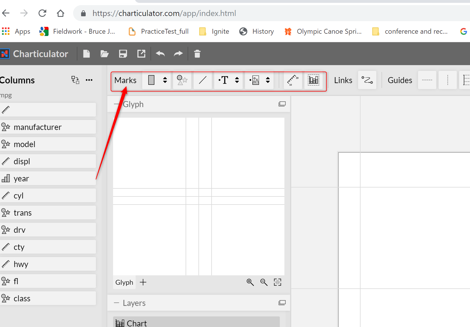
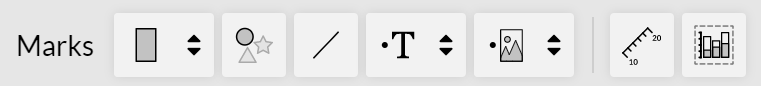
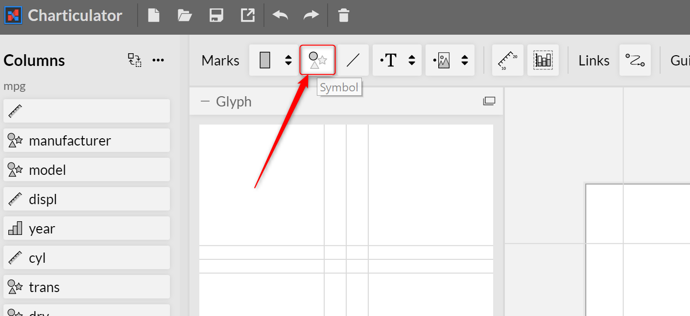
In Chrticulator, these symbols are located in Marks section. To draw a chart with these symbols you need to choose an icon from Marks section.
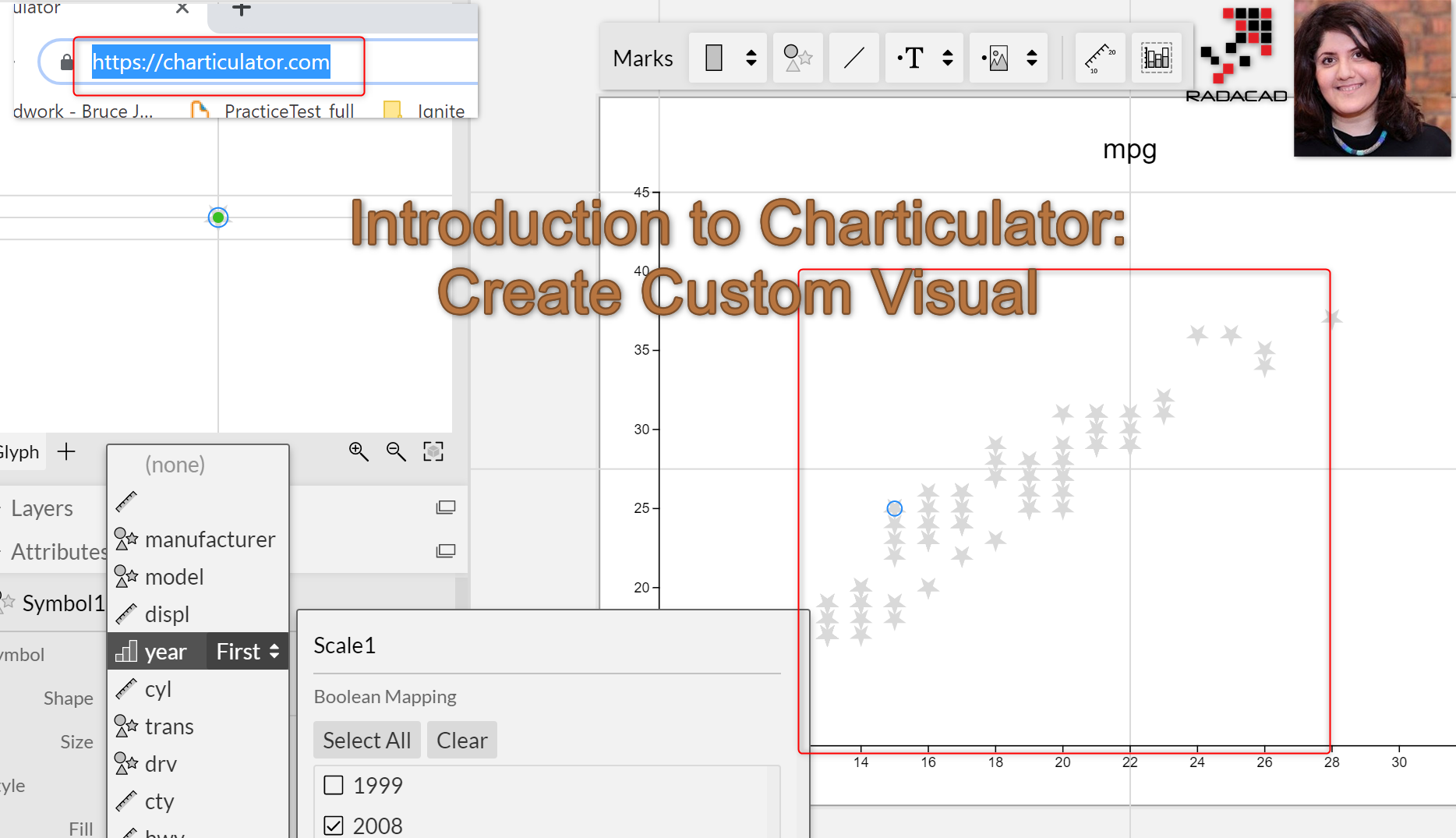
For this blog post, we want to create a simple chart as a scatter chart to see how it works.
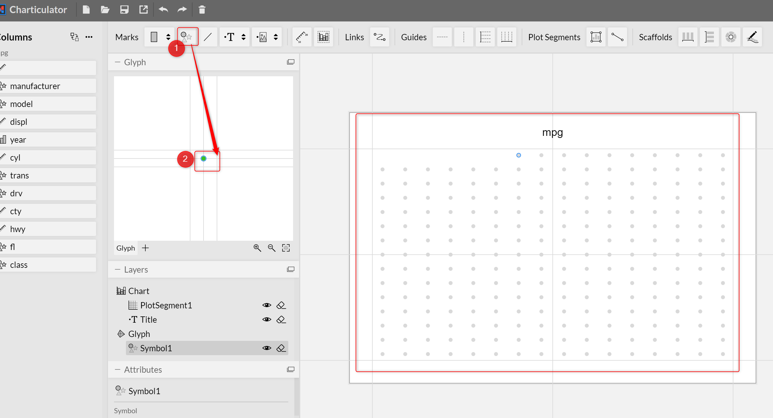
To create a scatter chart I need Symbol, this can be a cycle shape, star shape or rectangle shape.
Just click on the symbol and drag and drop to the center of Glyph. Glyph provides an overview of the dimensions of your graph. As you can see in the below picture, the symbol has been dropped into the middle of the chart. And you able to identify the location of the symbol.
Dimensions
In this section, I will show how to identify the dimensions like the X axis or Y axis.
We want to put the speed in a high way as y-axis and speed in the city as the X-axis.
so for Y-axis, just drag and drop the hwy field and pass it to the Y axis
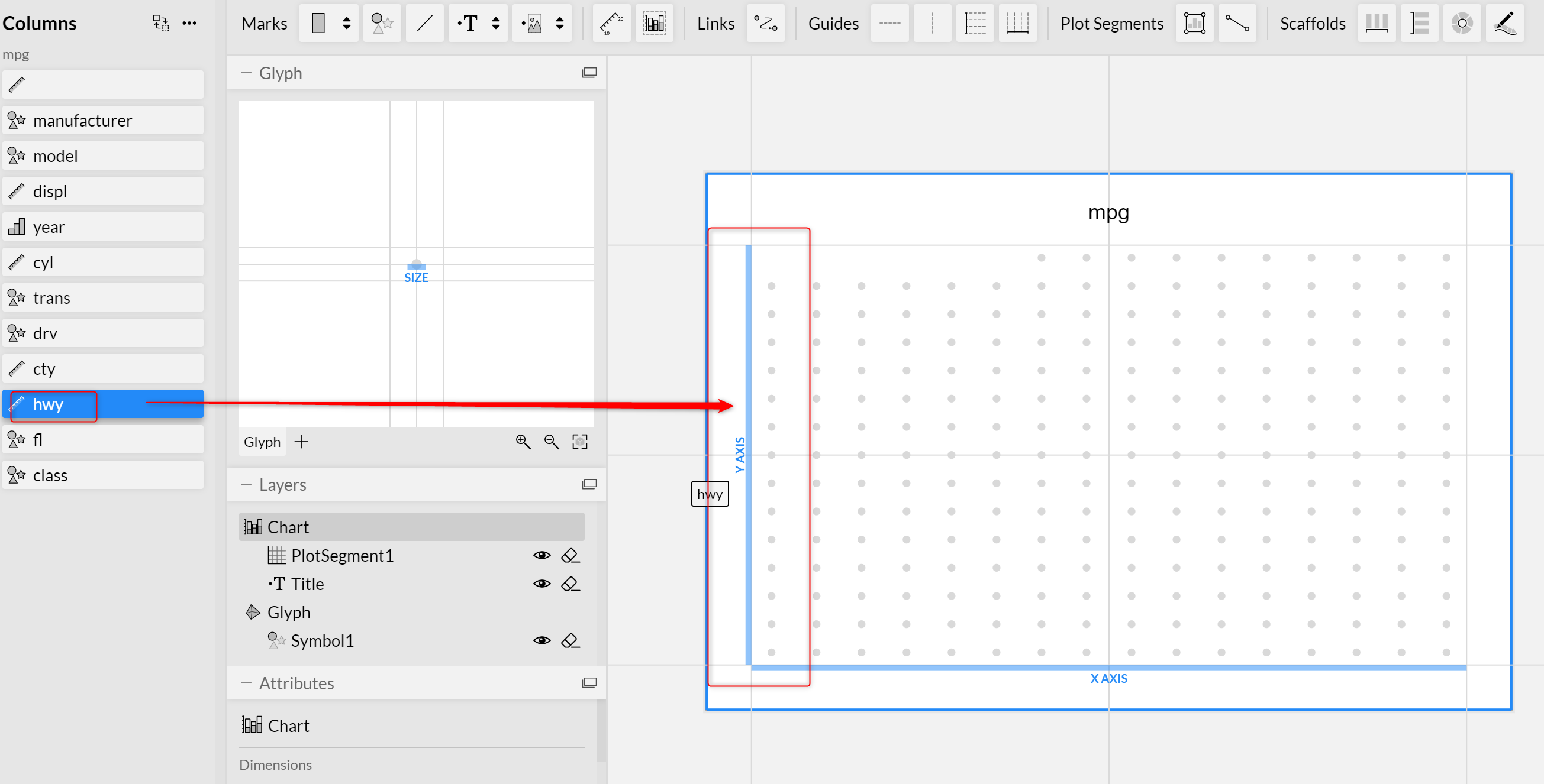
Do the same for X-axis.
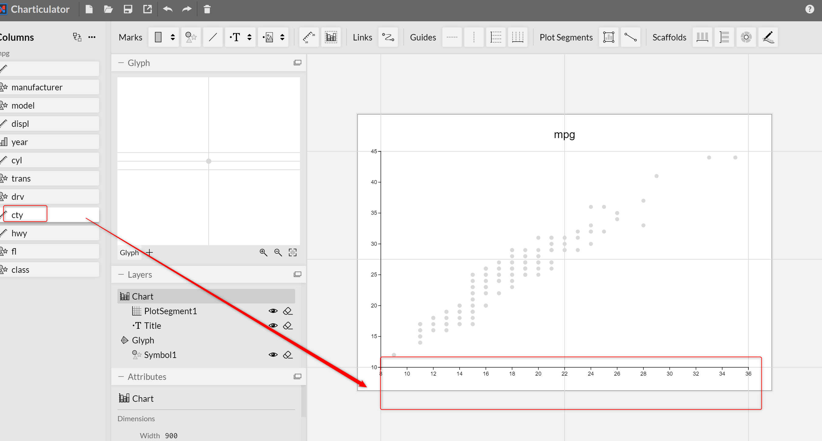
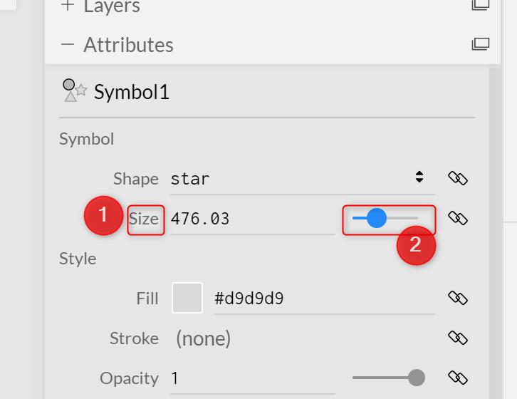
Next, you able to see the dots in the chart. Also, each dots( cycle) is a data point we have in our dataset. to see the specification of the symbol, click on the Glyph on the left side menu. Now you able to see the Symbole properties.
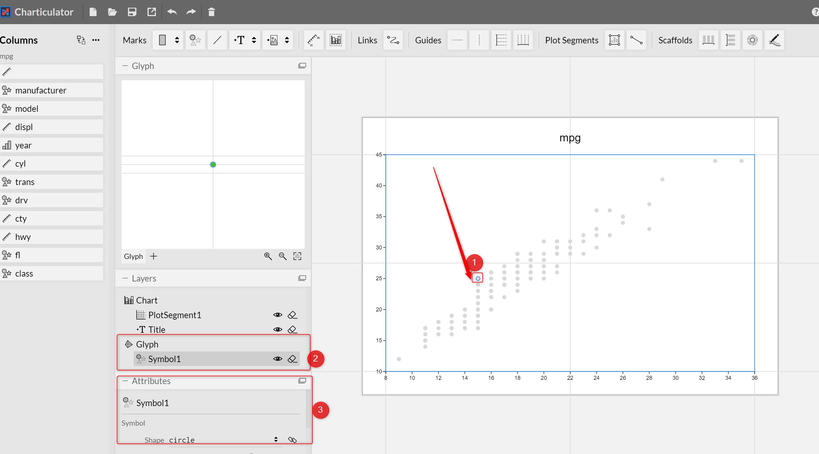
For instance, you able to change the shape of the symbol from cycle to star to diamond and so forth.
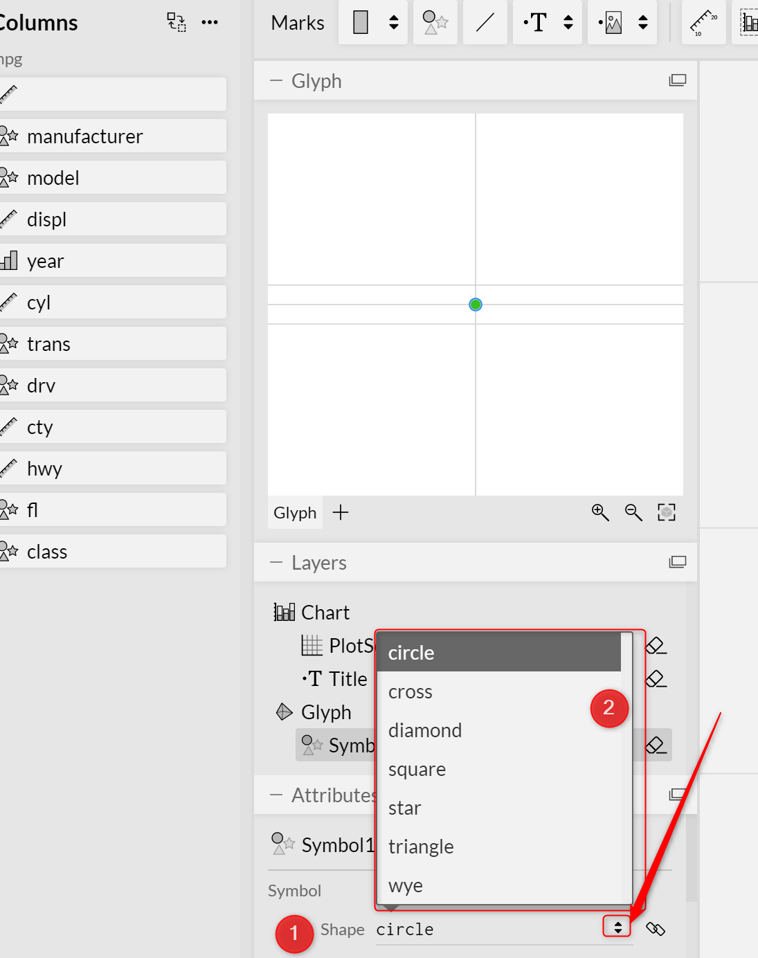

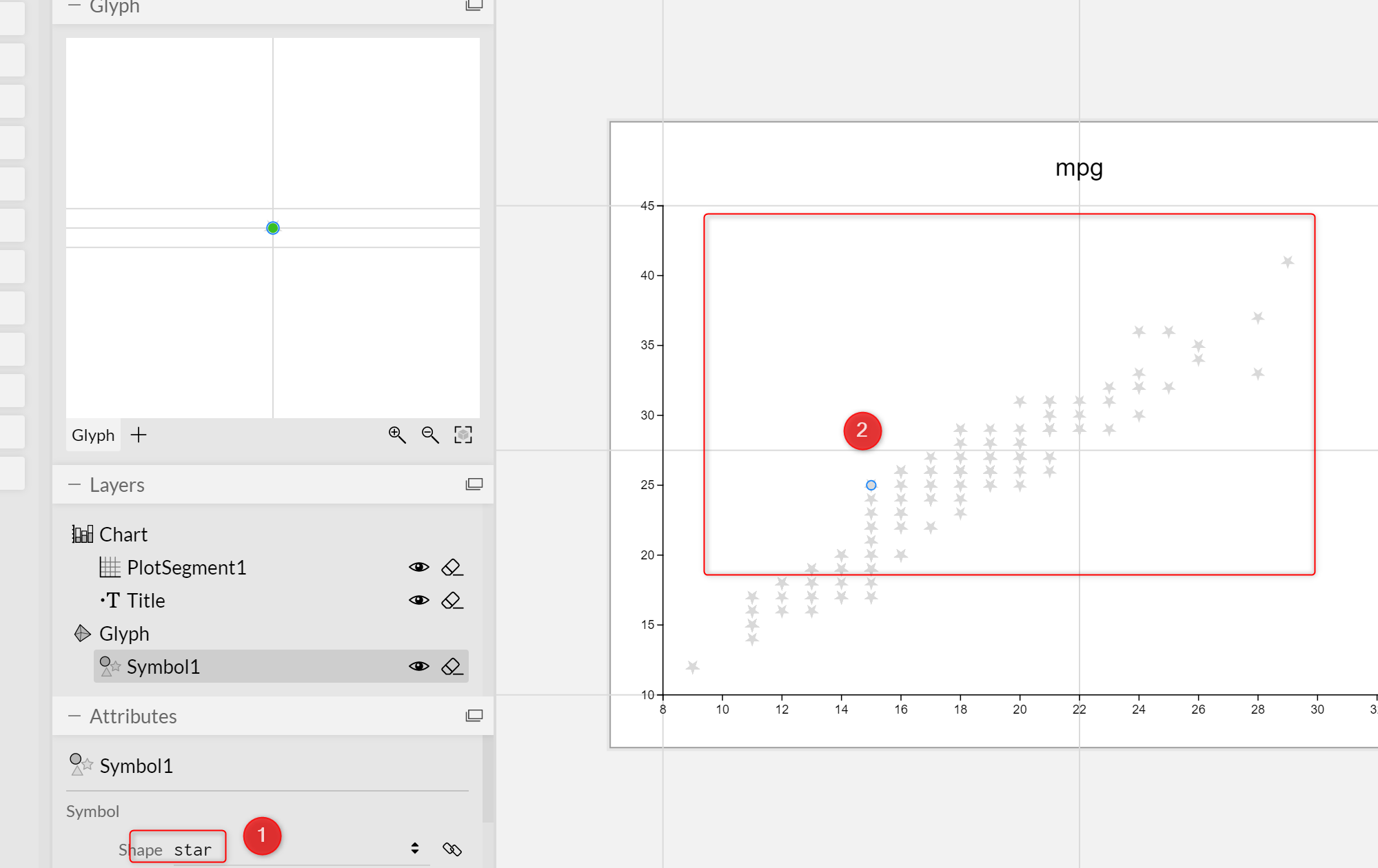
you able to change it to Star for example and see the chart change in the preview window.
Also, you able to change the symbol size
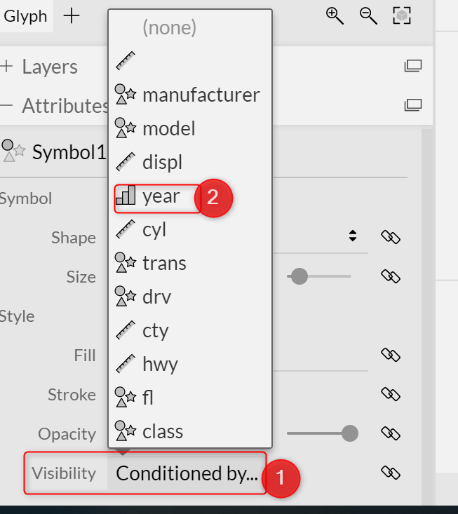
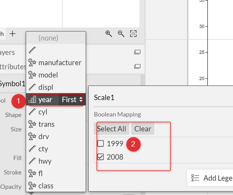
Moreover, there is a possibility to filter the data in a chart by applying a condition such as a year ( in the dataset)
To Be Continue…
In the next post, I will show how to add a legend to the chart and how to make it more complete and access to the visual in Power BI Desktop.
Also, see the complete video from here https://wwtube.com/watch?v=ew.youC0L3Q373lw&t=11s


