
There is always a need to extend the usage of visuals in Power BI. There are multi ways to do it
first using
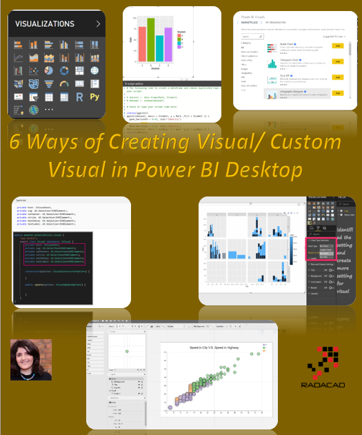
First Option: Using Standard Panel
- Easy to use and available all the time
- all tested and reliable
- A limited number of visual
- See more from here: sample scatter chart
Second Option: User Market Place Visuals ( Created by Partners)
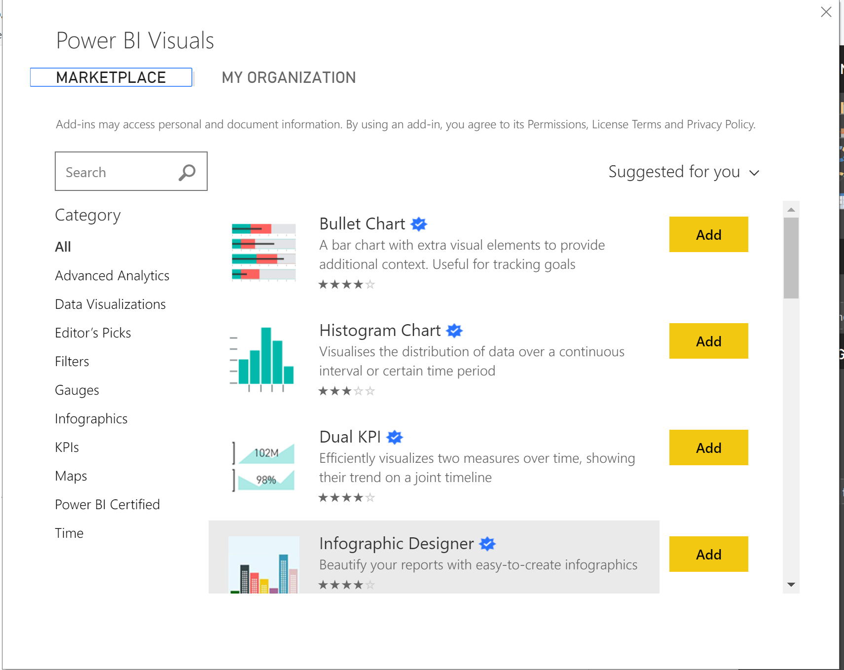
- Easy to use and need to login into Power BI account to be able to download
- Most of the Visuals has been certified but there are some that are not fully certified All tested and reliable
- There are many different visuals but developers not able to change the visual ( some R based can be changed)
- There are some visuals that you need to pay for them.
- See more about Custom Visual from here: link
Third Option: Create Custom Visual with Java Scripts and .net
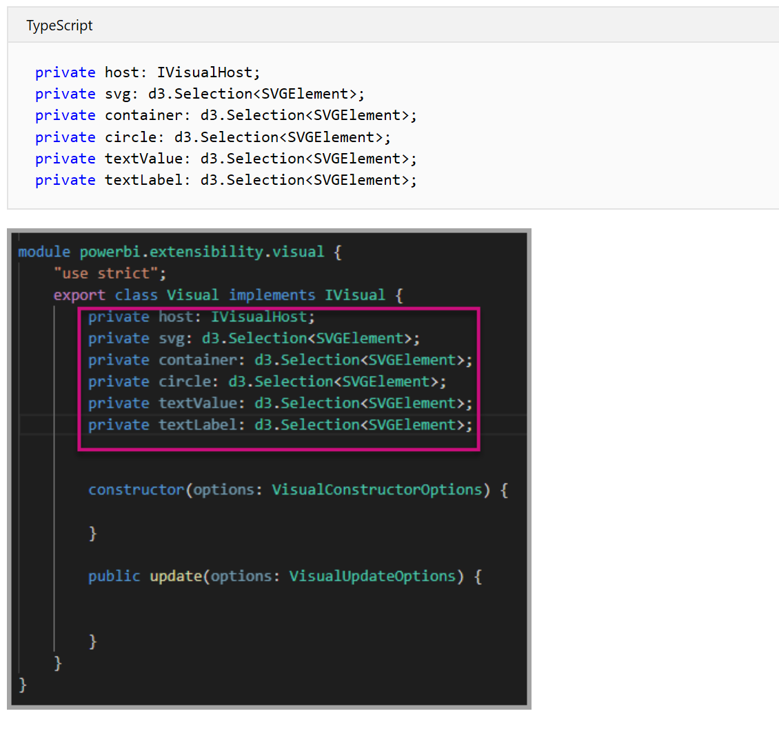
- Hard to create visual as you need to know to code in JAVA scripts and JSON.
- The visuals need to be accepted and certified by Microsoft and pass some of the exams.
- It is easy to change it as every aspect is created by a developer.
- You can create all the visuals you want
- The created visual has the bi-direction interaction ( able to slice and dice other visuals and able to be sliced and diced by other visuals)
See more about it from here
Fourth Option: Create Visual Using R/ Python Scripts in Power BI Desktop
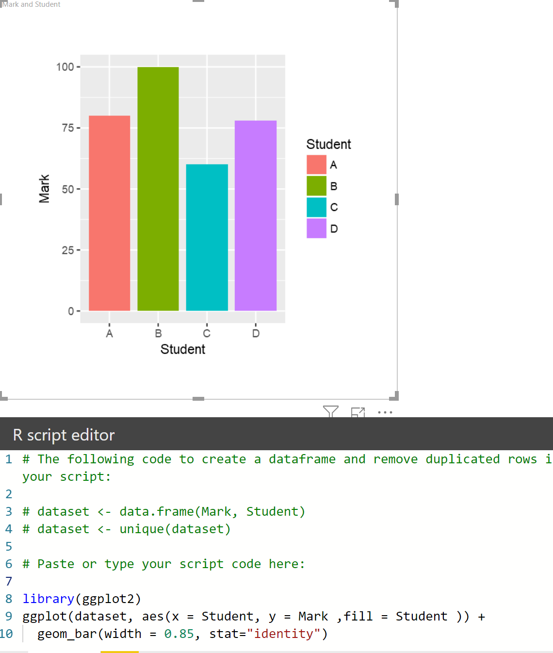
- Using R code to create visual inside the Power BI, easy to bring code there.
- Need to know the R/Python code,
- Need to access to R/ Python service through the installing this software
- the library of different visuals need to be installed beforehand
- no need to get the certify the visual
- it is flexible visual
- The library needs to be supported in Power BI service so you ale to see the visual in web reports
- to share it with others (Power BI desktop) you need to share the codes
See more about it from here
Fifth Option: Create Custom Visual using R
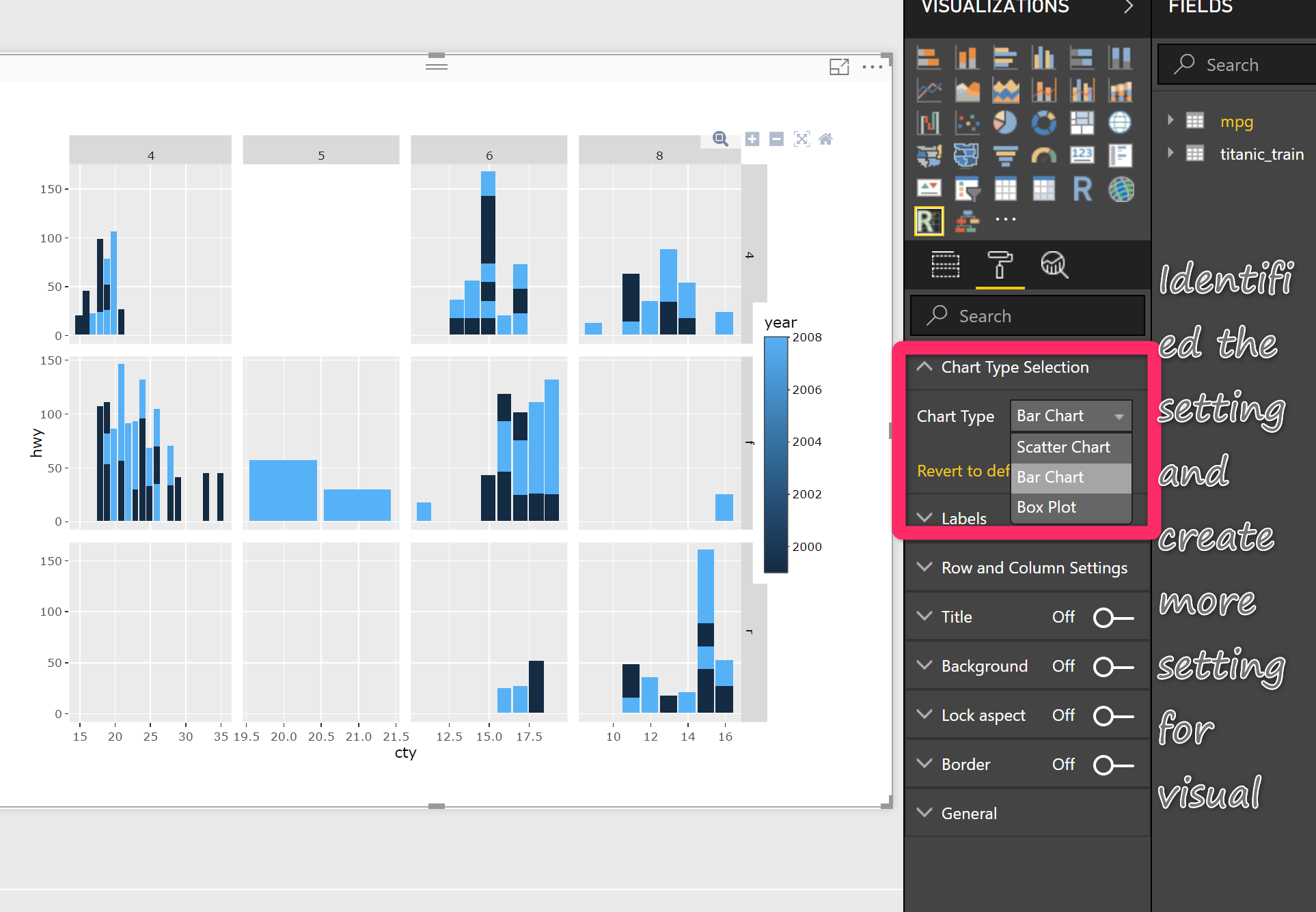
- The other option to create a custom visual is using R and JSON to create a pbix file
- The visuals need to be accepted and certified by Microsoft and pass some of the exams.
- It is easy to change it as every aspect is created by a developer.
- It is a good way of creating a Machine learning and statistical chart using R/ Python
- You will access to Plotly packages ( more interactive chart, that able to zoom in and zoom out)
- easily share the pbix file with others ( if you use specific packages they do not have install in their local R when they add the visual, it start to install the package itself)
See more from here
and finally
Sixth Option: Create Custom Visual Using Charticulator
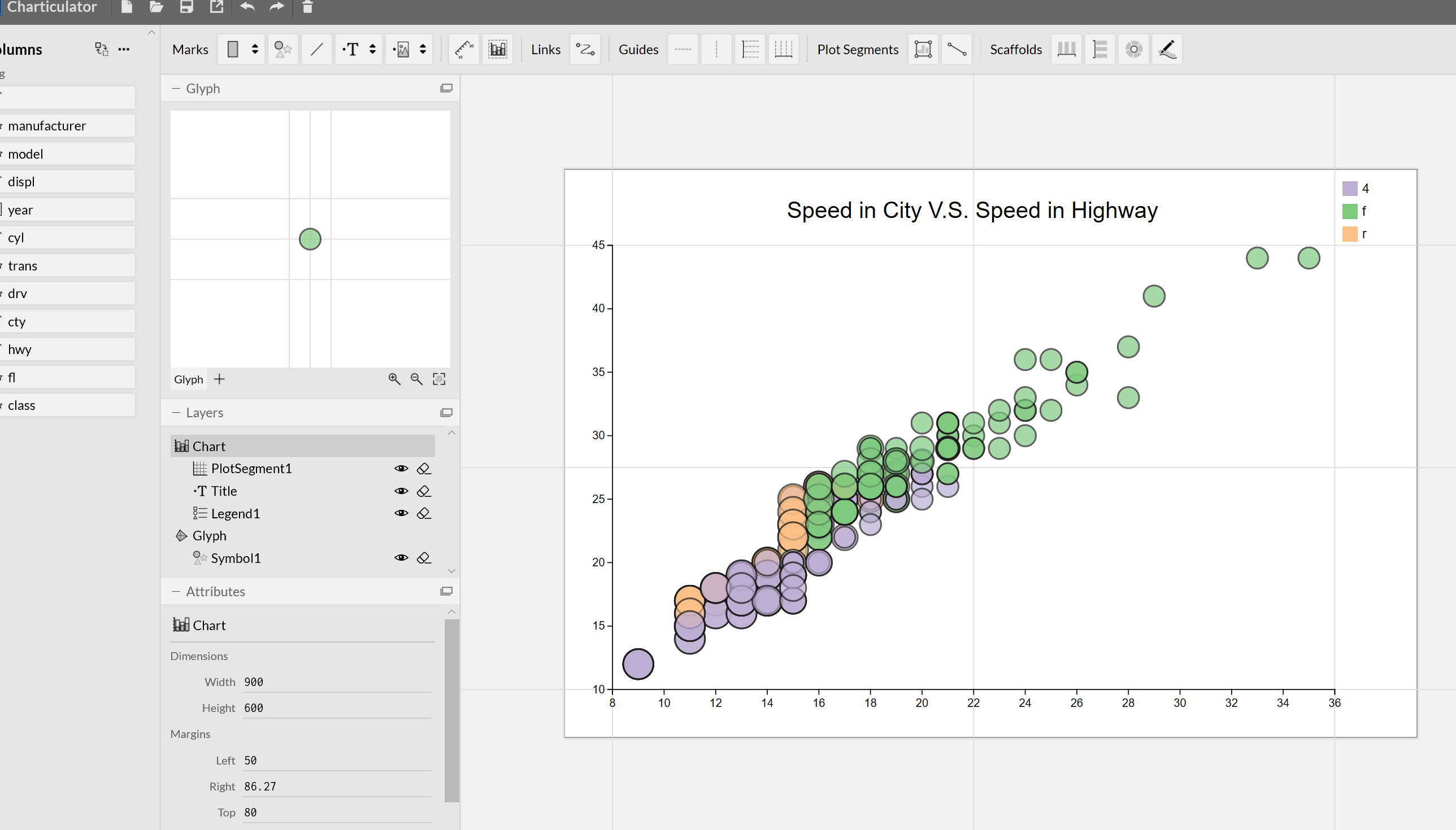
- Using a studio to create a custom visual (NO CODE)
- Able to import via Power BI visualization Pannel
- Able to create most of the visuals in just an hour!
- Slice and dice other PBI visuals
- No package installation needed
IN the series of the blog post and later videos I am going to show the capabilities of this tool to create custom visuals will be shown, to access you need to navigate to the below address :

Next, you need to click on the Launch Charticulator.

In next post I am going to show how I am able to create a simple Box Plot chart using this tool (Charticulator)
https://docs.microsoft.com/en-us/power-bi/developer/custom-visual-develop-tutorial


Trainer, Consultant, Mentor
Leila is the first Microsoft AI MVP in New Zealand and Australia, She has Ph.D. in Information System from the University Of Auckland. She is the Co-director and data scientist in RADACAD Company with more than 100 clients in around the world. She is the co-organizer of Microsoft Business Intelligence and Power BI Use group (meetup) in Auckland with more than 1200 members, She is the co-organizer of three main conferences in Auckland: SQL Saturday Auckland (2015 till now) with more than 400 registrations, Difinity (2017 till now) with more than 200 registrations and Global AI Bootcamp 2018. She is a Data Scientist, BI Consultant, Trainer, and Speaker. She is a well-known International Speakers to many conferences such as Microsoft ignite, SQL pass, Data Platform Summit, SQL Saturday, Power BI world Tour and so forth in Europe, USA, Asia, Australia, and New Zealand. She has over ten years’ experience working with databases and software systems. She was involved in many large-scale projects for big-sized companies. She also AI and Data Platform Microsoft MVP. Leila is an active Technical Microsoft AI blogger for RADACAD.