
This blog will show a technique that can be applied to certain charts allow banding or stripes to help highlight data.
This could be horizontal bands to help show data above or below a certain threshold, or this could be vertical bands to help highlight ranges of data by time. In both cases, using What-If parameters and sliders can give the end user the ability to make adjustments the bands if needed.
Horizontal Bands
To begin with, I will generate some dummy data to use as a base to apply horizontal and vertical bands to.
Using a blank copy of Power BI Desktop, click the Modeling table, click the New Table button and enter the following DAX calculation:
Table = GENERATESERIES(1,1000)
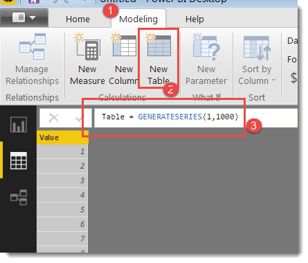
This will generate a 1000 row table with a single column with a sequence of numbers from 1 to 1000. These numbers will be the bases for creating something more interesting. I need some peaks and troughs to help demonstrate the banding so add this calculated measure to the model
Get Wave Value =
VAR X_Axis = MAX('Table'[Value])
VAR Height = 100
RETURN
    (
        SIN(
            RADIANS(X_Axis)
            ) * Height)
             + Height
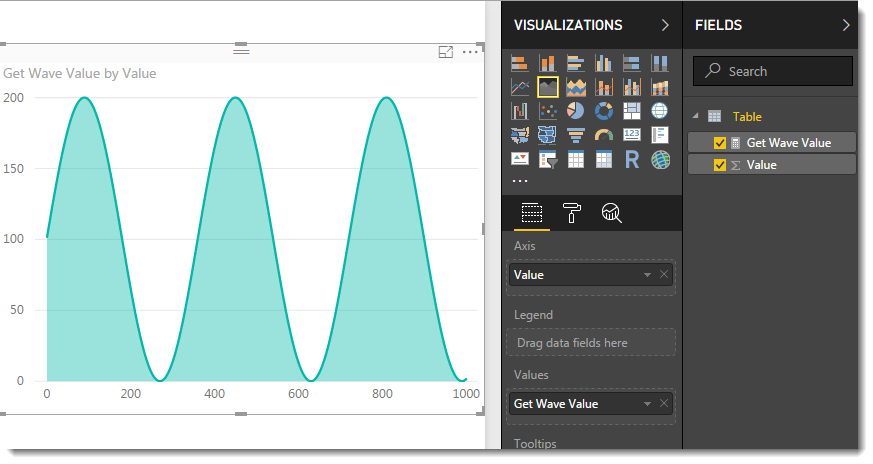
Now when I add the existing Value column and the [Get Wave Value] calculated measure to an Area Chart I see a nice sine wave.
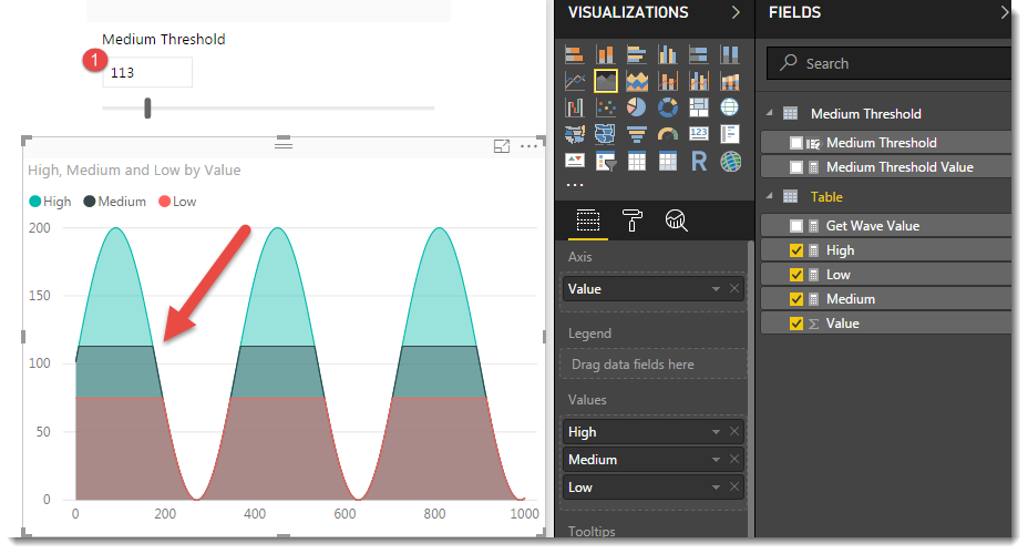
For horizontal banding, the trick is to create as many calculated measures as needed for banding. These will layer over the top of each other, so you don’t have fine grain control over the colour, but lets start with three simple layers of Low, Medium and High. I would like my chart to show a different “snow-peak” colour for any value higher than 150, and will use the value of 75 as the threshold between Medium and Low.
The next step is to create the following three calculated measures:
High = [Get Wave Value]
Medium =
VAR Threshold = 150
VAR MyValue = [Get Wave Value]
RETURN
	IF (-- test--
		MyValue >= Threshold ,
		-- then --
		Threshold ,
		-- else --
		MyValue
		)
Low =
VAR Threshold = 75
VAR MyValue = [Get Wave Value]
RETURN
	IF (-- test--
		MyValue >= Threshold ,
		-- then --
		Threshold ,
		-- else --
		MyValue
		)
The [Medium] and [Low] calculated measures are identical apart from the values assigned to the Threshold variable. These can be replaced with What-If parameters later to allow an end-user to adjust the thresholds in real time.
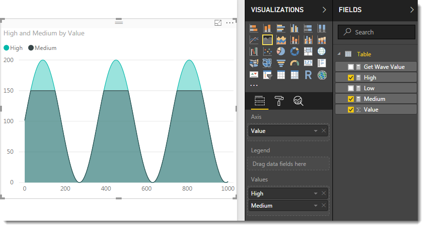
Updating the Area Chart from earlier to remove the [Get Wave Value] measure and replace with [High] and [Medium] now shows this.
and now with the [Low] calculated measure added to the Values area of the chart.
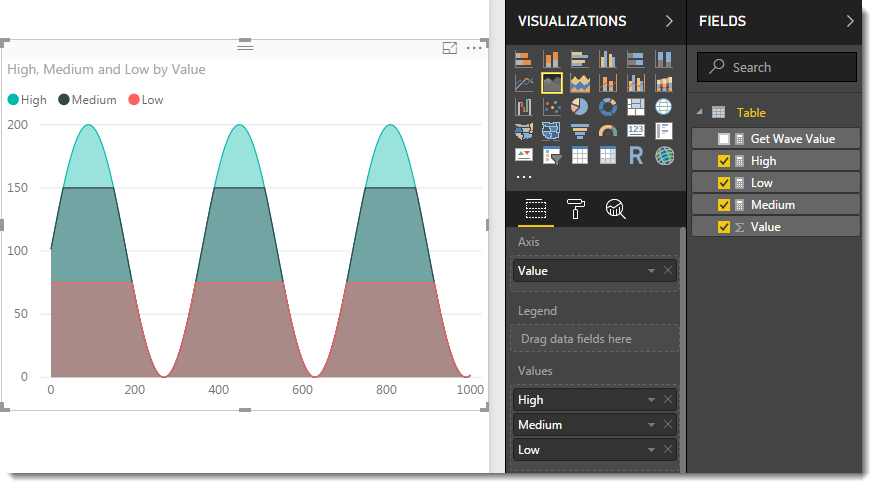
The formatting properties of the Area Chart will allow you to play with the colours to some degree but where colours overlap, such as the bottom areas on this chart, you will get a hybrid colour of the overlapping values. The formatting properties also allow you to reduce the thickness of the border lines.
To add more thresholds/bands just create more calculated measures and add them to your visual.
To make the thresholds dynamic, a What-If parameter can be added to the report by clicking the New Parameter button on the modeling tab. For my chart I used the settings as shown in this image:
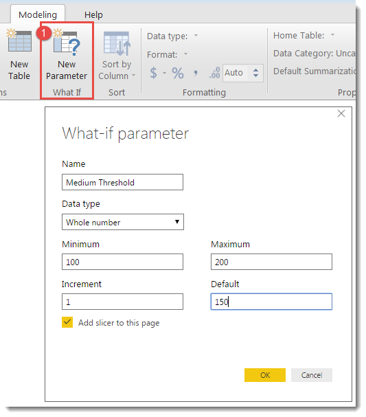
This will add a new calculated table to the model as well as add a report slider controlling this parameter to the canvas.
This will also provide a new calculated measure that can be incorporated into the [Medium] calculated measure from earlier as follows:
Medium =
VAR Threshold = [Medium Threshold Value]
VAR MyValue = [Get Wave Value]
RETURN
	IF (-- test--
		MyValue >= Threshold ,
		-- then --
		Threshold ,
		-- else --
		MyValue
		)
The [Medium] line is now connected to the slider, so as the end user adjusts the slider, the flat line that separates High from Medium will rise and fall.
The same technique can be applied to connect the other threshold to a slider – but to save digital trees I will not add screenshots showing this. The Minimum/Maximum values in the What-If dialog can be used to help make sure they don’t overlap.
The [Get Wave Value] measure and ‘Medium Threshold’ tables can be hidden from the Field tab if you like to keep this list tidy for end users.
Vertical Bands
Now to show the same base-data plotted using vertical bands.
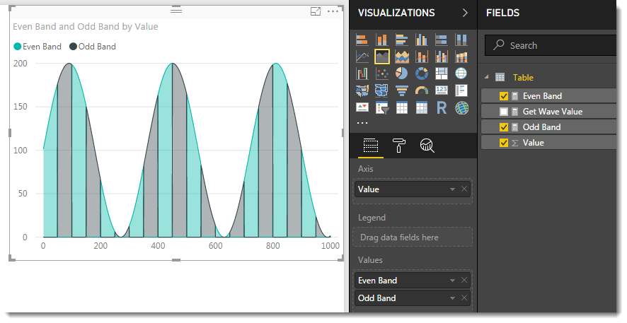
The following two calculated measures can be created and added to an Area Chart using the same chart.
Even Band =
VAR BandWidth = 50
VAR MyValue = [Get Wave Value]
VAR X_Axis = SELECTEDVALUE('Table'[Value])
VAR MyTest = ISEVEN(
			INT(
				DIVIDE(X_Axis,BandWidth)
				)
			)
RETURN
	IF(MyTest,MyValue,0)
and
Odd Band =
VAR BandWidth = 50
VAR MyValue = [Get Wave Value]
VAR X_Axis = SELECTEDVALUE('Table'[Value])
VAR MyTest = NOT ISEVEN(
			INT(
				DIVIDE(X_Axis,BandWidth)
				)
			)
RETURN
	IF(MyTest,MyValue,0)
The two calculated measures are identical apart from the use of the highlighted NOT in the [Odd Band] measure.
When these are added to an Area Chart, the result is as follows:
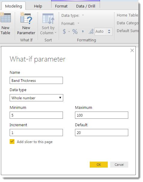
A new What-If parameter can be added to the model to provide another slicer for interactive control over the thickness of the bands.
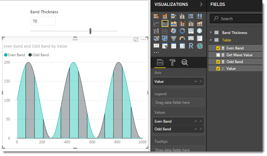
This example uses a slider to control the bands, but could easily be changed to another rule. Different years, or months could be highlighted, or even just one particular month could be plotted using one of the measures, with the rest of the data using a second measure as way to call out and highlight key data.
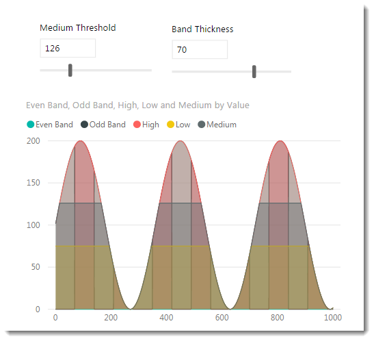
Combining the horizontal and vertical bands creates a tartan effect, which is an assault on the eyes. This version works with both slicers.
A fun distraction could be to combine What-If sliders with the DAX in the [Get Wave Value] calculated measure to provide end-user control over the shape and size of the sine wave.
The PBIX used for this blog can be downloaded here :
https://1drv.ms/u/s!AtDlC2rep7a-oSWASSTIl4GZJI39


Excellent technique! Thanks for sharing!