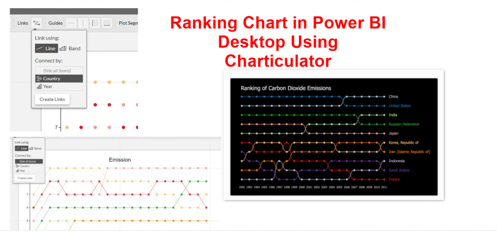
Regarding using Charticulator for creating custom visuals, I come across one of the visuals in the Charticulator gallery and I decided to follow it up to see how it created. So I manage to create a dataset that has ranking, name and amount.
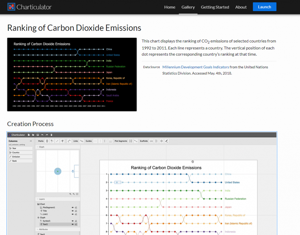
https://charticulator.com/gallery/co2_emission_ranking.html
In this example, I am using Carbon dioxide emission data for each country for some years. The original dataset was from http://mdgs.un.org/unsd/mdg/SeriesDetail.aspx?srid=749
but need some data transformation.
Data Transformation
(I put the transformed data in the next section, so you can skip this if you are not interested in this part)
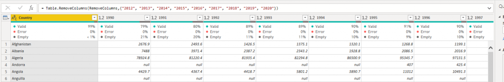
I need to remove some of the columns that I do not need, I already explained it in this post.
Next in Power BI I do more data transformation by the help of this blog post, and following below steps:
my data
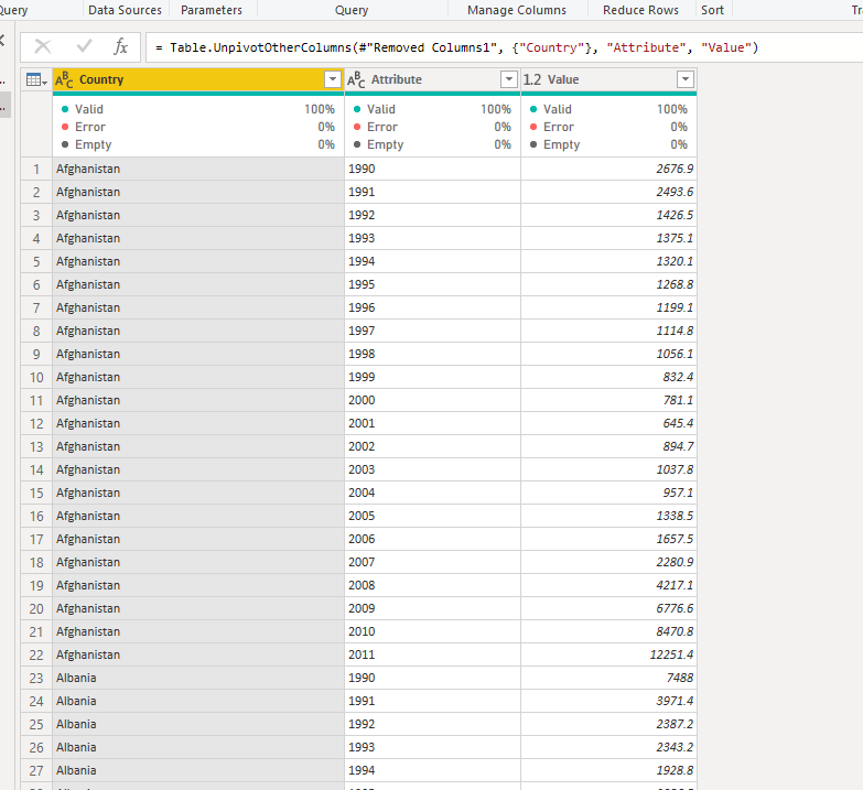
1-first I Unpivote table based on Year columns to achieve below:
Next , I sorted first based on the Year and then Value, just make sure to write the below code to sort in same step.
Table.Buffer( #”Sorted Rows”)
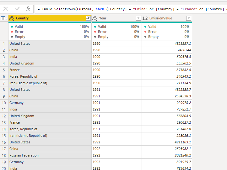
Then, I filter countries to some like US, China, Russia, UK, India, Iran, Germany, France and South Korea.
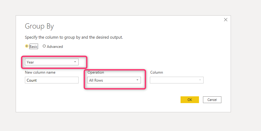
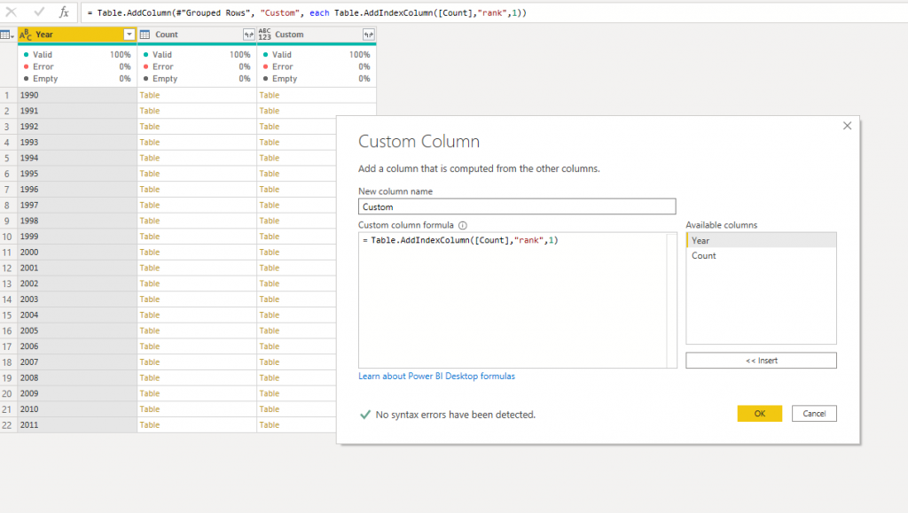
Now I need to create a Rank column for each year, which means I need to group based on Year First. I need to group the whole table based on the Year column, so I select All rows
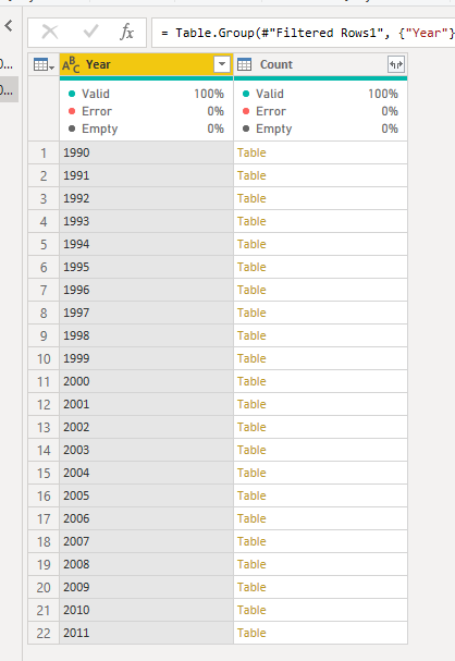
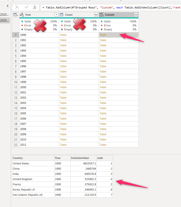
So the result is something like this
Then I added a custom column for adding an index for each group (table as count). Using a function to this purpose: AddIndexColumn() which get table name, that in the scenario is Count, and also a name for a new column, and how the index need to start ( index start from 0 or 1 or whatever)
Now you can remove the first two columns as the new one has all the required information. You just need to expand it
So this the data I want o use for Charticulator, Just make sure to copy the entire table and copy past into a CSV file for import into Charticulator
or you can use below link to download File:
Rank Chart, using Charticulator
First navigate to below pages
https://charticulator.com/app/index.html
Then select the datasets and you should see the four-column of data on the left side of the editor under columns.
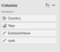
So as you can see these are all four columns we have, there is some icon beside them that shows their data type. For instance, the ruler is for continuous values, the histogram is for categorical numeric values, and the symbol one is for text.
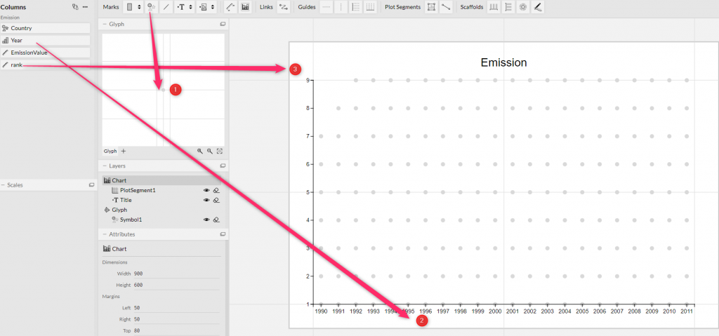
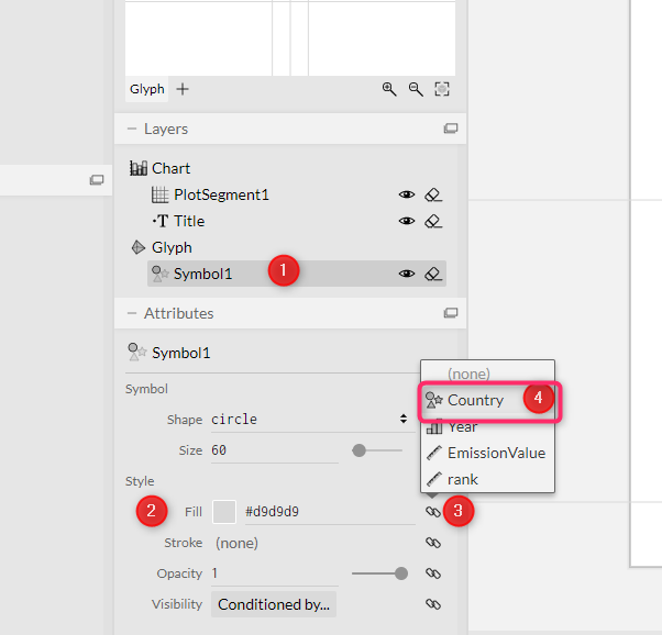
That means, we need a symbol, year for X-Axis, Rank for Y-Axis.
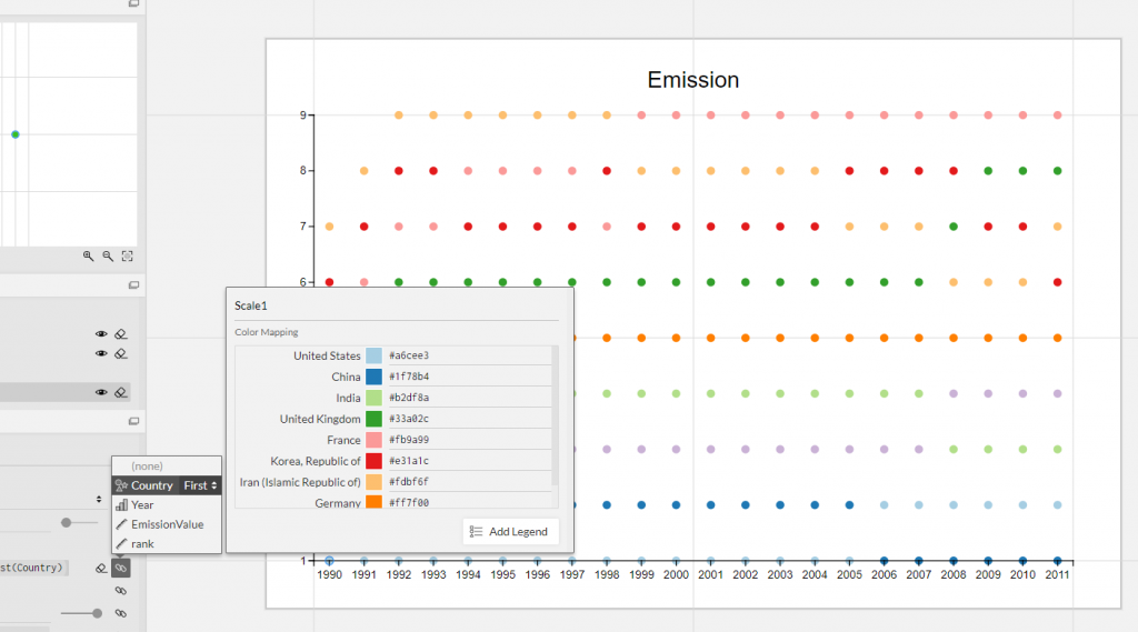
Now for each Symbol, we want to color code. The color code is the country columns.
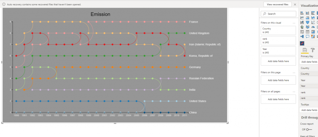
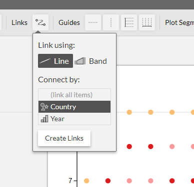
Now we want to connect the countries together. As result, in the top menu select the LInks, and choose the country and then Create Links.
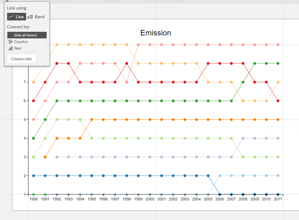
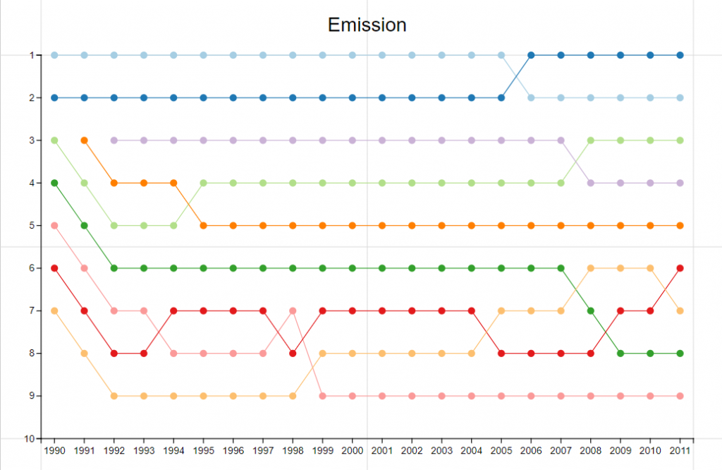
We need more infomration to make the visual looks better, As you can see we have a chart that in X-Axis, we have year from 1990 to 2011, Also we have 1 to 9 Rank that we need to make it sorted decending.
As a result
click on the Plot Segment and for Rank section change the orientation of the data as below
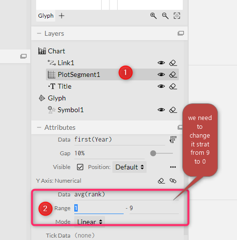
However, I change it from 10 to 1 to have better visual as below
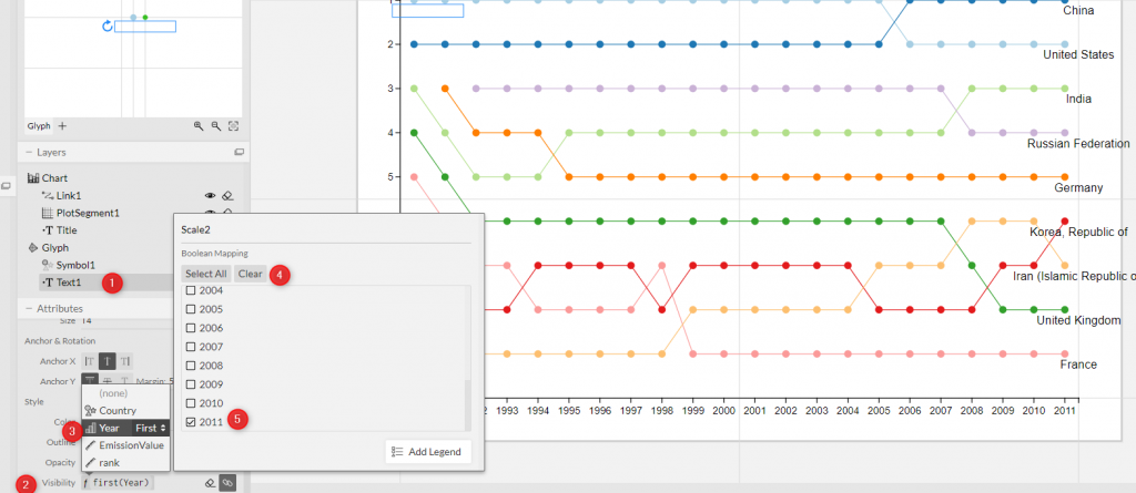
In next step, I need to know the name of the country, I can add legend but legend can be less readable as we have 9 different coolumn,
So I create a other text data beside each symbol as shown in below video
However it gets very messy as for each data point we have country name, I would prefer to show only for 2011 to make it clear and less messy.
in the same place for Text attributes, brows down to the visibility attribute. then for Year, clear all selection and only select 2011
So we will have below
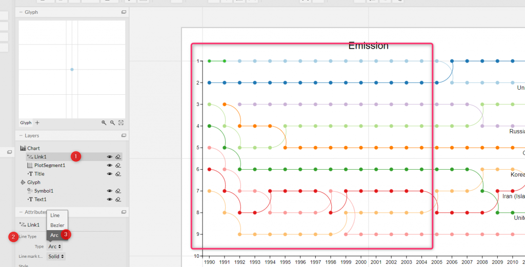
You can make chart nicer:
1- change the link type from line to Arc as below
Or other transformation as below to change the color background and fit every part in the visual are
At the final stage, you can export visual to use in Power BI desktop.
SO the final look would be as below in Power BI desktop