
So you want to add a sparkline in a Power BI report and wonder how to do it. Fortunately, the Power BI team recently added that functionality, and it is very easy to use. In this blog and video, I’ll explain how it works through a demo.
Video
What is the Sparkline?
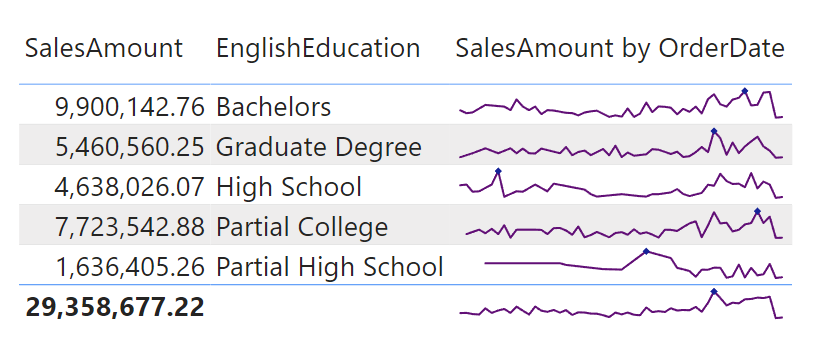
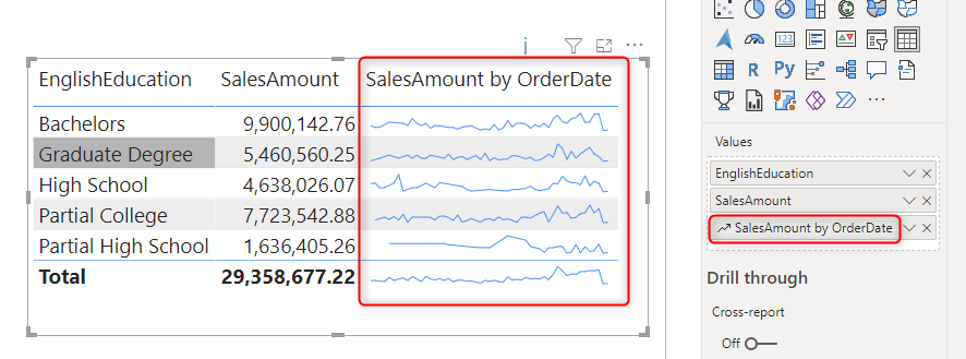
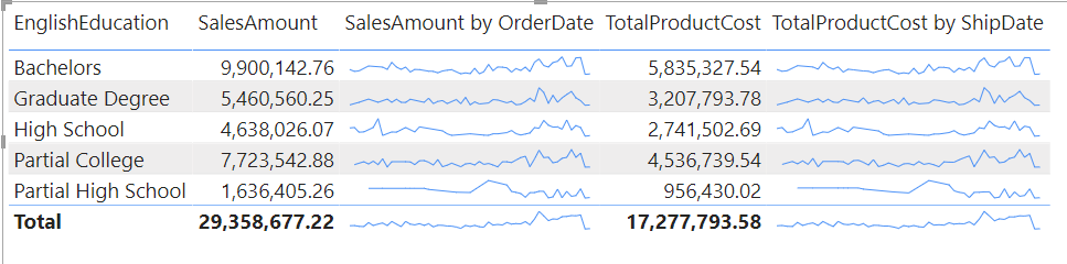
Sparkline is a line chart that is embedded into a table-style presentation. For example, you can have a spreadsheet or a table showing Education categories, and you are interested to see their Sales amount generated from these categories over time within the same table visual like below;
You can, of course, achieve the same thing using a line chart. You have to multiply it for each of the categories (you can do that in Power BI using small multiples). However, if you have many categories, then a small multiple might now show a nice view. that is why Sparkline can be helpful.
Sparklines are normally with minimal information. Their X-axis is a trend based on date (or something similar), but the axis is hidden because of minimal space. You can use the sparkline to understand the trend, the highest, the lowest, the starting and the ending point, etc. Because of their minimal nature, Sparklines are not used for a very detailed analysis. Instead, they are used to understand the trend of different categories over time in a high-level view.
How to use Sparkline in Power BI?
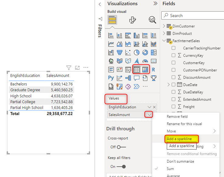
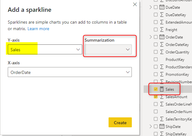
Using sparklines is simple, and it is possible in both Matrix and Table visuals in Power BI. To start, build your table visual in a normal way and add the fields into it. Then on any of the fields that you want to add a sparkline, click on the dropdown and select Add a sparkline.
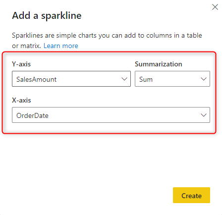
Set the configuration for the sparkline. Imagine this as a line chart that you specify the value (Y-Axis), the aggregation applied on the value (Summarization), and the trend axis (X-Axis), which can be the date or any sequential fields.
Once done, you can see a new field added to the visual with sparklines.
What if a measure is used for the X-Axis of the sparkline? in that case, the summarization will be disabled automatically, because the measure has some forms of aggregations in it.
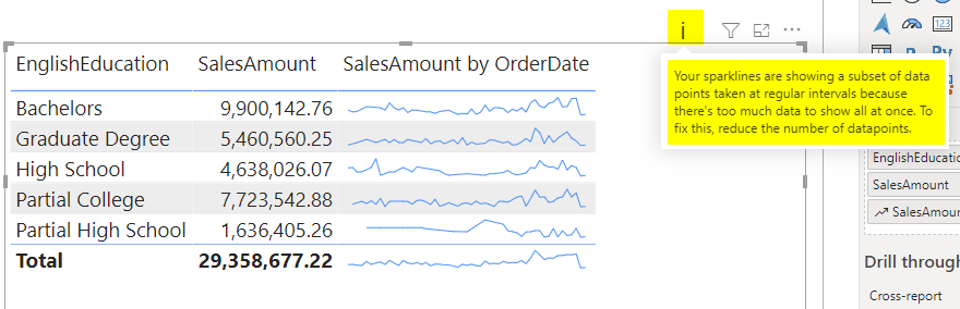
When you have date used as the X-Axis and especially if you have too many data points, then you will see a message at the top of the visual saying that a subset of data showed in the sparkline to fit in the minimal space provided;
If you have a custom Date table created by Power Query or DAX or any other way, you can use fields such as Year-Month combination, or Year-Quarter combination, or just Year to have fewer data points in the sparkline.
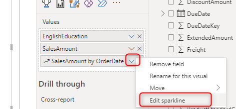
You can Edit the sparkline anytime you need;
And it is possible to have multiple sparklines in the same visual;
Sparkline formatting
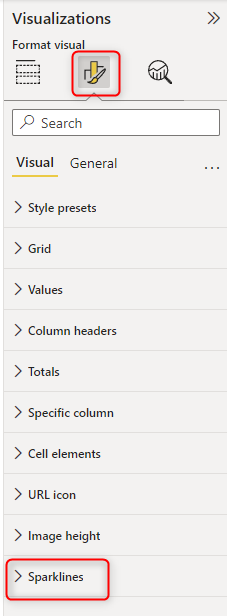
Formatting sparklines are easy and can be done through the Format pane in Power BI, Under the Sparklines section.
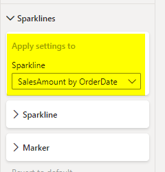
You can choose the sparkline that you want to apply the formatting (in case you have multiple sparkline fields).
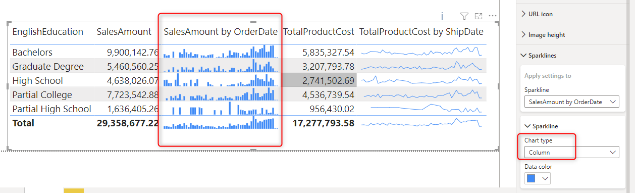
You can choose a column chart as a sparkline if you want to. This is under the Chart type under the sparkline format options. You can also change the data color.
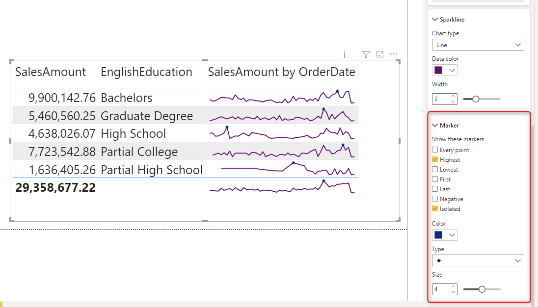
Another important setting for the sparkline is markers. You may want to show the point for the highest value, or lowest, or starting point, or ending, etc. This can be configured under the Marker settings under the Sparkline format options. Note that the marker option is only available for sparklines with a line chart type.
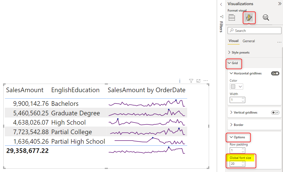
Finally, if the sparkline is too small to see, it is perhaps because the table cells are small. You can make the table cell bigger in multiple ways. One easy way is to increase the font size of the table visual. You can do this by going to the Format of the table visual, then Grid, Options, and then increasing the Global font size. This will increase all the fonts of this visual.
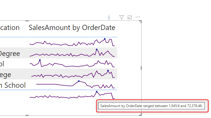
And finally. Hovering on the sparkline will show a piece of tooltip information about the range of values;
Summary
Sparkline is an important visualization element. It makes your report rich and informative. Fortunately, this feature is recently added to the Power BI Desktop, and it is easy to use and configure. This is particularly helpful if you want to show a trendline for categories that are too many to be visualized using a line/column chart with small multiples. If you have any questions about sparklines, please use the comments below, or contact me.


Reza is author of more than 14 books on Microsoft Business Intelligence, most of these books are published under Power BI category. Among these are books such as Power BI DAX Simplified, Pro Power BI Architecture, Power BI from Rookie to Rock Star, Power Query books series, Row-Level Security in Power BI and etc.
He is an International Speaker in Microsoft Ignite, Microsoft Business Applications Summit, Data Insight Summit, PASS Summit, SQL Saturday and SQL user groups. And He is a Microsoft Certified Trainer.
Reza’s passion is to help you find the best data solution, he is Data enthusiast.
His articles on different aspects of technologies, especially on MS BI, can be found on his blog: https://radacad.com/blog.