Column chart and Bar chart are two of the most basic charts used in every report and dashboard. There are normally two types of these charts: Stacked, and Clustered. At the first glance they seems to do same action; showing values by categories ans sub categories. However, they are different. Your storytelling of data would be totally different when you use one of these charts. The difference is simple, but knowing it and considering it in your visualization will take your visualization simply one level up. In this post I’ll show you the difference and when to use which. I will use Power BI for this example, but this is a conceptual post and works with any other BI tool. If you like to learn more about Power BI; read Power BI online book, from Rookie to Rock Star.
Prerequisite
For running example of this post you will need AdventureWorksDW sample database, or you can download Excel version of it from here:
Simple Column Chart
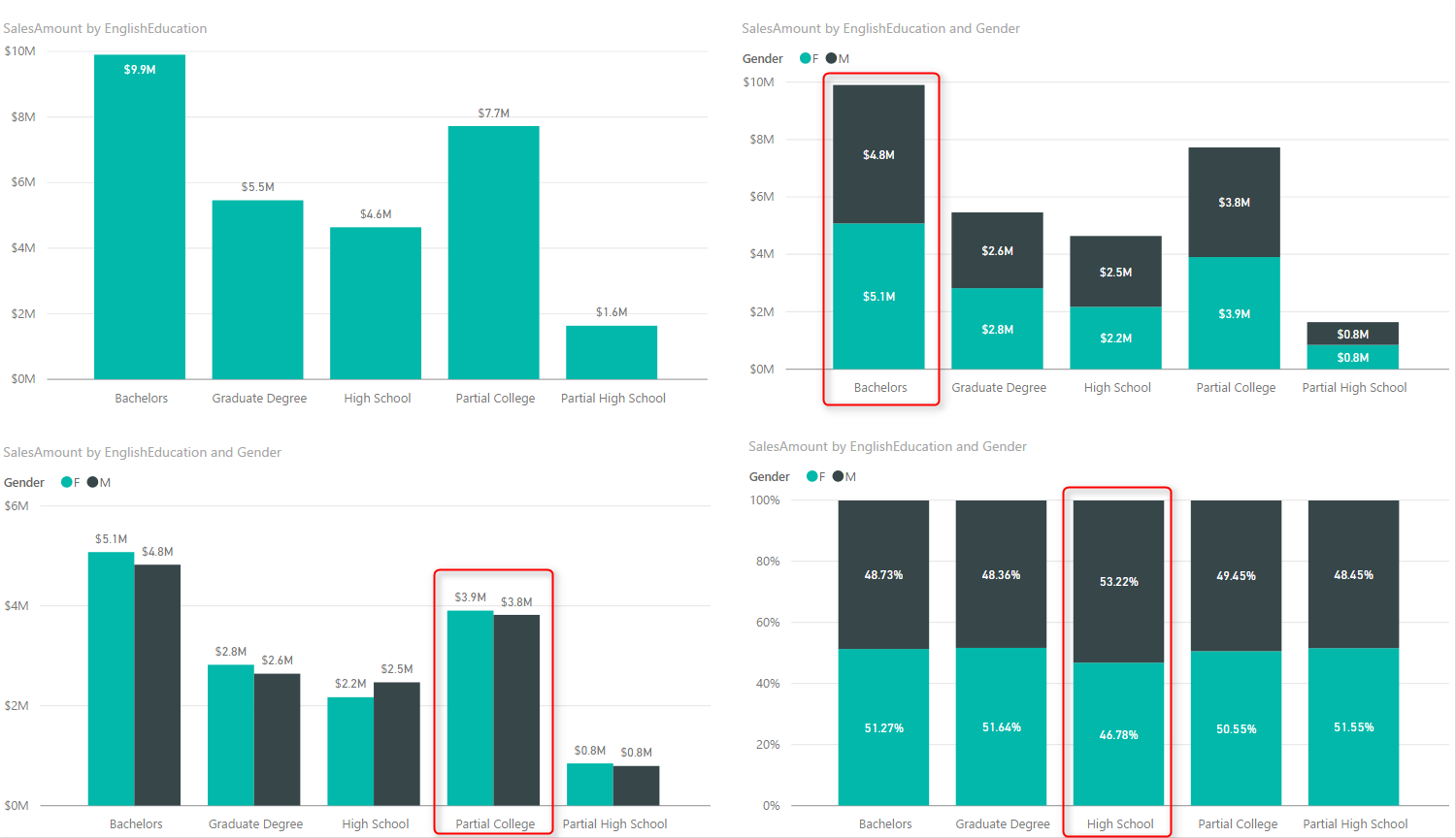
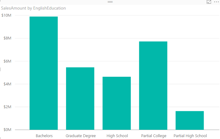
One of the best options to visualize difference between quantitative values across multiple items is column chart or bar chart. I have created a Power BI Desktop file connected to AdventureWorksDW, and loaded DimCustomer and FactInternetSales into the model. The chart below is a Column chart with EnglishEducation from DimCustomer as Axis, and SalesAmount from FactInternetSales as Value;
You can see with a single glance that Bachelors are producing the most revenue in this data set, and then Partial College after that. You can also simply understand Partial High School type of customers are lowest revenue generating customers. Column Chart and Bar chart are best for comparing a quantitative value (SalesAmount) based on categories/items (EnglishEducation). Now let’s bring another dimension here.
Clustered Chart
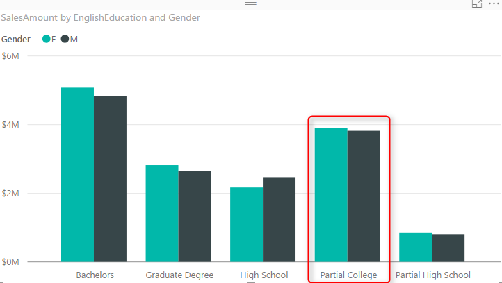
Clustered charts are best for comparing all categories and their sub categories as part of a whole. If you add Gender from DimCustomer as Legend, and choose the Clustered Column Chart type for your visual, this is what you will see;
Similar to normal column chart you can easily figure out which sub category producing the most revenue: Bachelors Female. and Partial High School Male is the least revenue generation sub category. You can also very easily realize that in each category which sub category has higher value than the other one;
You can simply say that Males are producing less revenue than females in the Partial College category. Even though in Partial College values of Male and Female sub categories are very close to each other. These are questions that you can answer with this chart easily:
- Q: Which sub category generating most revenue?
- A: Bachelors Female.
- Q: Which sub category in Partial College generating least revenue?
- A: Male.
How about this question: Which category produces most total revenue? You would say Bachelors probably fairly quickly because both Female and Males has highest values of females and males across all categories. However if I ask you between High School and Graduate Degree, which one has the most total revenue based on only Clustered Chart above, that might be challenging to answer. The point is:
Clustered Chart are not good for comparing totals of categories
Stacked Chart
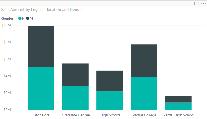
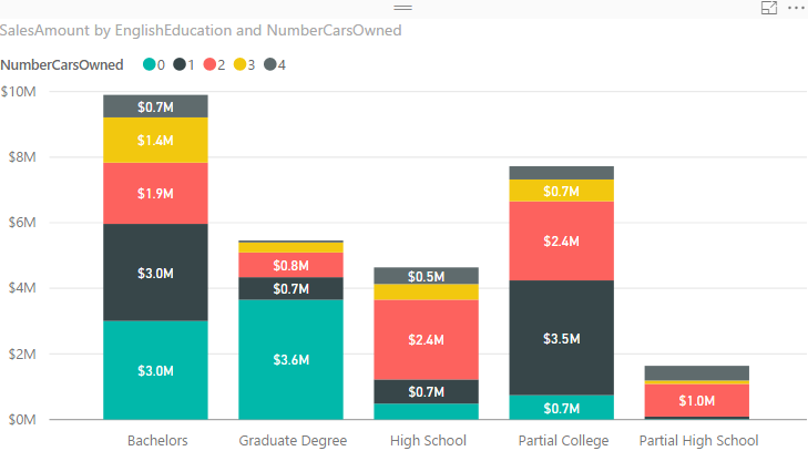
Point above leads us to Stacked Chart which is good for comparing totals and also values of sub categories. Change type of visual to Stacked Column Chart;
With this chart you can simply say which Education category provide most revenue, because the total is showed. between Graduate Degree and High School, it is obviously Graduate Degree. in Stacked chart however isn’t easy to compare values of a category. For example finding out is Male or Female producing more revenue in High School category is almost impossible through this. Stacked Chart is good when value difference is high between sub categories in each category.
Stacked Chart are not good for comparing values in each category
100% Stacked Chart
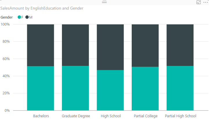
There is another type of stacked chart, named as 100% Stacked Chart. This chart is good for comparing percentages normally. To find out how sub categories of each category are doing compared with other sub categories. If you change the type of chart to 100% Stacked Column Chart, here is what you will see:
You can realize very quickly that portion of Males in all Education categories are less than High School’s Males. However You can never use 100% stacked chart for comparing actual values. This chart is only good for percentages. When you use this chart in Power BI, it will automatically uses percentages calculation for it.
100% Stacked Charts are not good for comparing actual values.
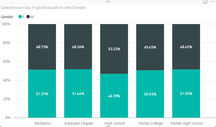
Data Label is Your Asset
Regardless of what type of chart (Stacked, 100% Stacked, or Clustered) you are using, Data Labels are always helpful. Here is how charts can be powered with labels;
Your Story of Data
Deciding which chart is the best is all depends on what you want to tell as the story of the data;
- If you want to visualize totals of each category with separation of sub categories; Stacked Chart is your option.
- If you want to visualize differences of percentage of sub categories value with other sub categories in other categories; 100% Stacked is the best.
- If you want to compare values for all sub categories, and understand which one is the best or worst, inside a category or overall; Clustered Chart is your asset.
There is no one single chart telling the whole story. You need to use combination of these, but use them wisely. For example don’t use Stacked Chart if you want to understand which sub category of a single category performs better or worst, or don’t use Clustered chart if you want to compare totals of categories together.
Be Careful of Too Many Items
All of these charts works perfectly when you have few number of items. if you want to spread these across many sub category these charts would be hard to understand. Best would be splitting that variety in multiple charts.
Download
Download the Power BI file of demo from here:
Save




Reza,
Nice. Another to include possibly is the stacked clustered chart. Helpful in showing y-o-y comparisons for business cycles to visualize Q1_15 vs Q1_16 etc, as well as see the trend for Q1-Q4 FY 16 very quickly in one chart.
Thanks Winston,
Great point. Yes Stacked Clustered Chart is another great chart to work with as you mentioned. I didn’t wrote about that because in this post I’ve been focusing on charts that is supported in Power BI, which Stacked Clustered Chart isn’t one of them.
Thanks for your valuable comment 🙂
Cheers
Reza
Hi
Great post as usual!
Love your way of writing simply and your clarification.
Thanks.
Nir
Thanks Nir for your kind feedback.
Cheers
Reza
Thanks for the write-up, it’s helpful as an illustration of other points as well..
Scale and consistency… I like that you were consistent in presenting the sequence of categories on the horizontal axis, but looking at so many charts with the horizontal so wildly out of logical order is aggravating my OCD. Wouldn’t the charts be more informative or intuitive if the English Education was ordered from least to greatest instead of alphabetical?
Hi Christopher,
Great point. Sorting is always one of the most important things to do in visualizations. I haven’t done that however intentionally in this post, because I wanted reader to try to understand difference of values in columns of chart without being sure that this is ordered.
Cheers
Reza
Hello,
I am not getting any download link for AdventureWorksDW
here is the link