Session Materials & Recording: Take Power BI Visualization to the Next Level – Data Insight Summit 2017

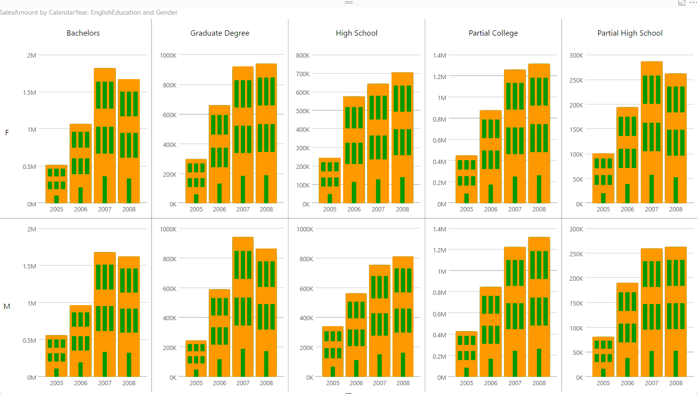
Thanks everyone to attend my session in Microsoft Data Insight Summit 2017 about Data Visualization. It was a pleasure to see you all. Here I put the session materials to download and links as reference to study more. Please feel free to ask your questions here. My session was over booked with 650 registrations, and Read more about Session Materials & Recording: Take Power BI Visualization to the Next Level – Data Insight Summit 2017[…]

Visualizing Data Distribution in Power BI – Histogram and Norm Curve -Part 2

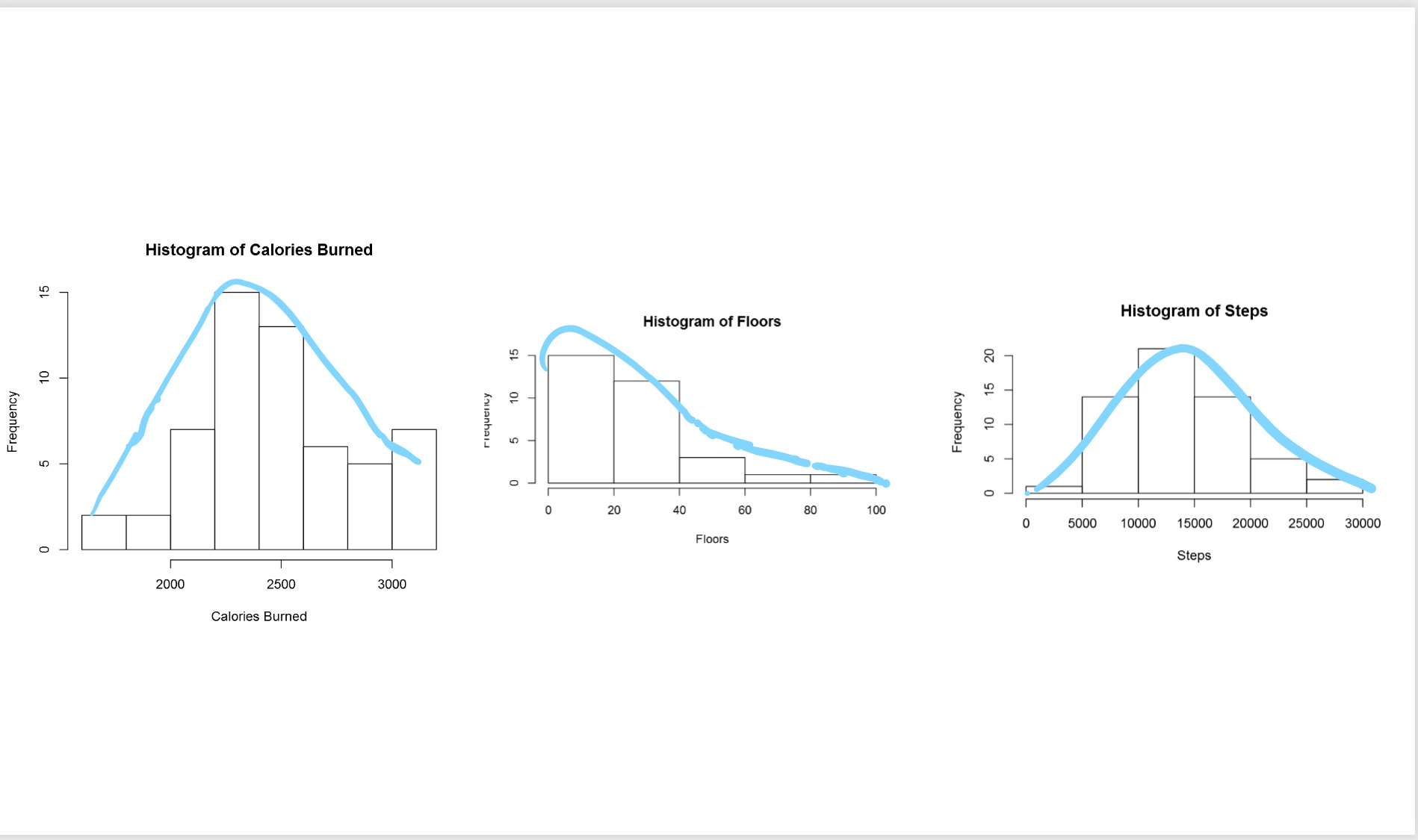
In the Part 1 I have explained some of the main statistics measure such as Minimum, Maximum, Median, Mean, First Quantile, and Third Quantile. Also, I have show how to draw them in Power BI, using R codes. (we have Boxplot as a custom visual in power BI see :https://powerbi.microsoft.com/en-us/blog/visual-awesomeness-unlocked-box-and-whisker-plots/ ). However, to see the data Read more about Visualizing Data Distribution in Power BI – Histogram and Norm Curve -Part 2[…]

K-mean clustering In R, writing R codes inside Power BI: Part 6

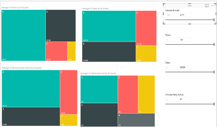
In the previous post,I have explained the main concepts and process behind the K-mean clustering algorithm. Now I am going to use this algorithm for classifying my Fitbit data in power BI.   as I have explained in part 5, I gathered theses data from Fitbit application and I am going to cluster them using Read more about K-mean clustering In R, writing R codes inside Power BI: Part 6[…]

Variable Width Column  Chart, writing R codes inside Power BI: Part 4

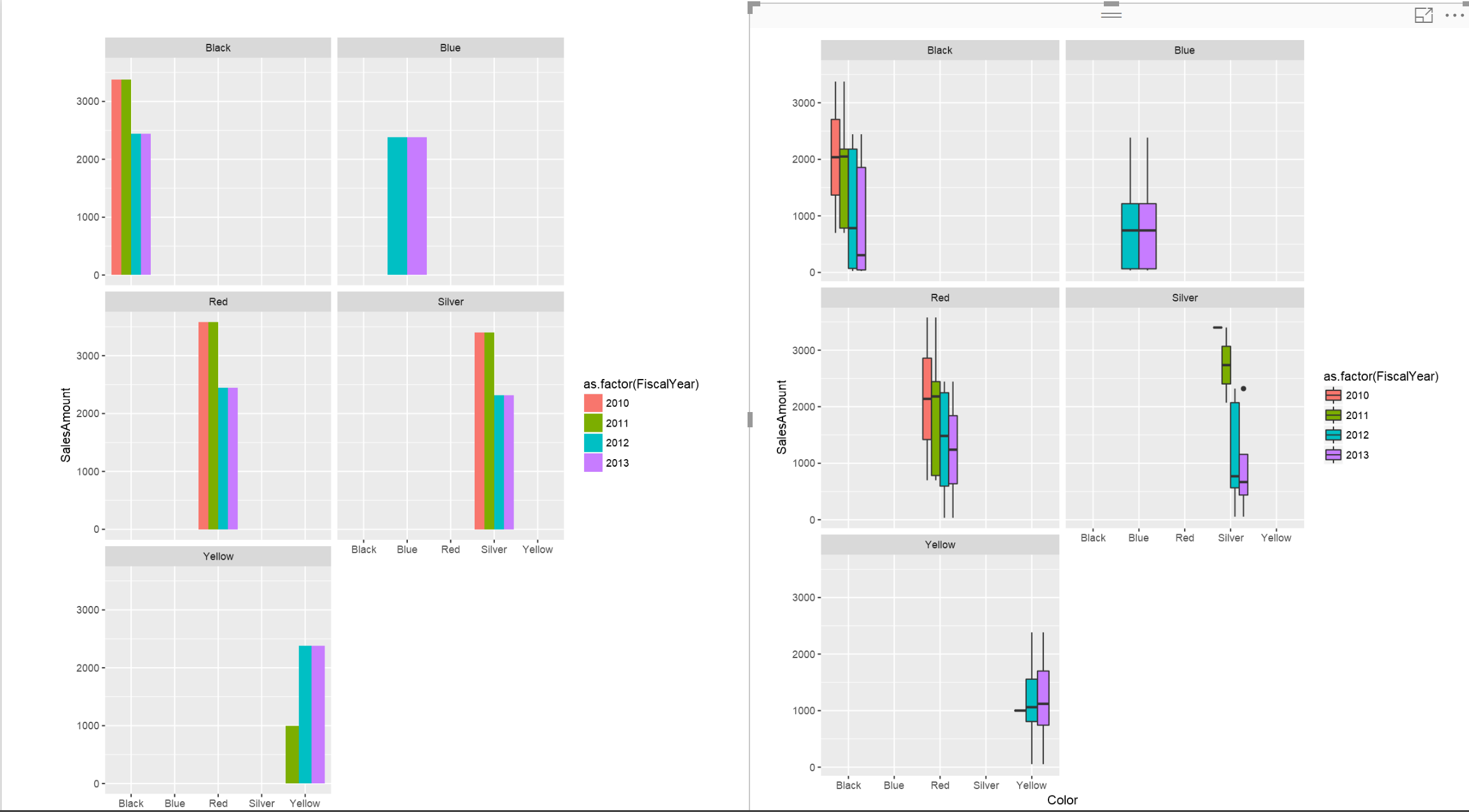
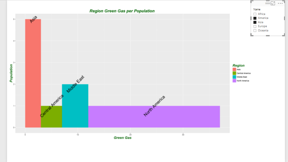
In the part 1, I have explained how to use R visualization inside Power BI. In the second part the process of visualization of five dimension in a single chart has been presented in Part 2, and finally in the part 3 the map visualization with embedded chart has been presented. In current post and next ones I Read more about Variable Width Column  Chart, writing R codes inside Power BI: Part 4[…]

Have more Charts by writing R codes inside Power BI: Part 1

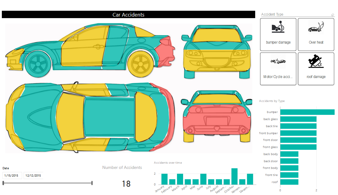
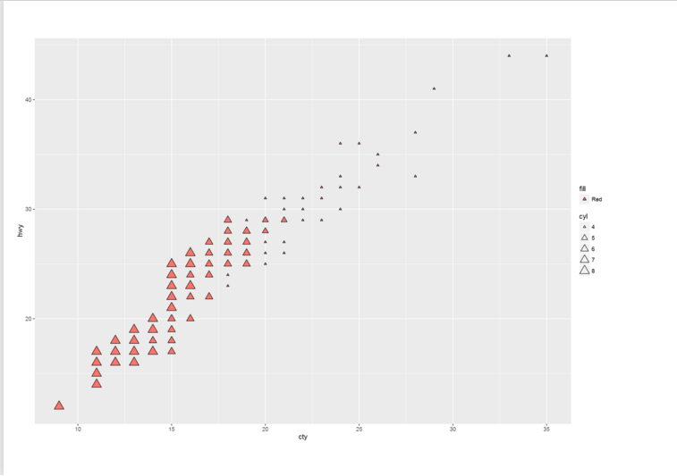
Power BI recently able users to embedded the R graphs in Power BI. There are some R visuals that it would be very nice to have them in Power BI. What is R ? Based on Wikipedia,  R is an open source programming language and software environment for statistical computing and graphics that is supported Read more about Have more Charts by writing R codes inside Power BI: Part 1[…]

Materials and Q&A of PASS BA VC Session: Take Power BI Visualization to the Next Level

Thanks for all attendees of my webinar yesterday in PASS Business Analytics Virtual Chapter (Group). It was a pleasure to present to you all again. The session time spent all for me speaking and there was no time for answering questions at the end, so here I’ll answer all questions, and you will have access Read more about Materials and Q&A of PASS BA VC Session: Take Power BI Visualization to the Next Level[…]

Grouping and Binning; Step Towards Better Data Visualization

The latest update of Power BI Desktop (October 2016) has many features. Two of these features are grouping and binning. These features used to create groups of items and visualize them better in the report. Previously you could do that by Power Query or DAX calculated columns, now it is all possible simply through the Read more about Grouping and Binning; Step Towards Better Data Visualization[…]

Dashboard vs Report; Differences At a Glance – Power BI

This question is one of the main questions that people ask when they are at the preliminary stages of building a Power BI solutions. There is a misconception that Report is a detailed tabular report, and dashboard is interactive visualizations with chart. However this definition isn’t what Power BI reports and dashboards stands for. There Read more about Dashboard vs Report; Differences At a Glance – Power BI[…]

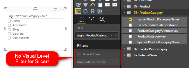
Filtering Slicer Resolved in Power BI

You can filter all visuals in Power BI except Slicer! In fact slicer itself is a type of filter, however there are some times that number of items in slicer is too many. So this is normal that we want to filter the items in the slicer itself. Unfortunately current version of Power BI Desktop Read more about Filtering Slicer Resolved in Power BI[…]

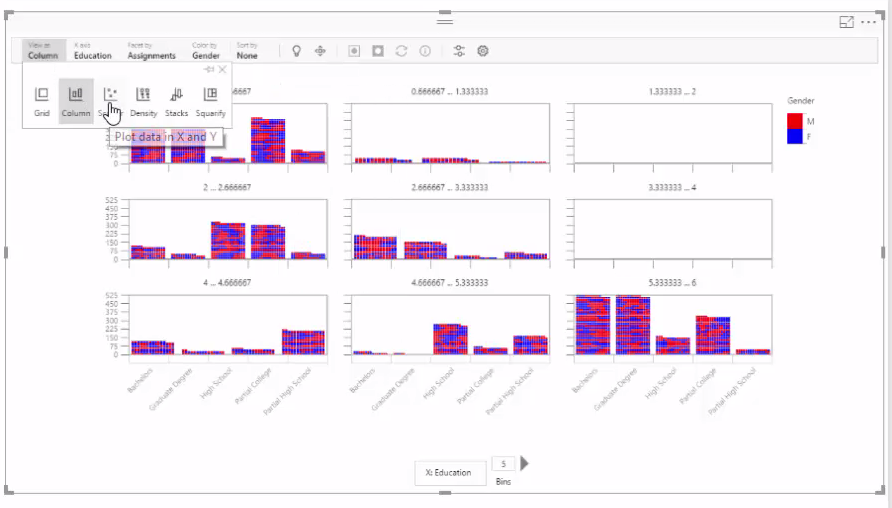
Azure Machine Learning with Power BI SandDance Visualization

You’ve seen a number of custom visualizations of Power BI that we’ve used in Power BI online book previously. In this post you will learn through a quick video how SandDance custom visualization of Power BI can be used to visualize clustering result set of an Azure Machine Learning model. In this video I’ll start Read more about Azure Machine Learning with Power BI SandDance Visualization[…]