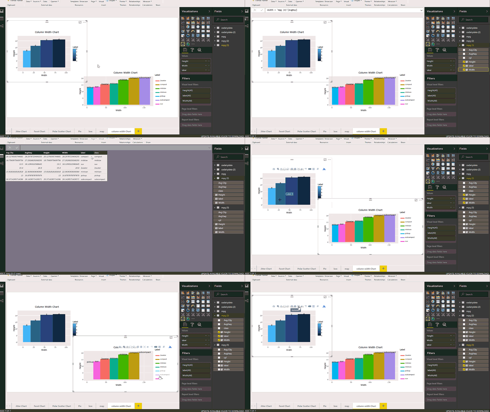
Table with Embedded Chart in Power BI using R

Visualization is any kind of graphical representation that enable us to: Exploration, it help us to get more deep insight through huge amount of data Discovery, It also gives extra vision Analysis, it can be used to find pattern Communication, visualization help us to communicate better A few years ago Dr. Andrew Abela published a good Read more about Table with Embedded Chart in Power BI using R[…]

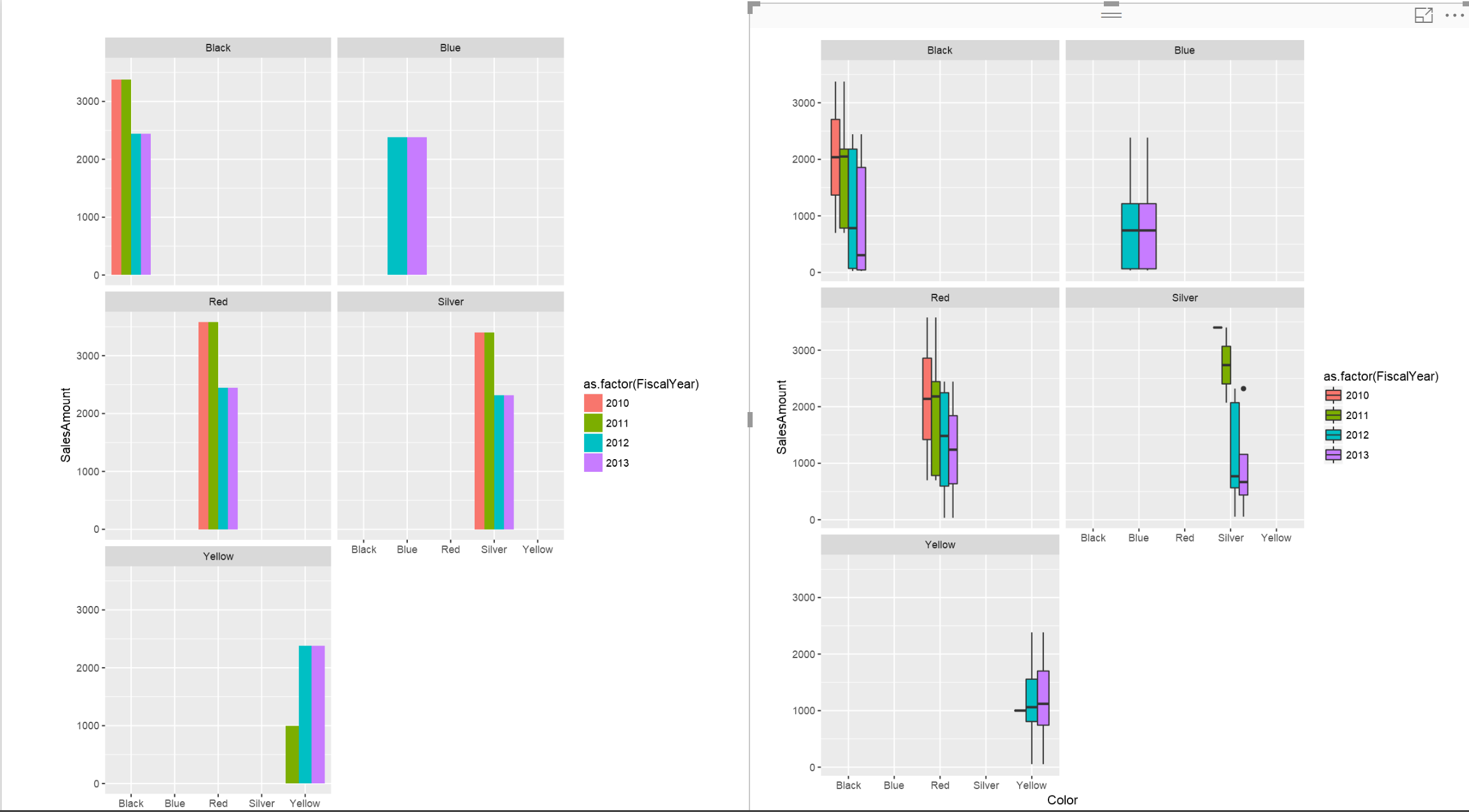
Interactive Charts using R and Power BI: Create Custom Visual Part 3

In the last two posts (Part 1 and 2), I have explained the main process of creating the R custom Visual Packages in Power BI. there are some parts that still need improvement which I will do in next posts. In this post, I am going to show different R charts that can be used Read more about Interactive Charts using R and Power BI: Create Custom Visual Part 3[…]

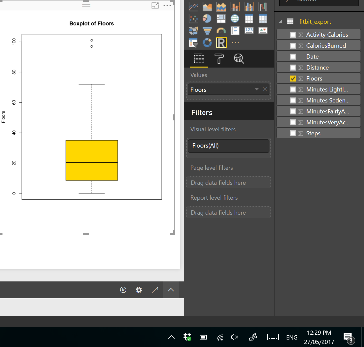
Visualizing numeric variables in Power BI – boxplots -Part 1

In this post and next one, I am going to show how to see data distribution using some visuals like histogram, boxplot and normal distribution chart. It always important to have a holistic perspective regarding the minimum, maximum, middle, outliers of our data in one picture. One of the chart that helps us to have a Read more about Visualizing numeric variables in Power BI – boxplots -Part 1[…]