Have more Charts by writing R codes inside Power BI: Part 3

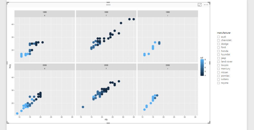
In the previous parts (Part 1 and Part 2) , I have shown how to draw a chart in the power BI (Part 1) visualization. Also, in Part 2 I have shown how to present 5 different variables in just one single chart. In this post, I will show how to shows some sub plots in a Read more about Have more Charts by writing R codes inside Power BI: Part 3[…]

Have more Charts by writing R codes inside Power BI: Part 2

In the previous post (Part 1) I have explained how to write a simple scatter chart in the Power BI. Now in this post I am going to show how to present 5 different values in just one chart via writing R scripts. I will continue the codes that I wrote in the previous post  as below : Read more about Have more Charts by writing R codes inside Power BI: Part 2[…]

Have more Charts by writing R codes inside Power BI: Part 1

Power BI recently able users to embedded the R graphs in Power BI. There are some R visuals that it would be very nice to have them in Power BI. What is R ? Based on Wikipedia,  R is an open source programming language and software environment for statistical computing and graphics that is supported Read more about Have more Charts by writing R codes inside Power BI: Part 1[…]

Shape Map Better than the Filled Map

I have previously written some blog posts about Map visuals in Power BI. One of them was specifically about Filled Map, titled as Filled Map; the Good, the Bad, the Ugly! Why? you need to read that post to find the reason. In this post I want to explain the power of Shape Map which Read more about Shape Map Better than the Filled Map[…]

Stacked Chart or Clustered? Which One is the Best?

Column chart and Bar chart are two of the most basic charts used in every report and dashboard. There are normally two types of these charts: Stacked, and Clustered. At the first glance they seems to do same action; showing values by categories ans sub categories. However, they are different. Your storytelling of data would Read more about Stacked Chart or Clustered? Which One is the Best?[…]

Sort By Column in Power BI

Power BI users Sorting in most of the visualizations, you can choose to sort ascending or descending based on specified data fields. However the field itself can be sorted based on another column. This feature called as Sort By Column in Power BI. This is not a new or advanced feature in Power BI. This Read more about Sort By Column in Power BI[…]

Visualization Tip: Change to Filter instead of highlight Control the Interaction in Power BI Report

Power BI reports are highly interactive, If you select a column in a column chart other charts will be highlighted. Selecting a slicer value will filter all other visuals in the report. This interactivity can be controlled easily. Despite the fact that this feature has been released in early phases of Power BI, there are Read more about Visualization Tip: Change to Filter instead of highlight Control the Interaction in Power BI Report[…]

Power Behind the Line Chart in Power BI; Analytics

Line chart is one of the most basic charts that you can see in every visualization tool. Power BI like other visualization tools has the line chart visualization which is good for showing one or two measure’s value across an axis which can be a category, time period and etc. Recently Power BI line chart Read more about Power Behind the Line Chart in Power BI; Analytics[…]