
At the time of writing this post; there are already more than 97 custom visuals posted in Office Store. The list includes many interesting custom visuals. However, Infographic Designer is one of the visuals that is not just another visual. This custom visual has some unique features that you cannot see in many other visuals. Some of these features helps a lot in your visualization scenario if you know how to use it. In this post I’ll explain some of the great features of this visual. If you like to learn more about Power BI; read Power BI online book from Rookie to Rock Star.
Sample Data Set
For this example, you need to have a copy of AdventureWorksDW database. here is where you can download the Excel version of it:
About Infographic Designer
Infographic Designer is a custom visual built by Microsoft. This visual first introduced in October 2016. This visual gives you ability to create charts with some infographic in it. However, this is not the only great feature of this visual. This visual also gives you ability to use Multiples (Called Row By or Column By). With Multiples you can create multiple charts based on specific dimension attributes. In this blog post we will have detailed look at what are options and features of this visual.
Create Sample Model
For this example you need to have AdventureWorksDW which you can download it from the link above. Select these tables from this data set; DimDate, DimCustomer, and FactInternetSales. Here is a screenshot of the data model;
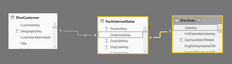
make sure to create a relationship between DimDate(DateKey) and FactInternetSales(OrderDateKey).
Get the Visual
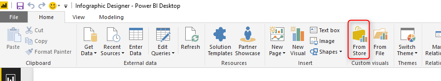
You can recently access list of custom visuals from Power BI Desktop itself. Select From Store in Home tab;
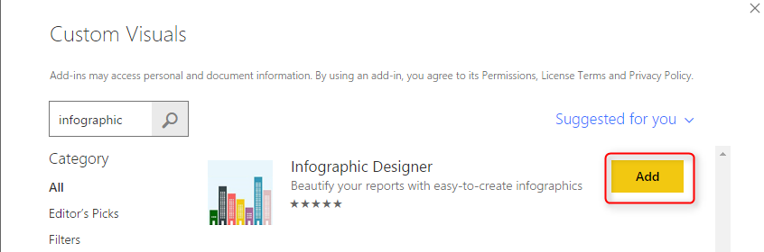
then search in the box for Infographic Designer and add it
You should see the new visual added in your list of visuals

Basic Visualization
The basic look and feel of this visual is similar to a column chart. if you drag it in the report and set CalendarYear(from DimDate) as Category, and SalesAmount(from FactInternetSales) as Measure, then you will see a simple column chart as below;
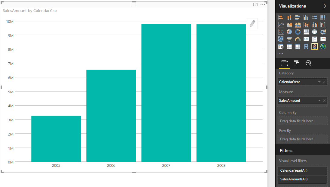
However, this chart has a lot of capabilities hidden, let’s look at some of it.
Infographic Visualization
As the name of this visual says; it is a visual for infographic. You can use it to visualize an infographic. To start that you have to click on Edit icon that appears at the top right hand side of the visual itself.
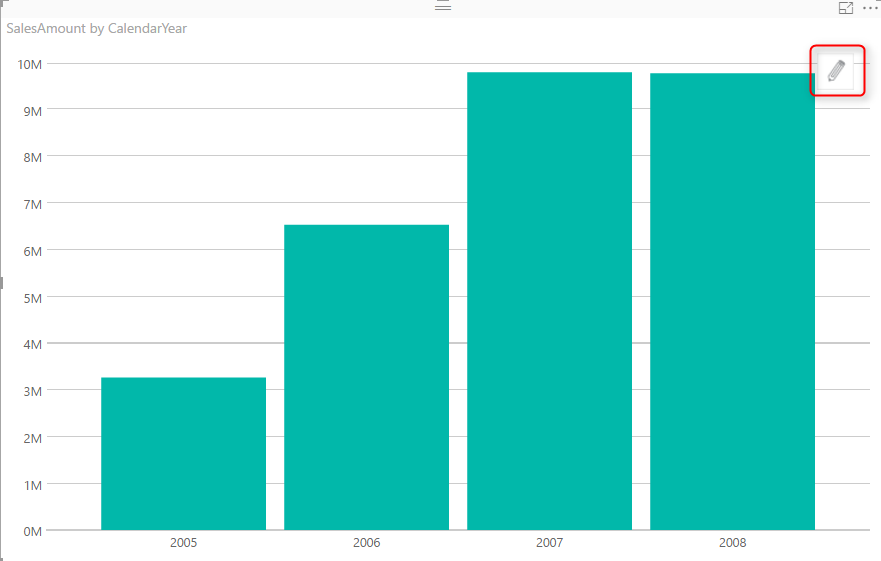
With clicking on Edit, you will see an Edit mode in the right hand side of chart.

There are some configurations you can apply here in Mark Designer. You can obviously change the color (In Value Color if you want). you can also select a particular shape.
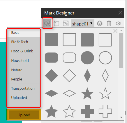
As an example; I have selected a shape of apartment, with some color changes. result is as below;
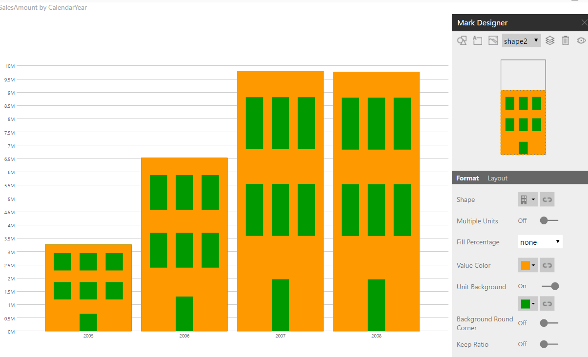
There are also some configurations you can do for every shape. by default shapes are stretched. you can choose Multiple unites to multiply them when column height is more. Here is an example; you can see the laptop image has been multiplied.
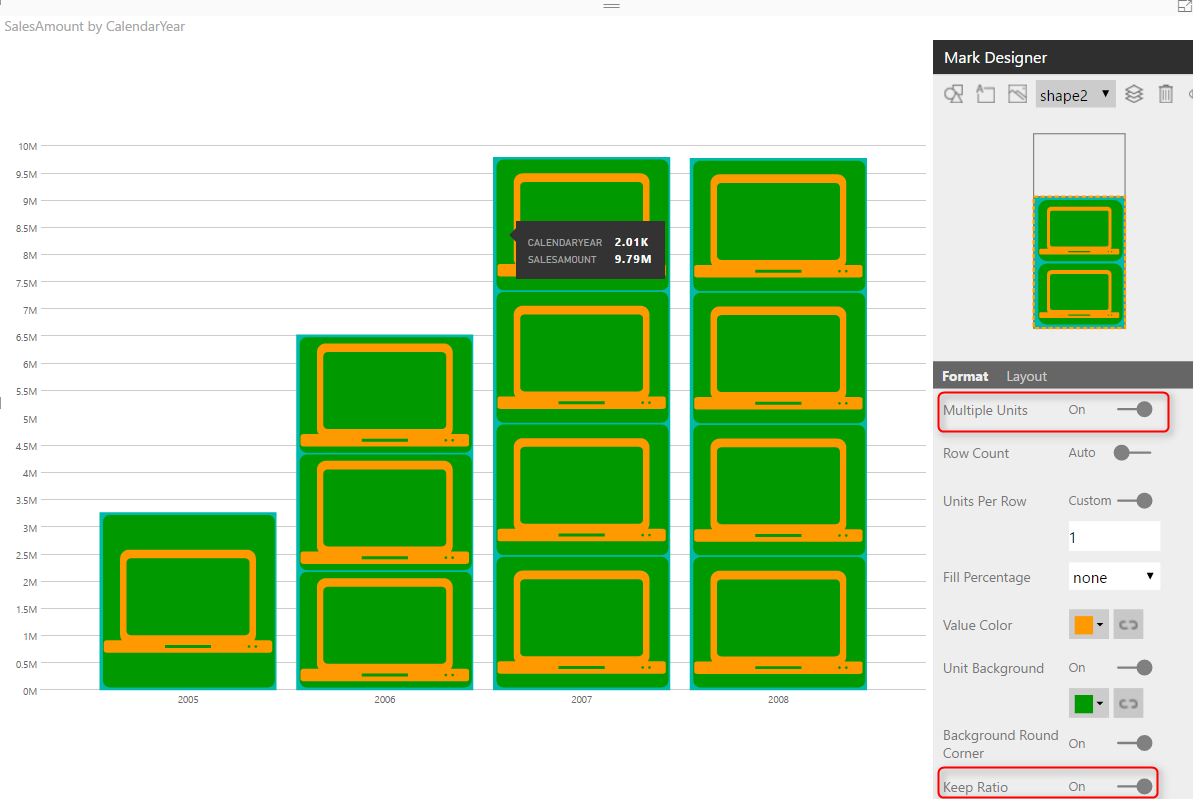
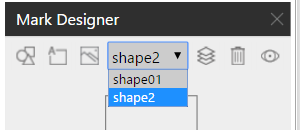
You can also add other layers of images into this. at the top section of Mark Designer you will see all options for switching between layers or adding or removing layers.
There are also some other details regarding infographic part of it, which I believe you will find interesting when playing with this visual. Now, let’s take a look at the best feature of this visual.
Multiples: Row By, and Column By
The best feature of this visual is something that previously in Power View was called as multiples. In this chart it is called as column by and row by. You can create multiples of a chart by another field. Let’s have a look at that.
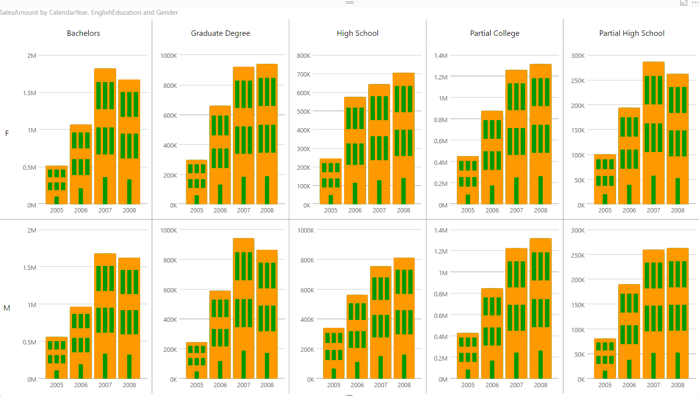
If you bring EnglishEducation (from DimCustomer) into Column By field. you will see the chart creates multiple times; one chart per each EnglishEducation value.
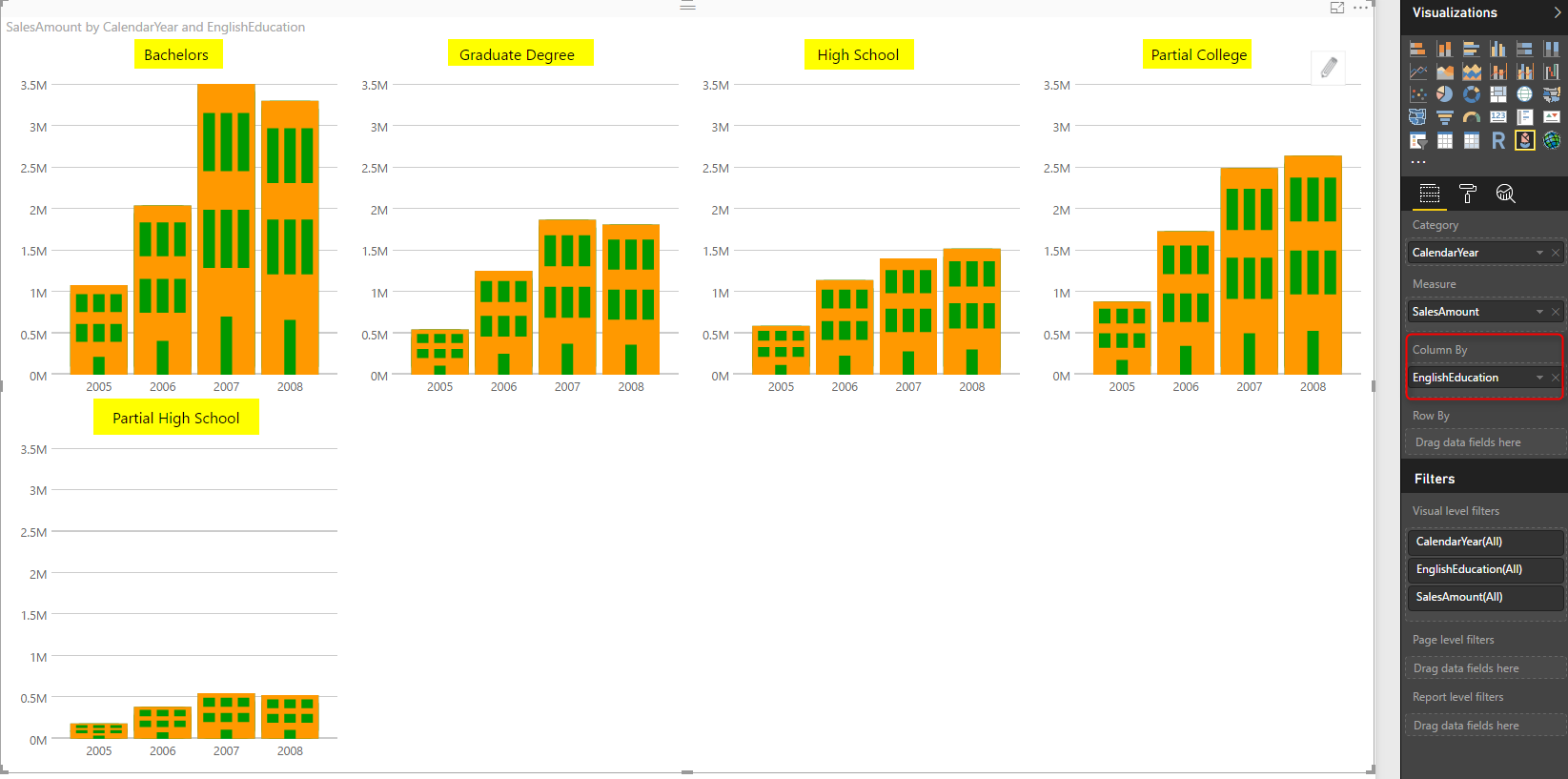
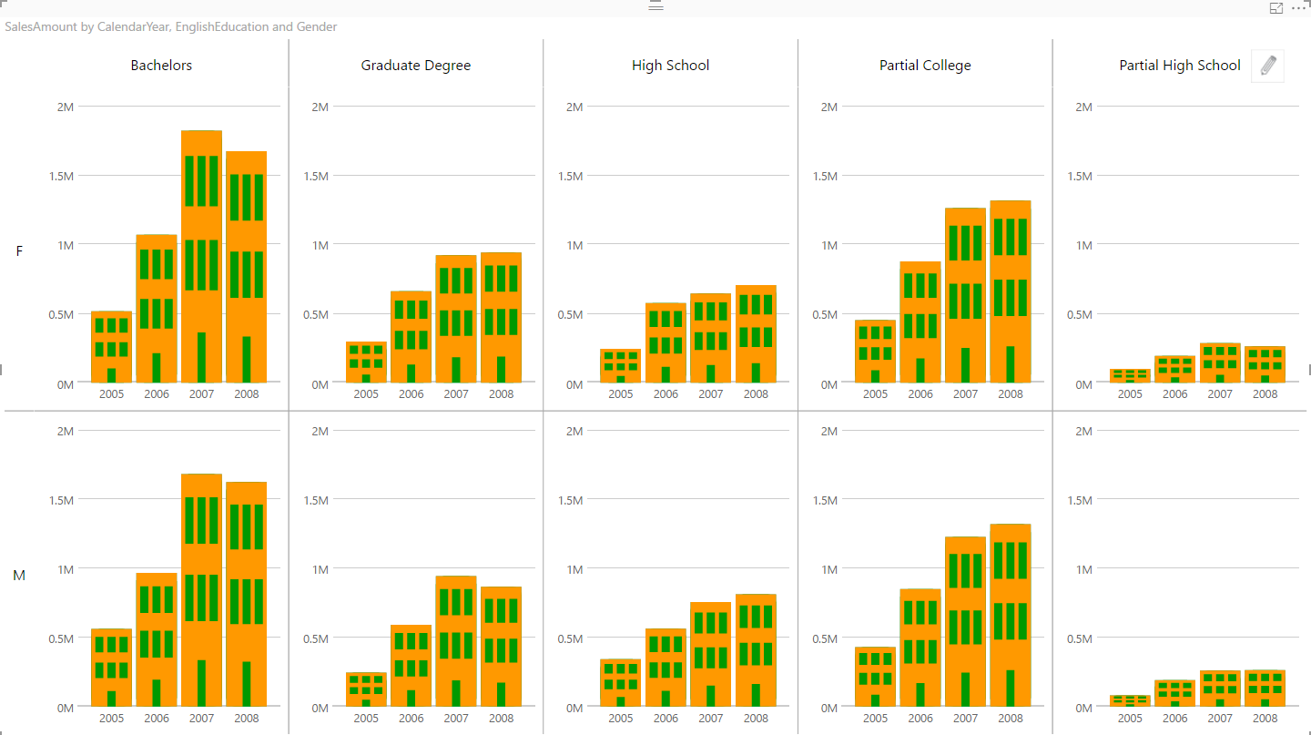
It actually creates a new chart in one column per each value: Graduate Degree, High School, and etc. Because number of charts is too much to fit into one row, so the last one goes to another row. With this chart now you can compare sales across years in all different education categories.
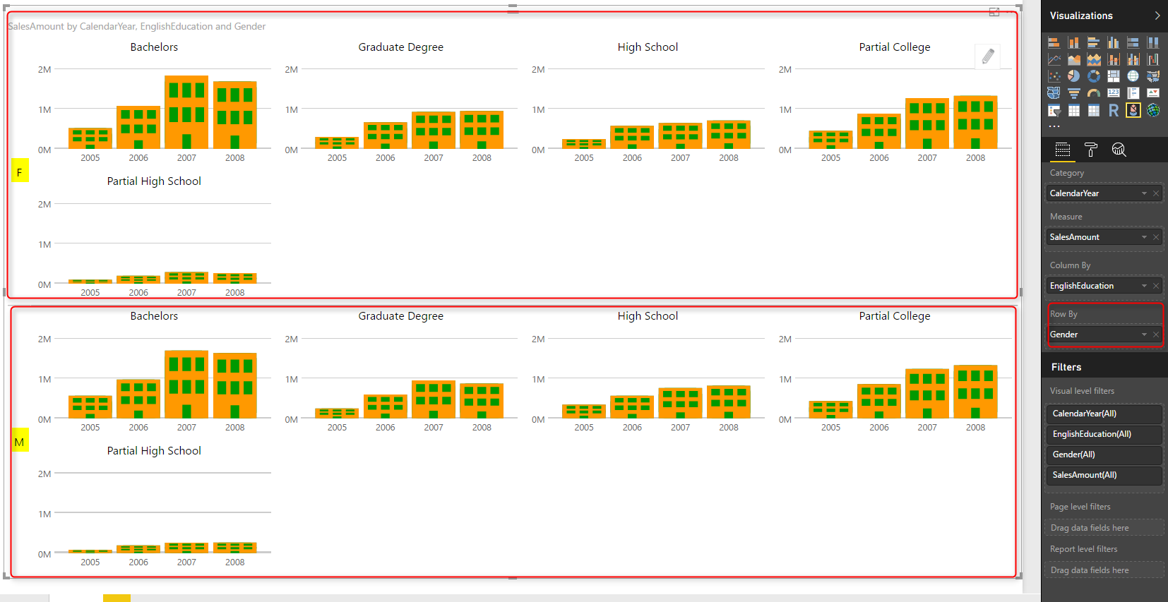
You can also bring another field into Row By, as an example: Gender (from DimCustomer);
You can also make some configurations to make it nicer. in the Format section, under Small Multiple you can set number of columns to 5 to fit all 5 categories in one row.
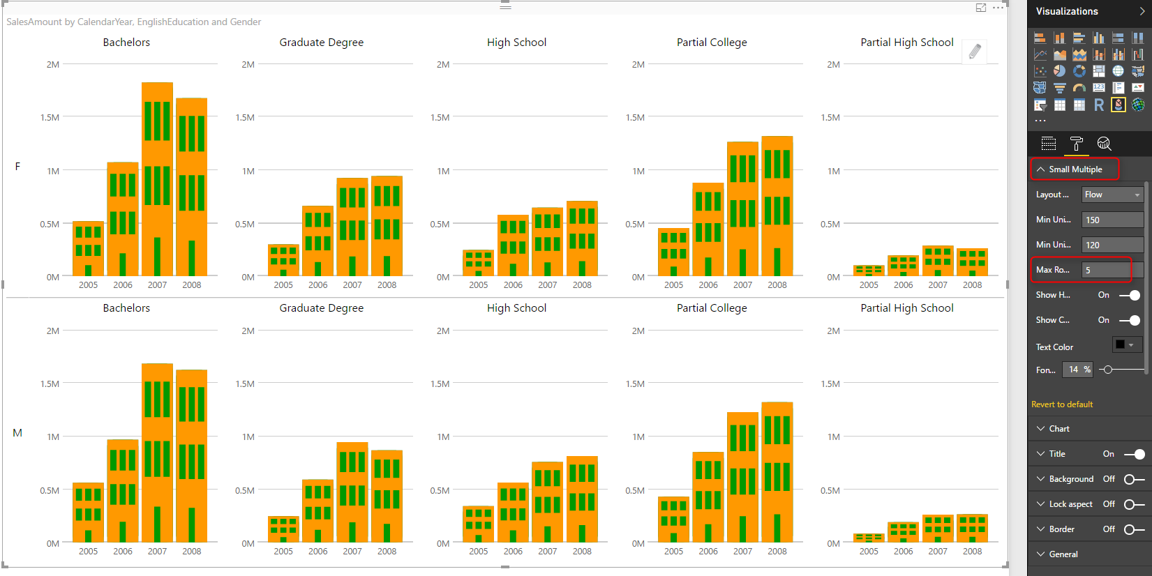
You can also change the Layout to Matrix to avoid extra space used for repeating chart headers
Some Extras
In addition to the powerful visualization option provided by Column By and Row By, you can even make it much more insightful with some other extra configurations. At the moment the chart above is good to show in which category of education or in which gender sales is less or high across years. However, it is not good to compare them at the same scale, because some charts (such as Partial High School) is so small compared to others (such as Bachelors).
You can change them all to be at the same scale; For this change, click on Chart, and set Uniform Y-Axis to be off.
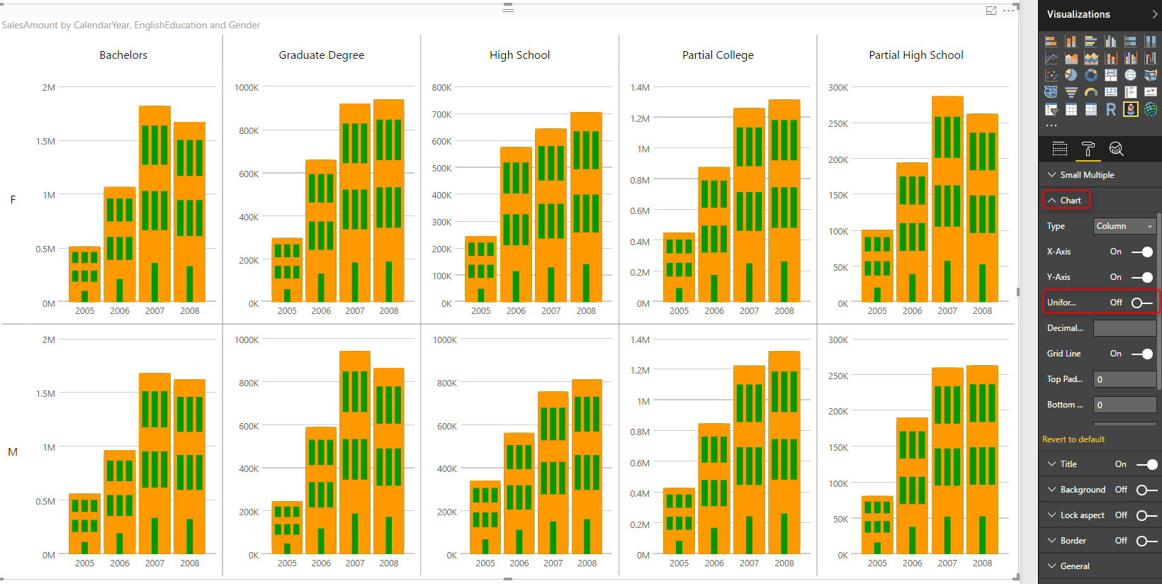
Now you can easily compare the ratio of values regardless of their sales amount. You can easily understand that Bachelors category for Male compared to Partial High School of male. bachelors is definitely doing better in terms of sales amount if you look at previous chart. but in this chart it shows that the sales for 2008 went down. however the sales for 2008 for high school went up. It is still lower in terms of $ value, but in terms of ratio it is better. So with this extra configuration you can get extra insight as well.
You can also change the Chart type to look at trend. You can change it to be Line Chart, Bar, or Column Chart.
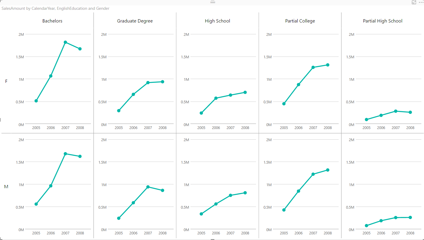
Example above shows when you change the chart type to Line. As you can see it gives you very insightful information to compare different education categories across different genders.
Summary
Infographic Designer is a visual that can build some nice and beautiful charts with infographic feature of that. However, never forget the best feature of this visual which is Multiples. This feature is unique for this visual, you can use it to generate more insightful visualizations and compare data across multiple dimension attributes. Have you found this chart useful? don’t hesitate to share your story with it here down in the comments below.


Reza is author of more than 14 books on Microsoft Business Intelligence, most of these books are published under Power BI category. Among these are books such as Power BI DAX Simplified, Pro Power BI Architecture, Power BI from Rookie to Rock Star, Power Query books series, Row-Level Security in Power BI and etc.
He is an International Speaker in Microsoft Ignite, Microsoft Business Applications Summit, Data Insight Summit, PASS Summit, SQL Saturday and SQL user groups. And He is a Microsoft Certified Trainer.
Reza’s passion is to help you find the best data solution, he is Data enthusiast.
His articles on different aspects of technologies, especially on MS BI, can be found on his blog: https://radacad.com/blog.