In the previous post,I have explained the main concepts and process behind the K-mean clustering algorithm. Now I am going to use this algorithm for classifying my Fitbit data in power BI.
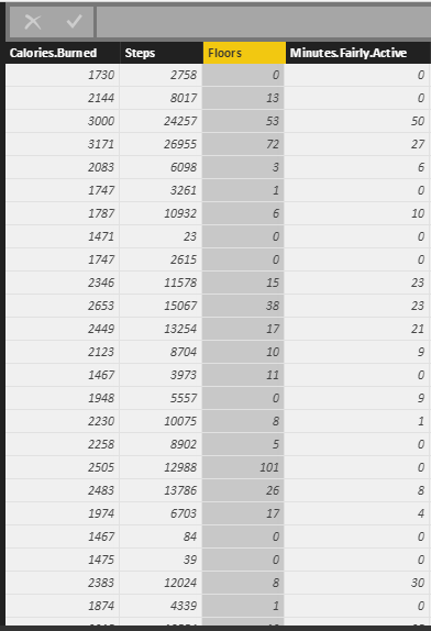
as I have explained in part 5, I gathered theses data from Fitbit application and I am going to cluster them using k-mean clustering. My aim is to group data based on the calories burned, number of steps, floors and active minute. This will help me categories my groups to “Lazy days”, “Working Days”, “Some Activities”, “Active Days”, and “Extremely Active” days.
First, in power BI, I clicked on “Edit Query”. Then I choose the “Run R Script” icon.
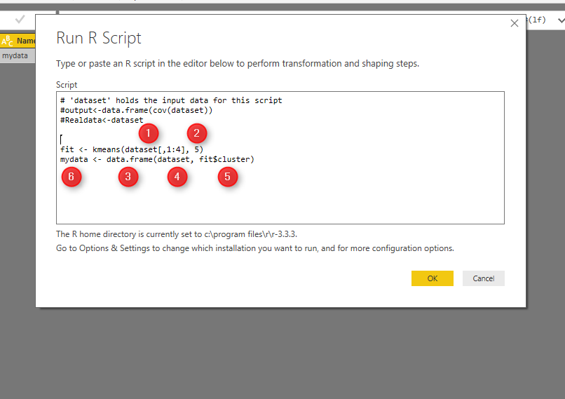
Next, write below codes in R editor (see below picture).
As you can see the data (fitbit data) is in variable “dataset”.
Kmeans function in R helps us to do k-mean clustering in R. The first argument which is passed to this function, is the dataset from Columns 1 to 4 (dataset[,1:4]). The second argument is the number of cluster or centroid, which I specify number 5. There is some approach to find the best number of cluster (which will be explain later).
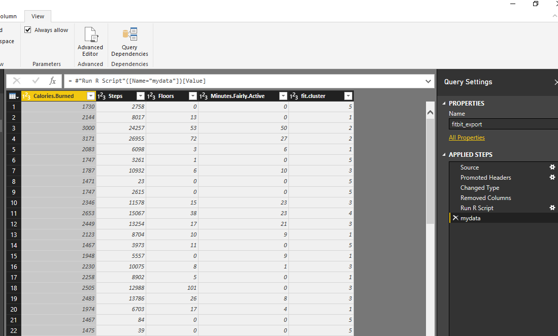
Tow the result of clustering will be stored in “fit” variable. Moreover, to see the result in power BI I need to convert dataset to “data.frame” format. so I called the function “data.frame” which gets “dataset” as the first argument. Moreover, the fit$cluster (result of k-mean clustering) will be added as a new column to the original data. All of these data will be stored in “mydata” variable. If, I push the ok bottom, I will have the result of clustering as new dataset.
see below picture. In data now each row has been allocated to a specific cluster.
We have run clustering, I am going to show the results in power BI report, using power BI amazing visualization tools!
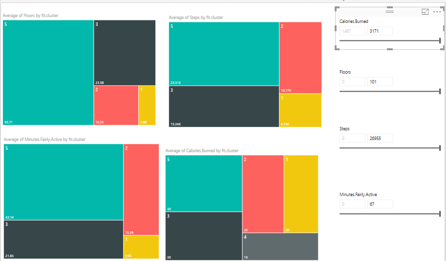
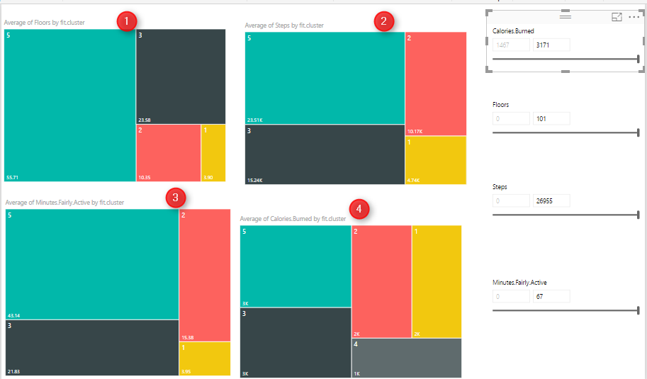
Created 4 different slicers to show “calories”, “floors”, “steps” and “activities”, I have four different heat map charts. Chart number 1 shows the average of” number of Floors” I did by different clusters, number 2 shows “average number of steps” by clusters, number 3 shows “average amount of active minutes” by clusters, and finally number 4 show the “average number of burned calories” by clusters.
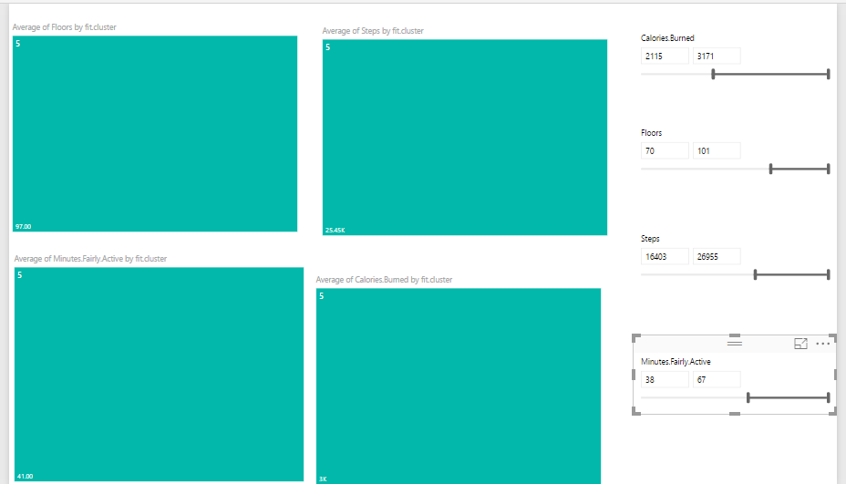
I am going to see if I burned between 2000 and 3200 calories, with 70 to 101 floors, and then with 16000 to 26000 steps and be active for 38 to 67 minutes I am belong to which cluster. as you can see it will be cluster 5.
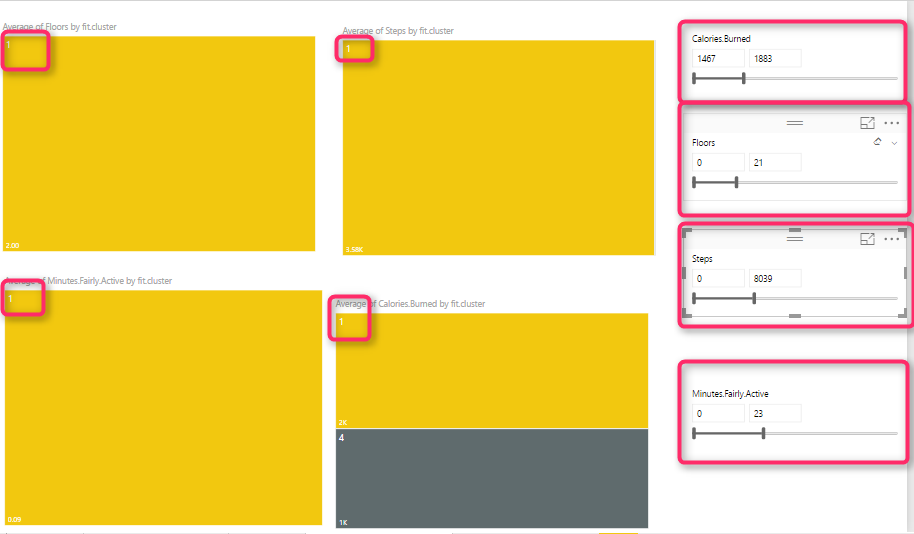
I did the same experiment and check different values to see the different cluster values as you can see below:
Another way of analysis can be done by comparing cluster 1 to cluster 2.
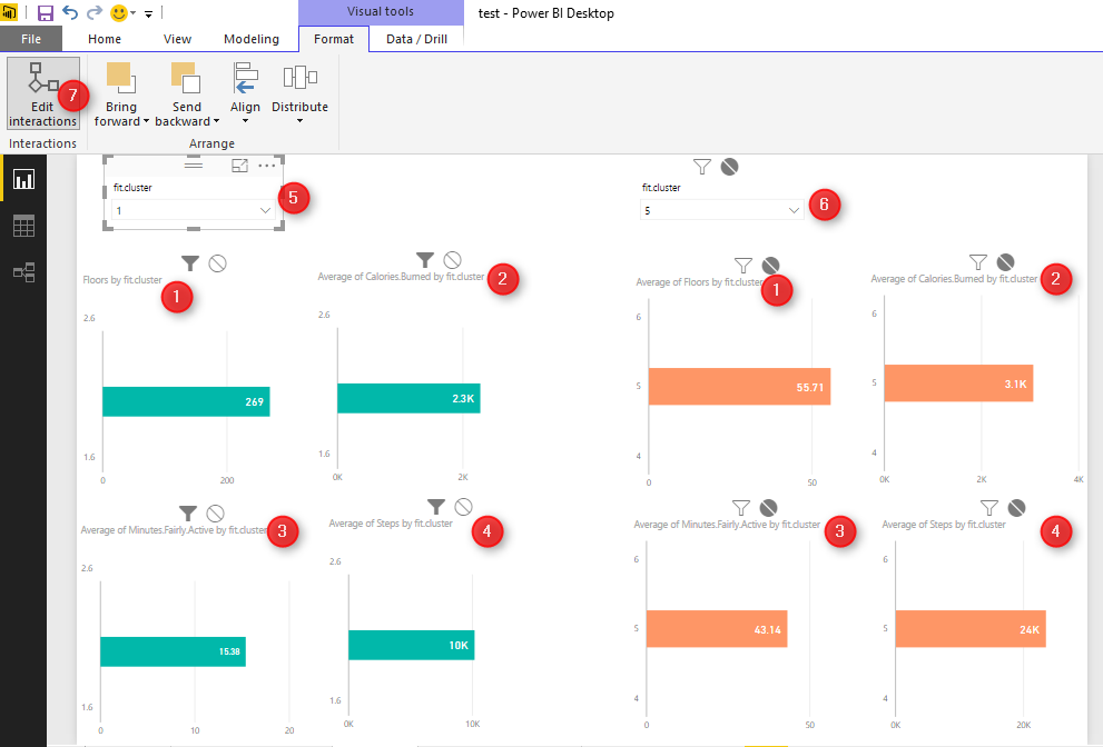
To do that, I have created the below reports for comparing these numbers. To create this report, I have two groups of charts (green and orange)
The first column chart (number 1) shows the “number of floors for each cluster”, charts number 2 in each group show the average “burned calorie” by cluster , chart number 3 show the “average active minutes”, and the last one shows the” average steps”. Then, I created two different slicers to select cluster numbers. Number 5 for first cluster and number 6 for second one. As you know selecting a number in each slicer will have impact on the other charts. To prevent the impact of slicer number 5 on orange chart, I click on “Format” tab in power BI, then I choose the “Edit Interaction” option, now I am able to select by clicking on each slicer which chart should change and which not. In the following example , for first slicer I chose cluster number 1, and for the other slicer I chose number 5. I am going to compare their result together.
The good thing about using R with Power BI is that you can benefit from the great interactive and nice looking charts in Power BI and hence better analyzing data with R algorithms. There are many other different ways that we can analysis these results to get better understanding of our data.
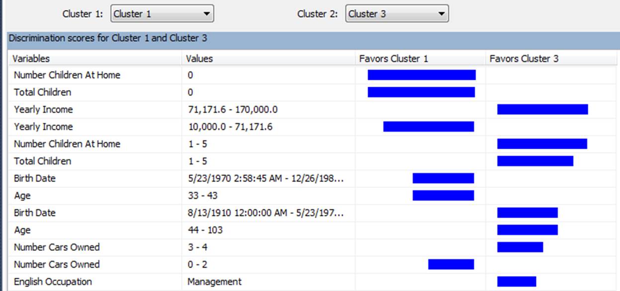
This visualization reminds me the “data mining” tools we have earlier in “Microsoft SSAS” see below:




Always your Fan Leila. Please attach the file as well.
Thanks so much for your support
I will do it soon
Hi Leila
Great article as always
Can you send the data file please ie the fitbit data
Regards
Graham
Thanks so much I put a reminder to put it soon, it need a bit admin work but welcome to email me I will send to you leila@radacad.com