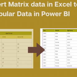
Convert Matrix data in Excel to Tabular Data in Power BI.
There is a common way of seeing data in Excel as a Matrix format; many data entries look like a matrix in many contexts, from accounting to health data. However, to better analyze data and add more calculations and charts and, in general, get more insight from data, we need to change the matrix data Read more about Convert Matrix data in Excel to Tabular Data in Power BI.[…]