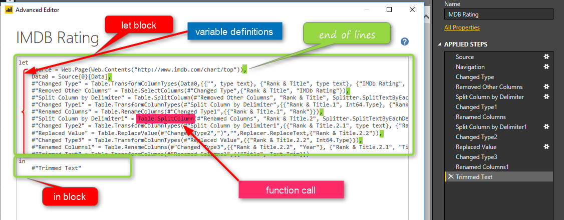
Integrate Power BI into Your Application: Part 1 – Register your App

Power BI Embedded, which I have written about it previously, brings the power of Power BI into your application. Power BI Embedded Recently had major changes. If you remember from my previous post, there were many limitations in the type of content you can embed into your application and the ways of interacting with it, Read more about Integrate Power BI into Your Application: Part 1 – Register your App[…]

Visualizing Data Distribution in Power BI – Histogram and Norm Curve -Part 2

In the Part 1 I have explained some of the main statistics measure such as Minimum, Maximum, Median, Mean, First Quantile, and Third Quantile. Also, I have show how to draw them in Power BI, using R codes. (we have Boxplot as a custom visual in power BI see :https://powerbi.microsoft.com/en-us/blog/visual-awesomeness-unlocked-box-and-whisker-plots/ ). However, to see the data Read more about Visualizing Data Distribution in Power BI – Histogram and Norm Curve -Part 2[…]

Power BI Premium. Is It For You or Not?

There were many announcements earlier this month about Power BI. One of them which was and still is the breaking news of all is Power BI Premium. Many of you already know that it is a new licensing plan, but how it works? Is this a licensing plan that works for you or not? What Read more about Power BI Premium. Is It For You or Not?[…]

K-mean clustering In R, writing R codes inside Power BI: Part 6

In the previous post,I have explained the main concepts and process behind the K-mean clustering algorithm. Now I am going to use this algorithm for classifying my Fitbit data in power BI.   as I have explained in part 5, I gathered theses data from Fitbit application and I am going to cluster them using Read more about K-mean clustering In R, writing R codes inside Power BI: Part 6[…]

Variable Width Column  Chart, writing R codes inside Power BI: Part 4

In the part 1, I have explained how to use R visualization inside Power BI. In the second part the process of visualization of five dimension in a single chart has been presented in Part 2, and finally in the part 3 the map visualization with embedded chart has been presented. In current post and next ones I Read more about Variable Width Column  Chart, writing R codes inside Power BI: Part 4[…]

ArcGIS Map in Power BI; Simple, But Insightful

I have written about 4 other types of map visual with Power BI before. In this post I want to explain how ArcGIS visual work as a map visual. There are some specific features in this visual which is simple to use, but will give you a lot of insight. With this type of map Read more about ArcGIS Map in Power BI; Simple, But Insightful[…]

One Data Set, Multiple Reports; Power BI Next Big Step Forward

You can use an existing data set with LiveQuery or DirectQuery connection as the shared data source for multiple Power BI reports. You can also create multiple reports from Power BI Service (website) connecting to the same data set. However, this new feature in Power BI Desktop version April 2017 is a big step forward; Read more about One Data Set, Multiple Reports; Power BI Next Big Step Forward[…]

Have more Charts by writing R codes inside Power BI: Part 3

In the previous parts (Part 1 and Part 2) , I have shown how to draw a chart in the power BI (Part 1) visualization. Also, in Part 2 I have shown how to present 5 different variables in just one single chart. In this post, I will show how to shows some sub plots in a Read more about Have more Charts by writing R codes inside Power BI: Part 3[…]

Have more Charts by writing R codes inside Power BI: Part 2

In the previous post (Part 1) I have explained how to write a simple scatter chart in the Power BI. Now in this post I am going to show how to present 5 different values in just one chart via writing R scripts. I will continue the codes that I wrote in the previous post  as below : Read more about Have more Charts by writing R codes inside Power BI: Part 2[…]