How to create Polar Charts

In this post I am going to show how to create a polar chart using R codes inside Power BI. imagin that we have below dataset about 4 main groups and their related values. I am going to show you how to draw different polar charts with different shapes. imagin that we have a bar Read more about How to create Polar Charts[…]

Draw Slope Chart in Power BI: Part 8

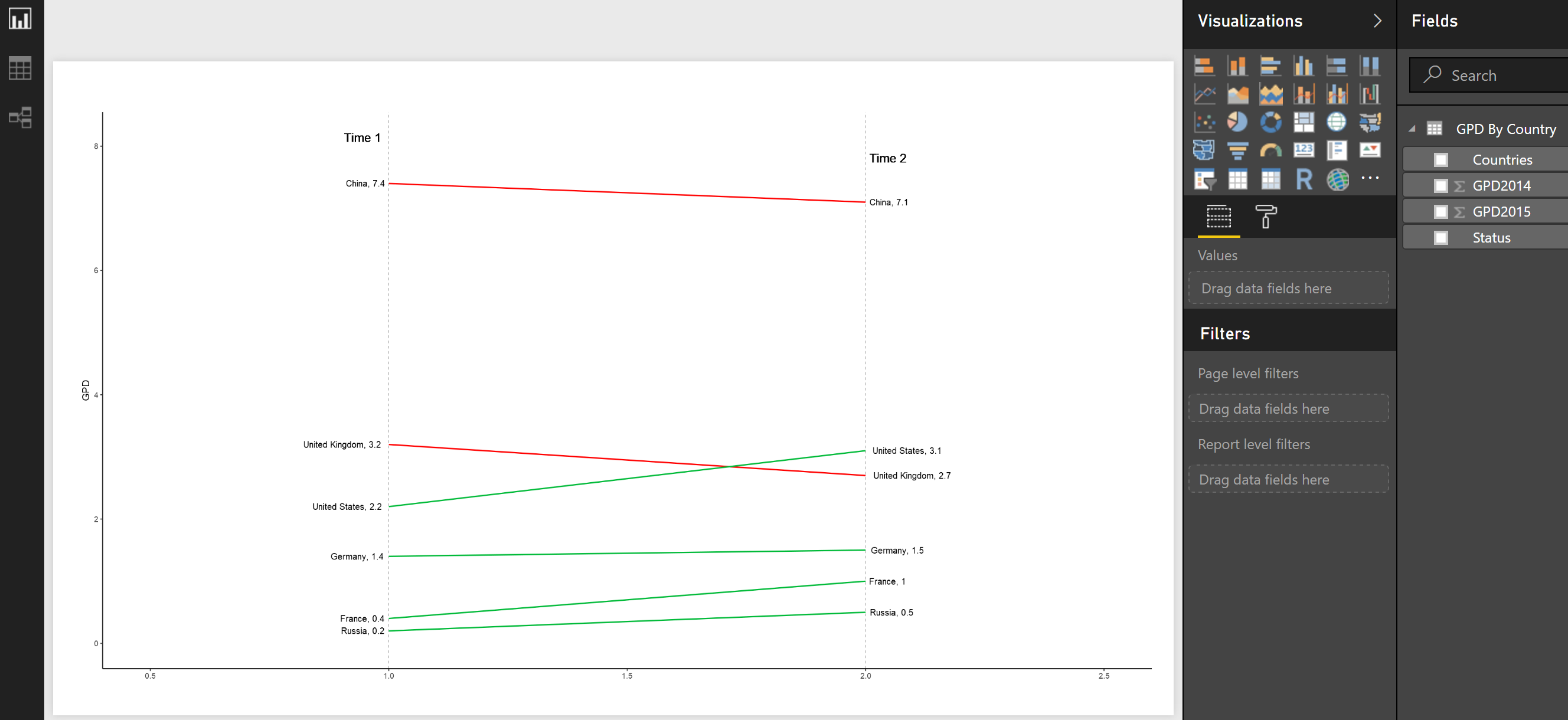
Slope chart can be used for comparing data between two different time periods. it is a very easy way to depict the difference between to time, two elements or any other two attributes. The slope charts can be used to study the correlation between variables or to study the change in the same variable between Read more about Draw Slope Chart in Power BI: Part 8[…]

New Series of Time Series: Power BI Custom Visual (Part 7)

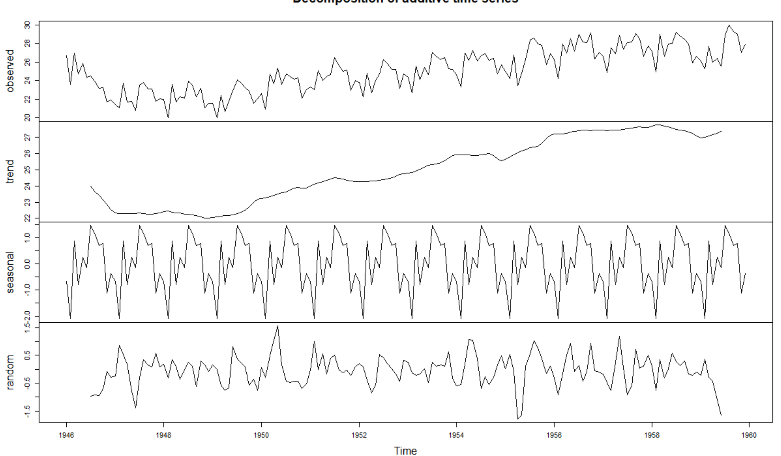
In the last three parts, I have explained about the time series R custom Visual we have in Power BI. as you remember we have 3 main time series chart in Power BI store (see below): Decompose of time series (trend, seasonality and irregular components). the two other custom visual help us to do forecasting Read more about New Series of Time Series: Power BI Custom Visual (Part 7)[…]

New Series of Time Series: Power BI Custom Visual (Part 6)

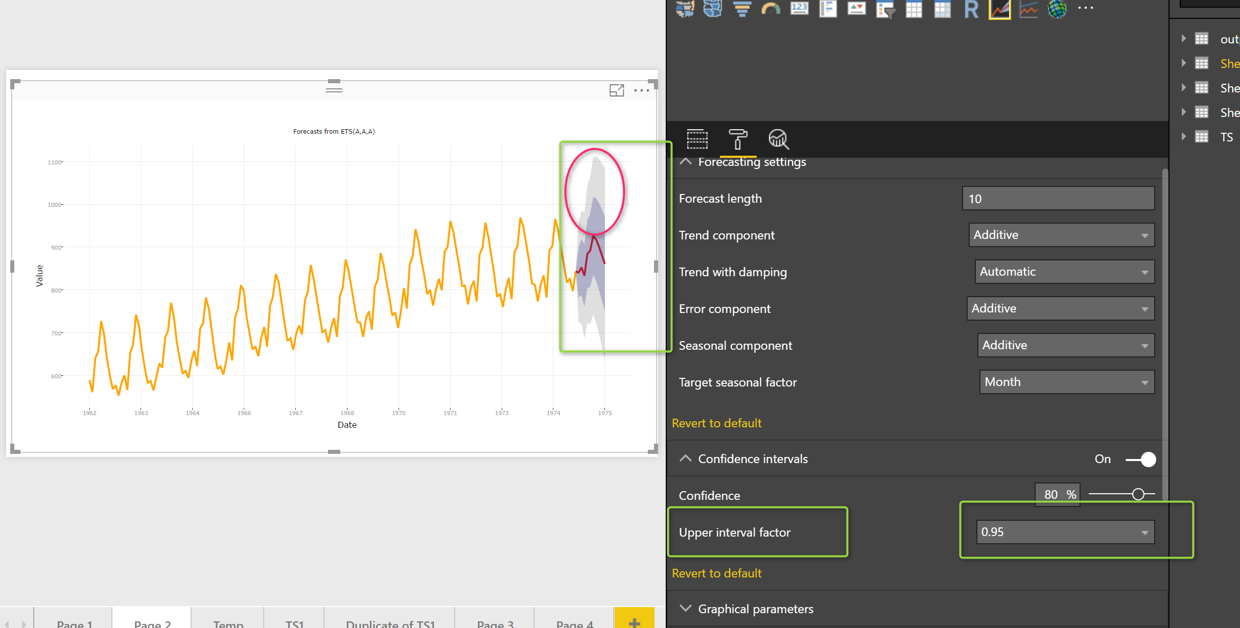
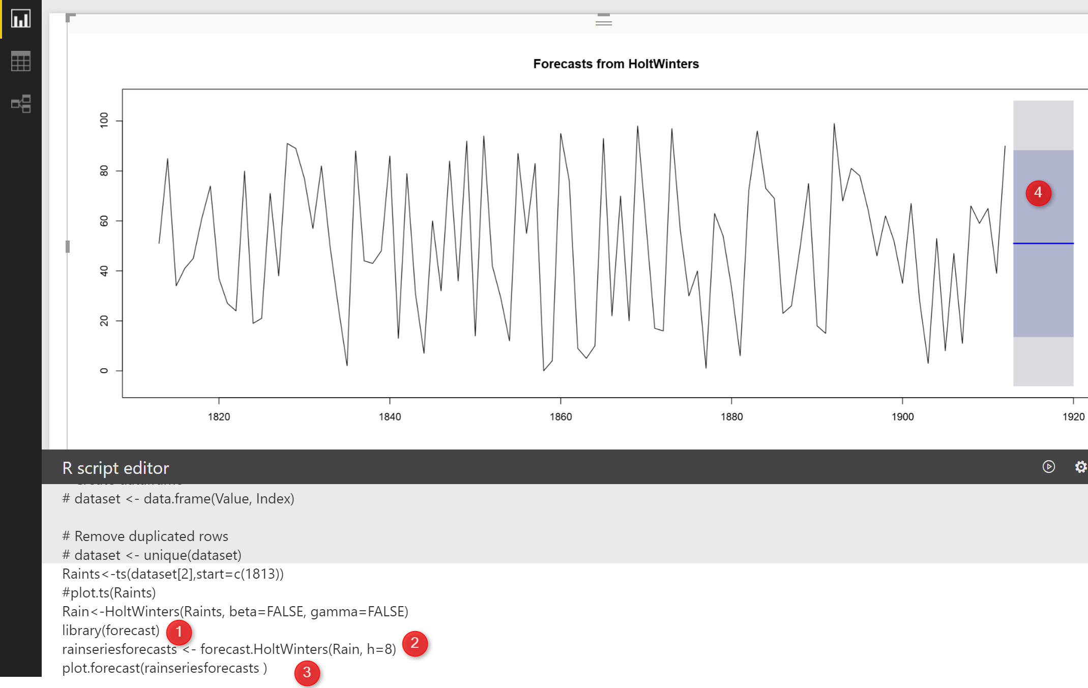
In the last post, I have explained how to do time series forecast using “Exponential Smoothing” approach in Power BI. I start to explain the main parameters that we need to set up. The main concepts behind of most of these parameters have been explained in previous posts (Post 4, Post 3, Post 2, and Read more about New Series of Time Series: Power BI Custom Visual (Part 6)[…]

New Series of Time Series: Part 3 (Holt’s Exponential Smoothing)

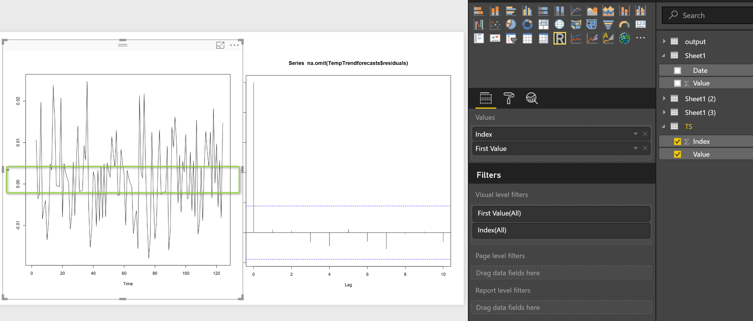
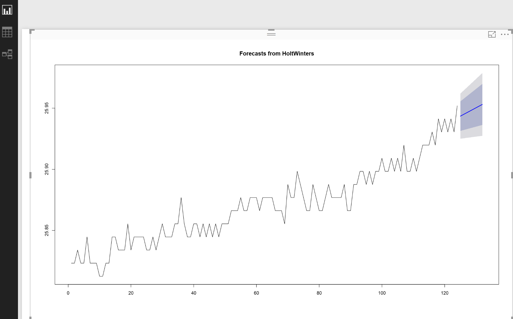
In the last posts, I have explained the main concepts behind the Timeseries (Post 1) and  in the second one a simple forecasting approach name as “Exponential Smoothing” has been proposed Post 2. In this post I am going to show how to do see the error of forecasting and also how to forecast when Read more about New Series of Time Series: Part 3 (Holt’s Exponential Smoothing)[…]

New Series of Time Series: Part 2 (Exponential Smoothing)

In the last post , I have explained the main concepts behind the timeseries. In this post, I am going to show how we can forecast for some periods. In the last post, I have mentioned that there is a possibility to have “seasonality” “Trend” and  errors (residual) in one dataset: Seasonality+Trend+Residual we call it as Read more about New Series of Time Series: Part 2 (Exponential Smoothing)[…]

Infographic Designer: Not Just Another Visual

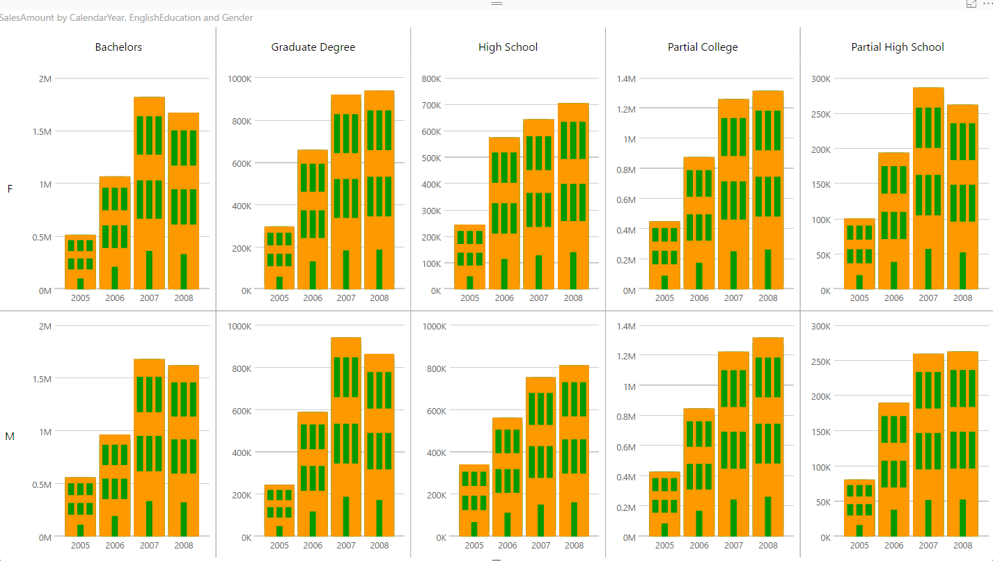
At the time of writing this post; there are already more than 97 custom visuals posted in Office Store. The list includes many interesting custom visuals. However, Infographic Designer is one of the visuals that is not just another visual. This custom visual has some unique features that you cannot see in many other visuals. Read more about Infographic Designer: Not Just Another Visual[…]

New Series of Time Series: Part 1

In this new series I am going to look at the time series models and how we able to use them for forecasting data. The first need in timeseries data is to have a series of data for years or for some qurdant. imagin that we have a time series data on birth rate from Read more about New Series of Time Series: Part 1[…]

Table with Embedded Chart in Power BI using R

Visualization is any kind of graphical representation that enable us to: Exploration, it help us to get more deep insight through huge amount of data Discovery, It also gives extra vision Analysis, it can be used to find pattern Communication, visualization help us to communicate better A few years ago Dr. Andrew Abela published a good Read more about Table with Embedded Chart in Power BI using R[…]

Interactive Charts using R and Power BI: Create Custom Visual Part 3

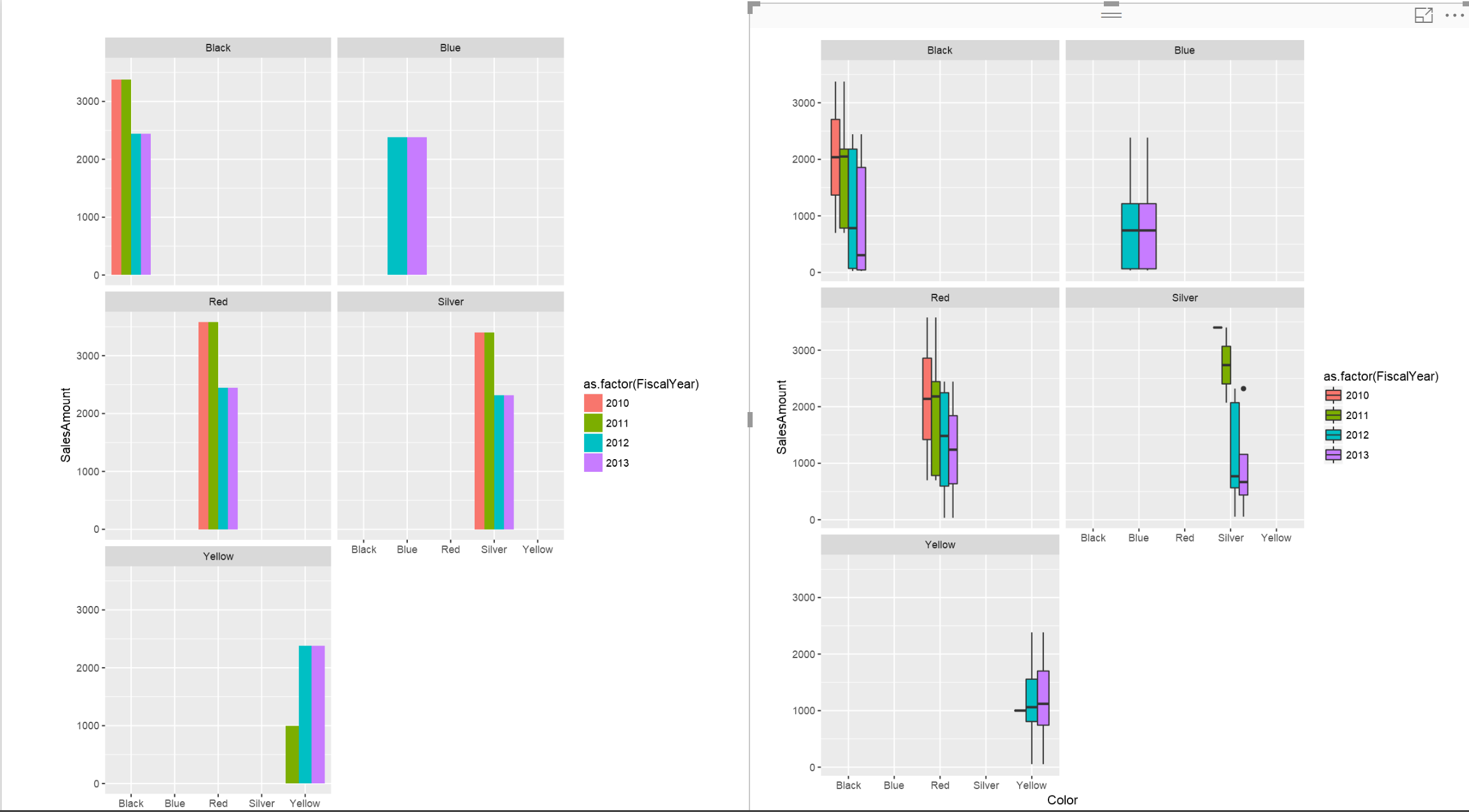
In the last two posts (Part 1 and 2), I have explained the main process of creating the R custom Visual Packages in Power BI. there are some parts that still need improvement which I will do in next posts. In this post, I am going to show different R charts that can be used Read more about Interactive Charts using R and Power BI: Create Custom Visual Part 3[…]