
I have written about profiling data and the importance of it in Power Query, I also explained how the profiling data can be prepared to create a report in Power BI for the user to understand the data better. And I explained how the error count of that can be added to the report. Another very important thing that can be added to the profiling report for your users is the distribution of values in each column. Users would gain a lot of benefits knowing how many of each value are there and how they are distributed. At the moment, this is only available in Power Query using Column Profile, In this article and video, I show you a technique to bring that information out of Power Query and into the Power BI report.
Video
Defining the problem
As a Power Query developer, you can open Get Data and Transform (Power Query Editor), and click on any column, and enable the Column profile and see the distribution of values in that column.
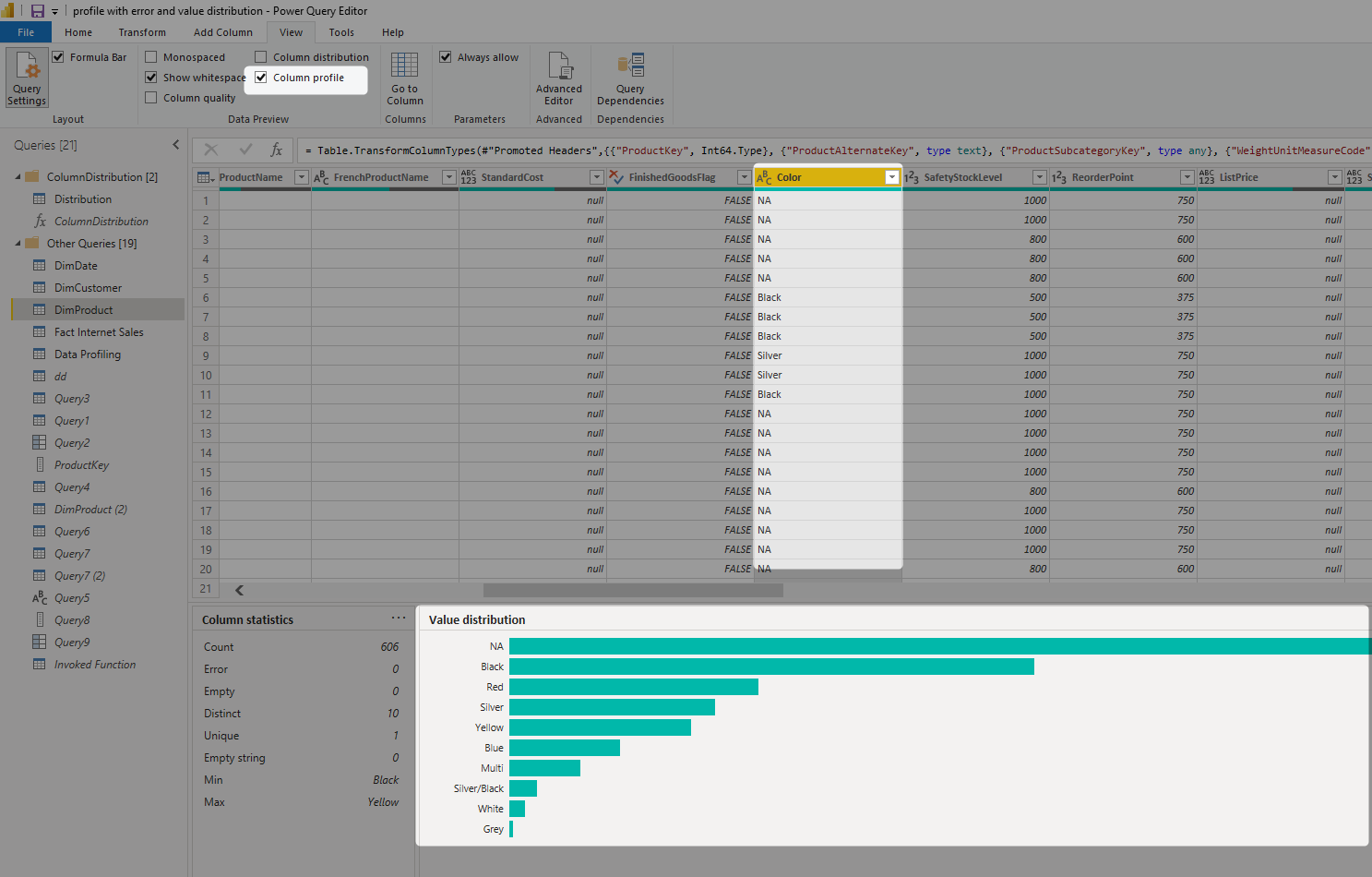
The information above is very helpful to learn more about the column’s data, and have a better data analysis solution as a result. For users in the organization, sometimes the information above can be helpful. However, they may not be familiar with Power Query to do the actions above. They like to have a Power BI report and see the value distribution as a report.
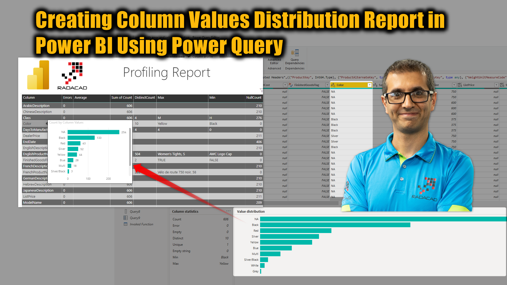
Having something like the below report will provide extreme value for some of your users to check the quality of the data.
As you can see in the screenshot above, the value distribution is added to the Power BI report as a tooltip for each column in the profiling report.
In this article and video, I’ll explain how it is possible. I do recommend reading these articles before to get the full picture of the scenario;
- Profiling data and the importance of it in Power Query
- How the profiling data can be prepared to create a report in Power BI
- How the error count of that can be added to the report
Value distribution table
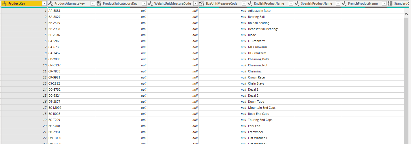
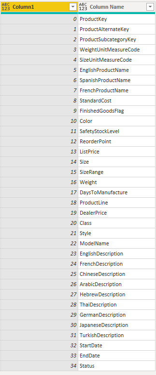
The first step towards creating the report is to create a table of value distribution. For example, the given data table is like the DimProduct below;
A value distribution table should have each column’s title in one row, and all the values of that column as another column beside it. The blow is how the value distribution table structured;
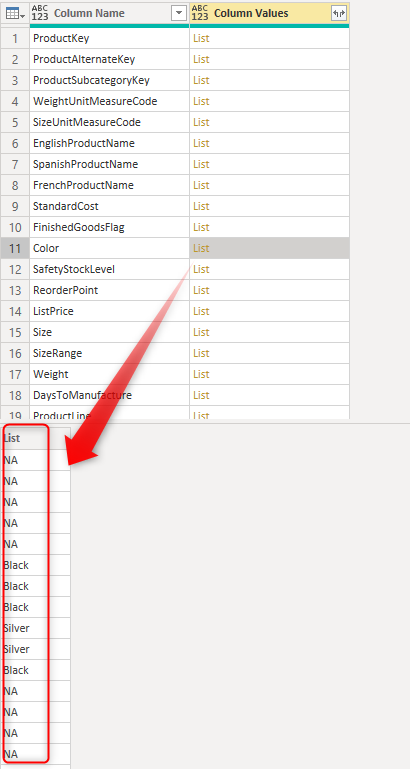
As you can see, each column’s data is structured as a list in a row with another column beside it which is the column header. The number of rows in the main table above is the same as the number of columns in the DimProduct table. Now, let’s see how we can achieve that.
Create a base table with the column count of the input table
The first step to create the base table is to create a table with the same number of rows as the count of columns in the DimProduct table, you can do that using this in a new blank query in Power Query Editor;
= {0..Table.ColumnCount(DimProduct)-1}
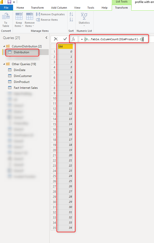
This will create a list of numbers starting from zero until the count of columns in the DimProduct minus one. The { and } are there to create a list. To learn more about list generators read my article here. The Table.ColumnCount is providing the count of columns in a table.
The structure above is a list, to convert it to a table, go to List tools, and Convert to Table.
Add column names to each row in the table
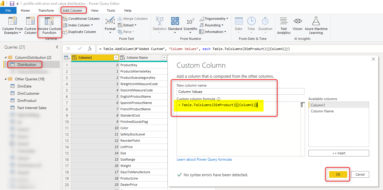
Then you can add column names to each row in that table, which can be done simply by adding a custom column under add column tab with the formula below;
Table.ColumnNames(DimProduct){[Column1]}
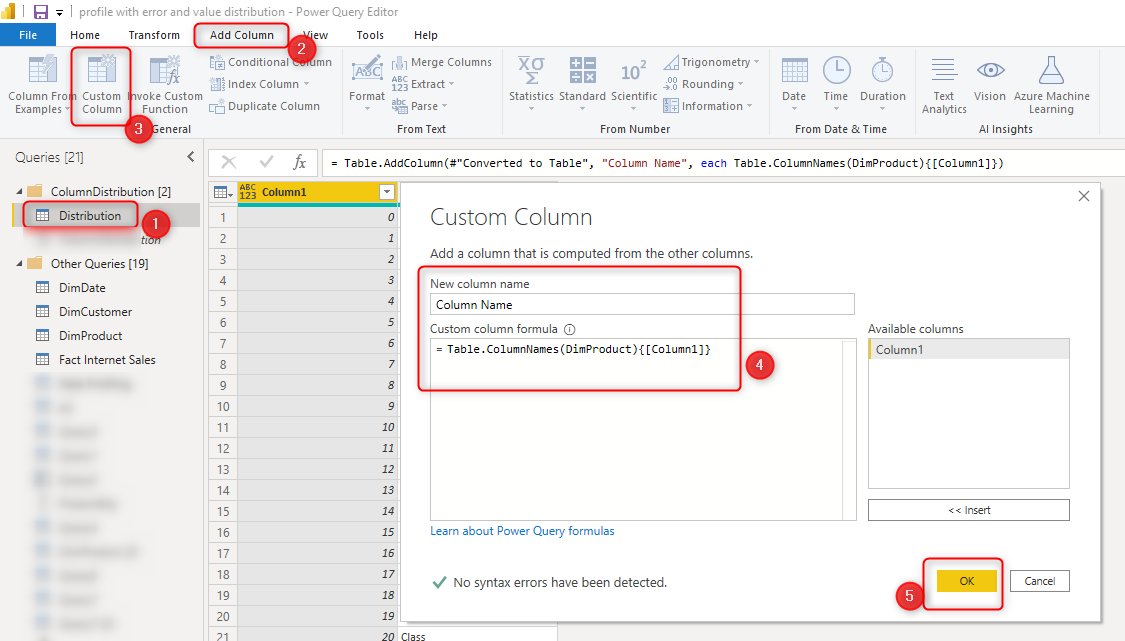
The Table.ColumnNames provides a list of column names, and then the {[Column1]} picks the specific indexed element in that list, which would be the column header. To learn more about navigation in a list read my article here. The output of this step will be as below;
Add values as a list to each row
Now we need to add the values of each column here. There is a very useful function in Power Query named Table.ToColumns, This function will give you a list of lists! each inner list will be the list of values in each column, and each list will be for one column. To use this, add another custom column with the expression below;
Table.ToColumns(DimProduct){[Column1]}
The Table.ToColumns function does the magic and brings a list of items, and we pick the one related to the specific column index. The result of this step will be as below;
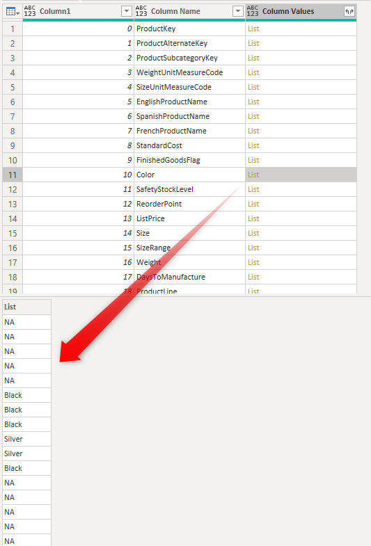
As you can see, each list in each row, represents all the values of a column from the DimProduct table. Now that the structure is ready, let’s calculate the distribution.
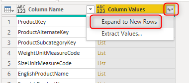
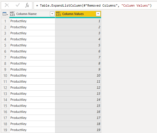
Expand all values
To build the value distribution, we first need to create a list of all values, which can be done simply by expanding the Column Values. As you can see I removed Column 1 from this table beforehand.
This will give us all the values in the “Column Values” column. Please note that this process might take time depends on the size of the table, especially if you have too many columns. The result will be as below;
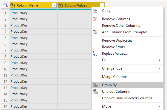
Count of distribution of each value in each column
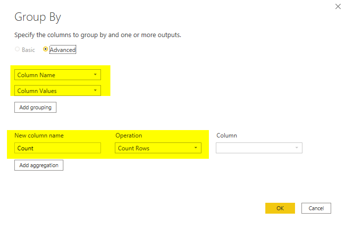
You need to apply a Group By transformation based on the two columns Column Name and Column Values, and get the Count as the output.
The group by configuration is as below;
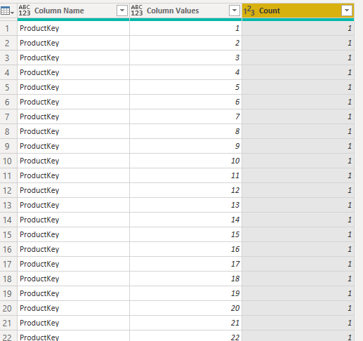
This will generate a distinct list of values in each column and the count of those values as below;
Visualize in the report
The value distribution table is now ready. All you need to do is to create a report page with it. An example report is as below;
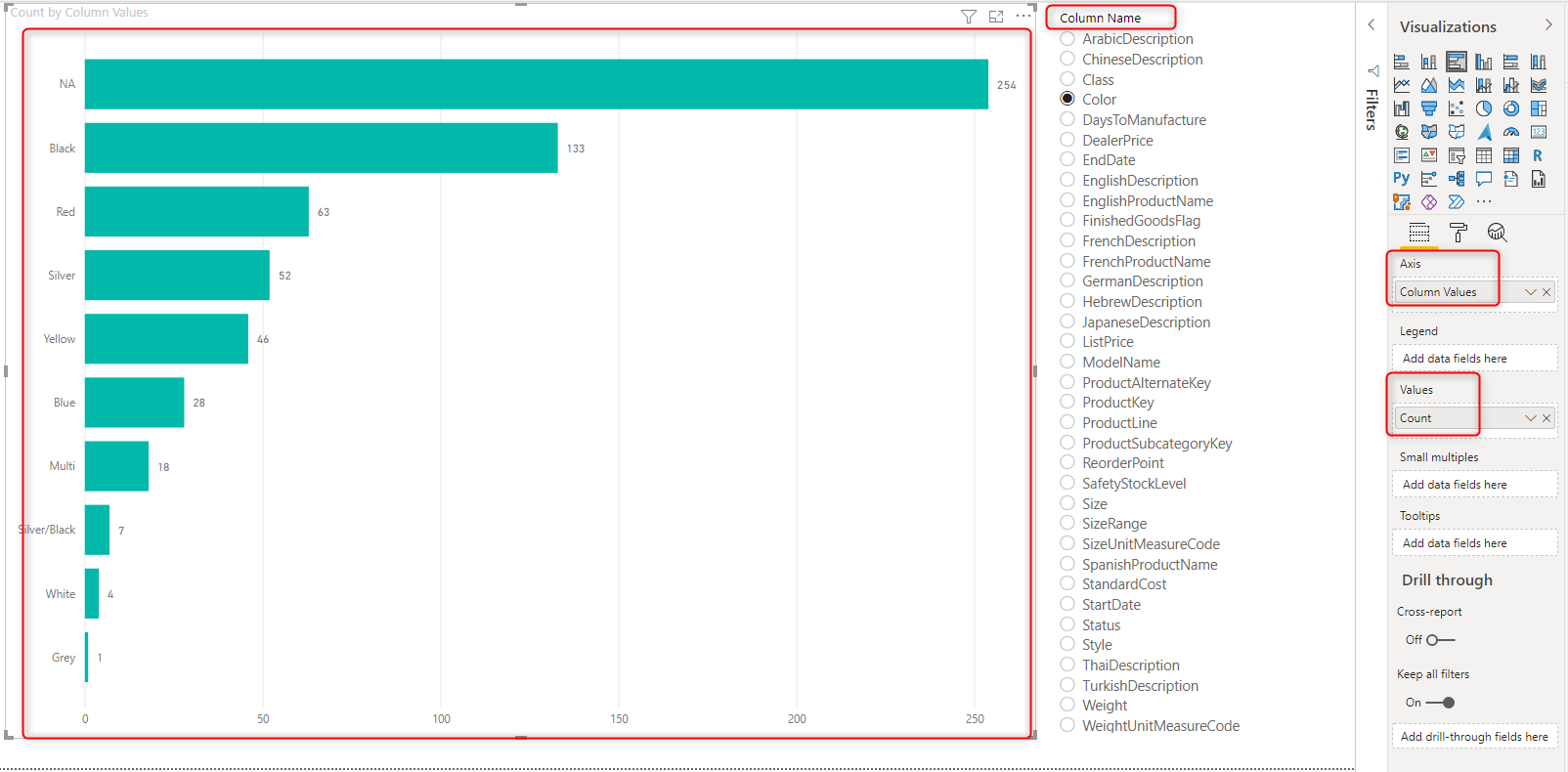
In the report above, the “Column Values” is used as the axis of the chart, and the Count is used as the values. Also, there is a slicer based on “Column Names”. By selecting each column, you can see the value distribution of that column.
Report page tooltip
If you have created a profiling report using the method I mentioned in this and this article, then you can add a report page tooltip using the value distribution and achieve a report like below. by hovering on each row in the table (which is a column in the given table) you will see the distribution of values as a tooltip.
Important Considerations
I have to mention some very important considerations here beforehand;
- The value distribution report can be very slow for large tables. Be careful when you are using it. You may need to reduce the columns and rows beforehand.
- Profiling data is not a luxury, it is a critical element. There is no use of a beautiful report with bad data quality, data profiling is an step towards fixing data quality issues.
- The method I mentioned here is just for one table. I’ll write the next article about using a function so that you can use it for other tables with ease. Stay tuned for that.
- If you have error values in your columns, then you may get some unexpected results in your ditribution table. I strongly recommend to check for errors first.
- Data profiling without error and exception report can’t be much of a use, consider implementing the exception reporting for errors too. I explained the method here.


Reza is author of more than 14 books on Microsoft Business Intelligence, most of these books are published under Power BI category. Among these are books such as Power BI DAX Simplified, Pro Power BI Architecture, Power BI from Rookie to Rock Star, Power Query books series, Row-Level Security in Power BI and etc.
He is an International Speaker in Microsoft Ignite, Microsoft Business Applications Summit, Data Insight Summit, PASS Summit, SQL Saturday and SQL user groups. And He is a Microsoft Certified Trainer.
Reza’s passion is to help you find the best data solution, he is Data enthusiast.
His articles on different aspects of technologies, especially on MS BI, can be found on his blog: https://radacad.com/blog.