
You’ve heard the news about Power BI Desktop release with bunch of new features. If you don’t, read blog post here to understand new features of Power BI. Waterfall chart is one of the new visualization elements in this product. For finance people this chart makes sense, but not everyone knows the usage of that. In this post I want to explain what is Waterfall chart, when to use it? and how to use it? So you would learn what’s Waterfall chart all about?
There are many charts that are self-explanatory, such as Bar chart, line chart…. Some charts might need a little bit working with to understand what is the best situation to use them, such as scatter chart (especially with play dimension). Some charts looks easy but you might not get their reason to exists, and the type of problem that they solve. From feedback that I’ve heard I think waterfall chart is in the latest category. But don’t be afraid, it is an easy chart. you only need to know when and how to use it.
What is Waterfall Chart?
Waterfall Chart is a type of chart that usually used for
“understanding the cumulative effect of sequentially introduced positive or negative values”.
Don’t blame me! I’ve get that definition from Wikipedia 😉 My simple definition however is: Waterfall chart is for analysis of up and downs for an additive measure. as an example you can analysis cashflow based on up and downs of it through all months of a financial year.
When to use Waterfall Chart?
You can also use waterfall chart for analysis of inventory, credit, performance, and everything else that falling or raising of its value matters. sequential of attribute that describe the value is also another helpful dimension of the waterfall chart. For example you want to know up and downs of performance through the last year with the sequence of quarters that you’ve done performance reviews.
So Don’t limit yourself, this chart visualize and tell many stories, just think big and find situations that you can use this chart to respond to the existing requirement.
How to use this Chart?
Easy! When you know the usage of chart, and you have the data set to work with, then just use Waterfall chart in Power BI Desktop. I’ll show it through an example to you.
Sample Data
I used the data set provided by Debra Dalgleish in this post. The data set is a cashflow data set as below:

As you see in above data set we have periods (months), base, up, down, and the cash flow. If you want to understand how the calculation of cashflow works. it is as below:
- Base of the start period is coming from previous period (year) balance.
- Base of each period is the Base from previous period + Up of previous period – Down of the previous period
- CashFlow is equal to Up minus Down
- value of End of Period calculated in the same way of base for each period
- As an example B3=B2+D2-C2 (this formula continues to down with numbers changed based on rows)
So Let’s use this data set in the Power BI.
Extract the Data
I just fetch the data from the excel file as is. with no changes. the only change I make is to add an Index Column to it (this index column will be used for sorting later on);

After adding the index column and changing name of the query to CashFlow. I’ll start preparing the model.
Modelling
There is only one data table in our model, so modelling shouldn’t be a problem. However there are some changes that I like to make as below:
- Changing Format of columns (Base, Down, Up, and Cash Flow) as Currency

- Change Sorting of Period Column to be based on Index column

For doing above change; select Period column first, then from Modeling tab, click on Sort By Column, and then choose Index. If you don’t apply this change waterfall chart will sort periods based on their alphabetical order.
Visualization
Go to Report tab. double click on Waterfall chart from Visualizations pane in the right hand side.
You have to set only two parameters:
- Category: Set it to Period
- Y Axis: Set it to Cash Flow

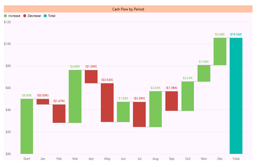
As you see in above chart, the cashflow and its up and down showed beautifully in the chart. Order of period category is also right, and that is because of the Sort By Column setting we’ve done in previous section.
You can apply formatting as you want to this chart, like changing colors, backgrounds, title and so on. I just like to set data labels for now.

Result
And this is the final chart (with few formatting):
Video


Reza is author of more than 14 books on Microsoft Business Intelligence, most of these books are published under Power BI category. Among these are books such as Power BI DAX Simplified, Pro Power BI Architecture, Power BI from Rookie to Rock Star, Power Query books series, Row-Level Security in Power BI and etc.
He is an International Speaker in Microsoft Ignite, Microsoft Business Applications Summit, Data Insight Summit, PASS Summit, SQL Saturday and SQL user groups. And He is a Microsoft Certified Trainer.
Reza’s passion is to help you find the best data solution, he is Data enthusiast.
His articles on different aspects of technologies, especially on MS BI, can be found on his blog: https://radacad.com/blog.
Hi Reza,
I have no issue using an excel data source. The trouble i have is using a SQL table as it might require more transformation. Also, i need to see an equipment maintenance KPI visualisation as most examples i see model business/commercial problems.
Hi Often.
You can do whatever transformation needed using Power Query to prepare your data in a way that it can be used for this visual.
Cheers
Reza