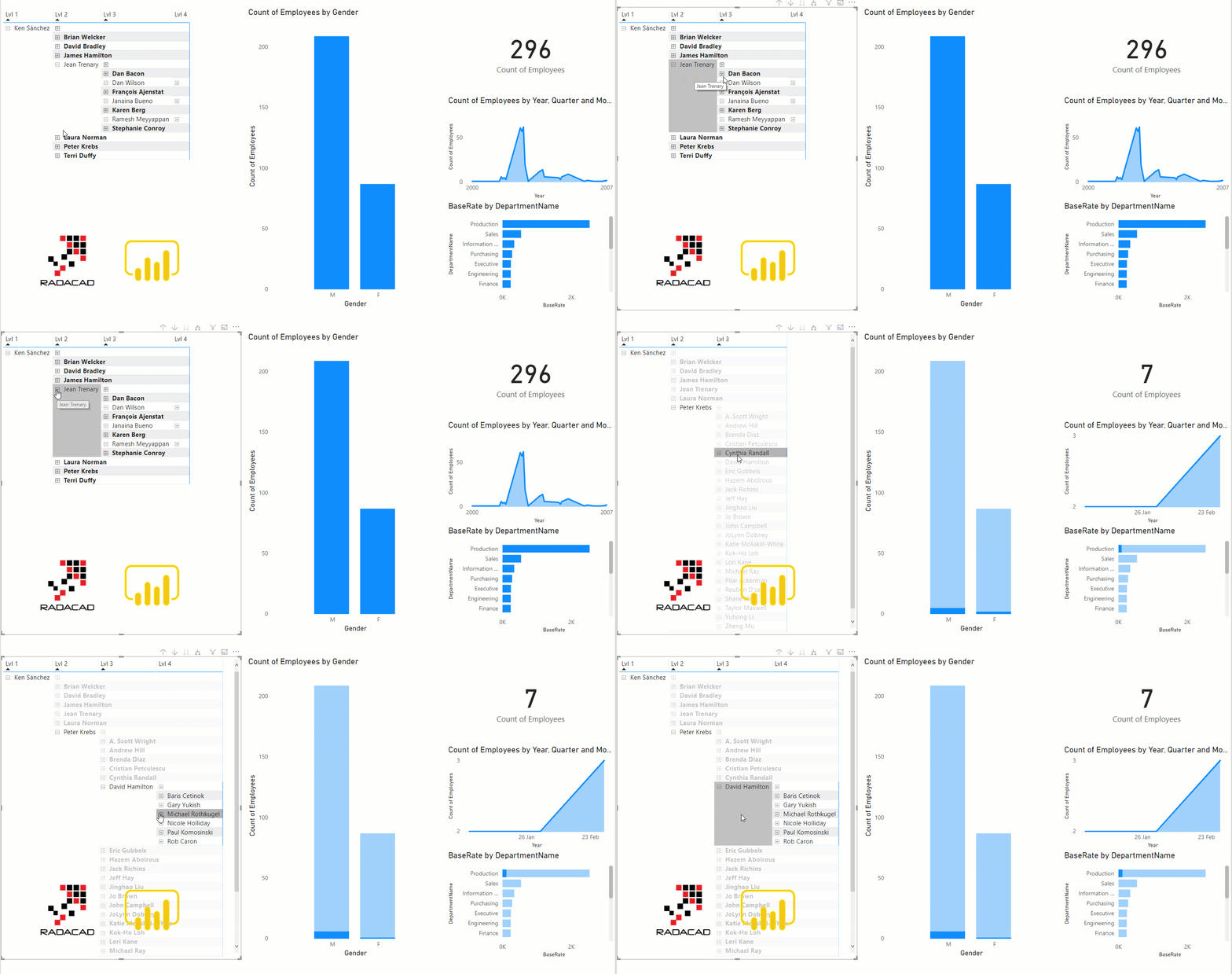
I have previously written how to create a ragged hierarchy, which can be used for organization hierarchy or chart of accounts or similar scenarios. A ragged hierarchy is a hierarchy with un-even number of levels. In a parent-child scenario of organization hierarchy, for example, the CEO is the highest level of the organization, so won’t have 2nd or 3rd level, but someone down in the hierarchy would have two or three levels of management on the top. Using DAX parent-child functions, you can create a set of columns for this type of hierarchy, which I have explained here. However, modelling this data is one thing, visualizing it is another thing. When you have a hierarchy with un-even number of levels, how you can visualize it? Let’s see. If you want to learn more about Power BI, read Power BI book from Rookie to Rock Star.
What is a Ragged Hierarchy?
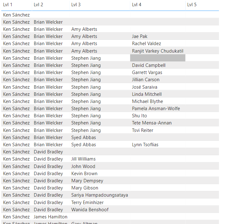
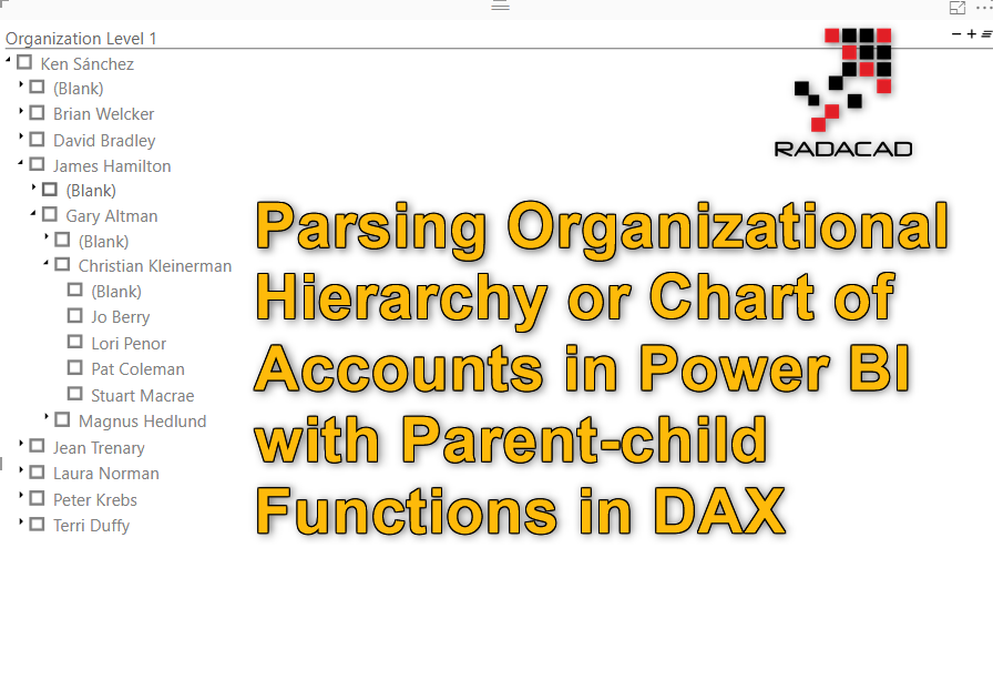
A ragged hierarchy is a hierarchy with an uneven number of levels, an organizational chart is a good example of that. Down below, Ken Sanchez is the top-level manager, but Rachel Valdez is a level 4 employee;
How to build a Ragged Hierarchy using Parent-Child DAX functions in Power BI
If you like to learn about how to build a hierarchy (like the one that I use in my sample dataset here), read this article:
A Custom Visual: Hierarchy Slicer
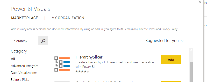
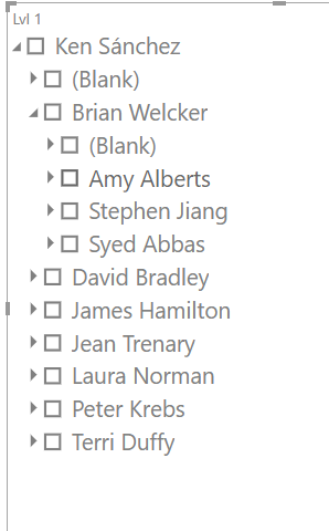
One easy way to visualize this data is the Hierarchy Slicer as a custom visual, which you can add from the AppSource;
This visual is a custom visual, means it is not supported by Microsoft. Jan Pieter Posthuma created this visual (Great community effort, and thanks to him), which is a great visual for working with hierarchies and showing it as a slicer:
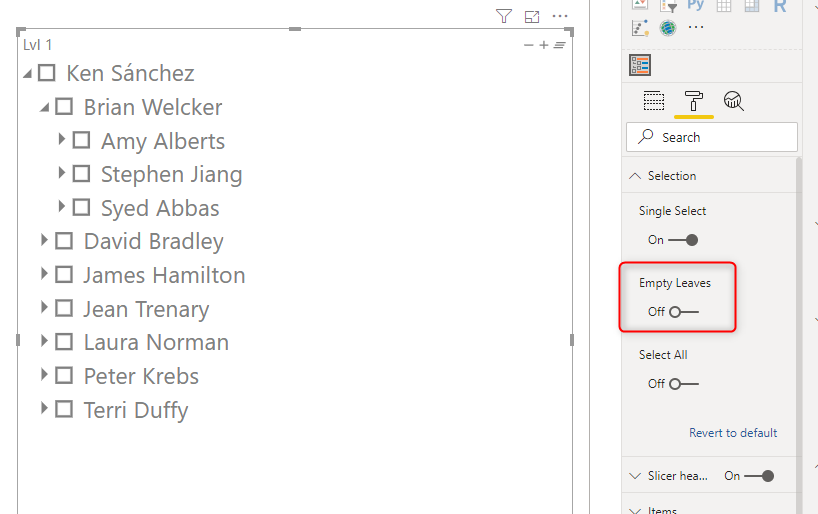
If you want to turn off blank values that you see in the visual (which belongs to nodes with no leaves), you can go to the Selection tab, and set the Empty Leaves to be Off
This visual is working great. However, for a large number of rows, it has a performance issue. So let’s see what other options you have to visualize this hierarchy.
Matrix Visual
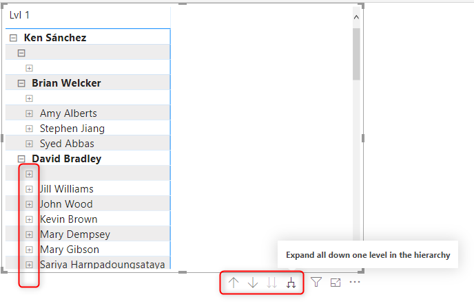
Matrix visual has the ability to show a hierarchy, and you can navigate through the hierarchy using the buttons related to it. Here I explained what each hierarchy navigation button does and how to use it.
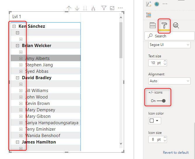
There is also a +/- button besides items in the Matrix visual which is helpful in navigating through the hierarchy. If you don’t see that button, here is how to enable it:
Under Format of the Visual -> Row Headers -> turn the +/- icons On
What about Blanks?
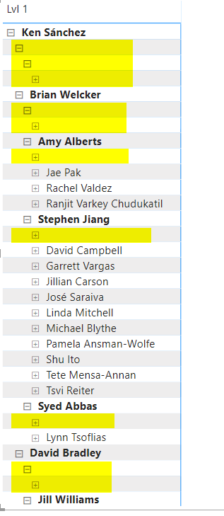
One of the issues with using Matrix visual for a ragged hierarchy is that it will show blank values like this:
Unfortunately this visual, unlike the Hierarchy Slicer, doesn’t have the option to turn off the empty leaves. On the other hand, if you use the filter on the visual, it will remove the whole row, which is not what we want. We want the data to be there, but the empty leave to not to expand. Here is a workaround for this:
NO Stepped Layout
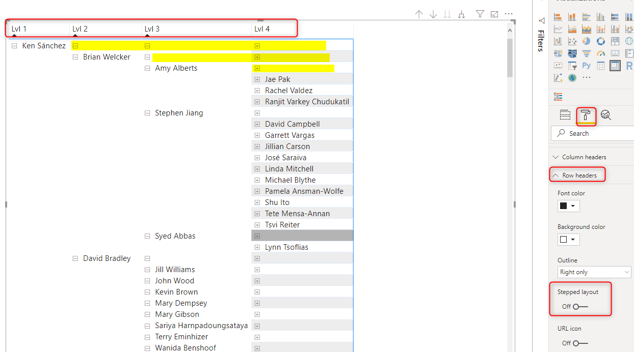
You can set the Matrix visual in Power BI to not use the Stepped Layout which is the default layout. This option is under Format -> Row Headers -> Turn off the Stepped Layout
This option will bring the other levels as other row headers (or let’s say additional columns) in the Matrix. And the main benefit of this method is that then the blank values are all in the same row as the node itself. which can be more appealing than an extra node or layer.
Turn Off Subtotals
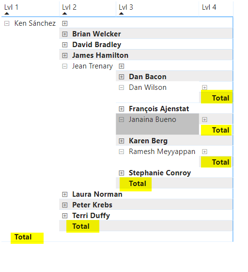
Another enhancement in the layout is to turn off extra subtotals. The normal look and feel of the Matrix visual will be like this:
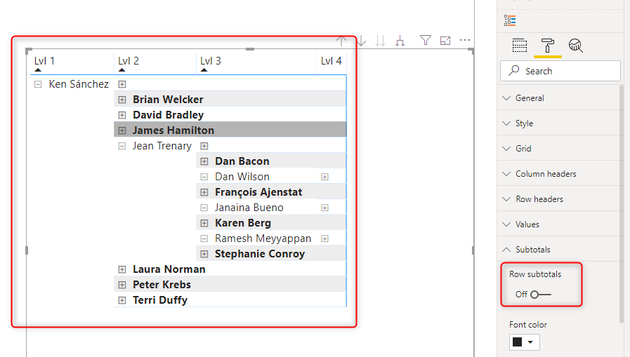
As you see, it has lots of total rows in it, which you might not want, you can turn off subtotals, and get a better view of the visual;
Now I have the Matrix visual acting very similar to the Hierarchy Slicer, with this difference that I can have other fields in it (because it is a Matrix visual), and it has a very good performance too.

The method showed here in this blog post is not a solution, it is a workaround. Until the ability to disable empty leaves becomes available in the Matrix visual, it can be used in the ragged hierarchy implementations.



Great workaround but I think there are a few limitations with this solution if you have a report that has multiple pages – ie: the Matrix visual cannot be synchronised across multiple pages. Any ideas with this scenario is – (Our Org does not allow Non Cert Visuals so I’ve been on the lookout for an alternative and this would be good apart from the fact lots of reports do have multiple pages….)
Kind Rgds,
It won’t be synchronized like a slicer. However, you can use drill through filtering to create a master-detail page like what I explained here.
Cheers
Reza
There’s actually a way using ISINSCOPE, it’s not perfect but pretty good! See this vid:
https://youtu.be/YEuxONjCl1A
Hi Alex,
Yes, that is also a very good method of removing blanks 🙂
I might write about InScope DAX function sometimes later.
Cheers
Reza
There’s one problem with the Matrix method described above: it squeezes out the space on the visual for the actual data being presented. So if you go even maybe 3 levels down on your hierarchy, you no longer have any visual space left to view your data.
True
but you can use the parent-child page using Drillthrough, and from one page drill through to another page, this will give you extra space for visualizations.
Cheers
Reza