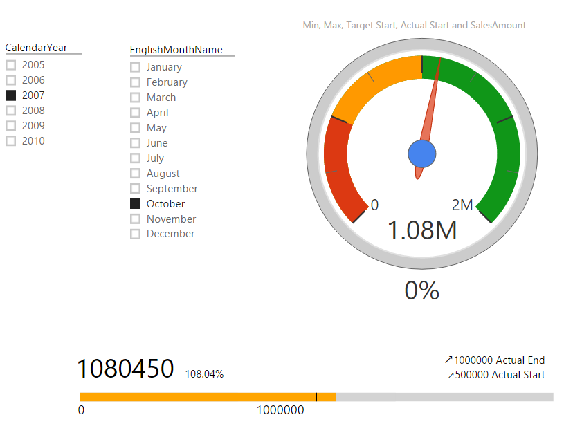
KPIs and Power BI; Visualization Aspect
In every reporting solution you might feel KPI as a requirement. KPI or Key Performance Indicator is a measure for business to understand how they are acting in specific area that is very import for their business. Power BI supports built-in visualization for KPI, and there are also some good custom visuals that can be Read more about KPIs and Power BI; Visualization Aspect[…]