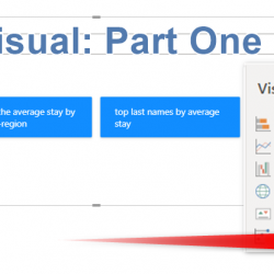
Introduction to Decomposition Tree Visual Part One

Decomposition Tree allows you to visualize the data regarding various dimensions. It is all about the aggregation of data and drills down. In the first post about this feature, I am going to show how this works for a simple decomposition task, in the next posts, I will show you how embedded AI in this Read more about Introduction to Decomposition Tree Visual Part One[…]

Say No to Export Data, Yes to Analyze in Excel: Power BI and Excel Can Talk!

Despite the fact that I have explained about the Analyze in Excel feature in Power BI before, still, I hear and see many users are using the Export data option in Power BI much more. In this post, I am explaining what is the difference and why it is better to use Analyze in Excel Read more about Say No to Export Data, Yes to Analyze in Excel: Power BI and Excel Can Talk![…]

Calculating Stock on Hand Using DAX: Power BI Inventory Model

You don’t have always the luxury of having a snapshot fact table that has the stock on hand value for every single day, at every single workshop, and for every single product. Even if you want to build such a table, it can get easily gigantic. In this blog post, I am going to show Read more about Calculating Stock on Hand Using DAX: Power BI Inventory Model[…]

Removing the Total Value for a Column in the Table Visual of Power BI Using ISFILTERED

Table visual is one of the most commonly used visuals. In Power BI, you can turn off the total row (when it won’t make sense to have the total) entirely. However, you cannot turn off the total for some columns and keep it working for the others. Using a DAX function, you can, however, do Read more about Removing the Total Value for a Column in the Table Visual of Power BI Using ISFILTERED[…]

Sentiment Colors for Gauge Visual in Power BI

Gauge Visual is a great visual for KPIs, however, the Gauge visual in Power BI doesn’t have the sentiment colors as an option. Sentiment colors make a gauge much more understandable, you can easily find out is the value high, low, or in the mid-range. Fortunately, there is conditional formatting that can help. In this Read more about Sentiment Colors for Gauge Visual in Power BI[…]

Compare Period Over Period Breakdown in Power BI Using the Waterfall Chart

The Waterfall chart is a good visualization to show you changes on value over a sequence, The sequence can be time, or date or workflow steps, etc. There is also an ability in this chart that may not be visible to everyone, and that is the breakdown option of this chart. You can use the Read more about Compare Period Over Period Breakdown in Power BI Using the Waterfall Chart[…]

Currency Exchange Rate Conversion in Power BI with Live Rates – Part 2

In the previous part of the currency exchange rate conversion, I provided a function script that you can use to get live rates using a free API. In that part, you learned how you can create a table in dataflow using live rates. In this part, I will show you how you can use the Read more about Currency Exchange Rate Conversion in Power BI with Live Rates – Part 2[…]

Currency Exchange Rate Converter Power BI Function – Part 1

If you ever need to convert amounts from one currency to another, you face the challenge that currency rates are not constant. They change every day. You either need to keep an up-to-date table of all new currency rates and use that in your Power BI solution, or use a function that gets the rate Read more about Currency Exchange Rate Converter Power BI Function – Part 1[…]

Sort a Column with a Custom Order in Power BI

I have previously written about how to sort a column by another column, and I used Month Names as an example. However, still, many are unaware that the same technique with slight modifications can be applied to any other columns. You can have a text column in your slicer (product category for example), and sort Read more about Sort a Column with a Custom Order in Power BI[…]

Caution When Using Variables in DAX and Power BI

I have written another blog post about variables previously and explained how useful variables are. Variables in DAX are helpful in both readability and also the performance of your code. However, there are scenarios that you have to be careful when you use variables. Because variables are stored, they might return a result that is Read more about Caution When Using Variables in DAX and Power BI[…]