Loop Through On-Premises Files with Power BI and Schedule it to Refresh Automatically

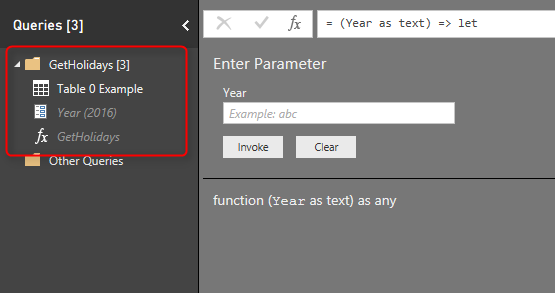
Previously I’ve explained a method of looping through number of files in a folder which used Custom Functions. This method is preferred method buy not always working with Schedule Refresh and gateway setup, because scheduled refresh doesn’t always support custom functions in the code. So I this post I show you a second method that Read more about Loop Through On-Premises Files with Power BI and Schedule it to Refresh Automatically[…]

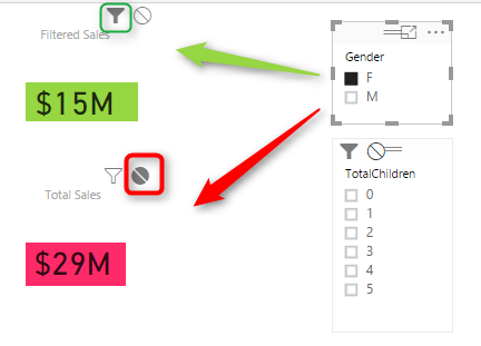
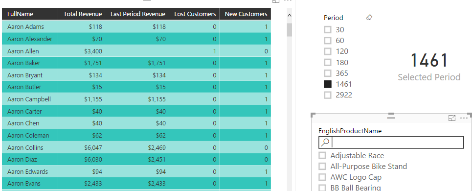
Filtering Slicer Resolved in Power BI

You can filter all visuals in Power BI except Slicer! In fact slicer itself is a type of filter, however there are some times that number of items in slicer is too many. So this is normal that we want to filter the items in the slicer itself. Unfortunately current version of Power BI Desktop Read more about Filtering Slicer Resolved in Power BI[…]

Stream Analytics and Power BI Join Forces to Real-time Dashboard

Few weeks ago, I’ve written how REST API can be used for real-time dashboard in Power BI. Another method for real-time dashboard is using Azure Stream Analytics. This can be combined with Azure IOT and Event Hub to get data from IOT devices. In this post I’ll explain to you all steps necessary to push Read more about Stream Analytics and Power BI Join Forces to Real-time Dashboard[…]

Power BI Story in PPT Slides with Comments

This is not story of Power BI in Power Point slides. This post is about how to use Power Point integration with Power BI for story telling of Power BI reports and dashboards through slides, and also give some users features such as commentary. This features is not a new feature, it has been released Read more about Power BI Story in PPT Slides with Comments[…]

Power Behind the Line Chart in Power BI; Analytics

Line chart is one of the most basic charts that you can see in every visualization tool. Power BI like other visualization tools has the line chart visualization which is good for showing one or two measure’s value across an axis which can be a category, time period and etc. Recently Power BI line chart Read more about Power Behind the Line Chart in Power BI; Analytics[…]

Grouping in Power Query; Getting The Last Item in Each Group

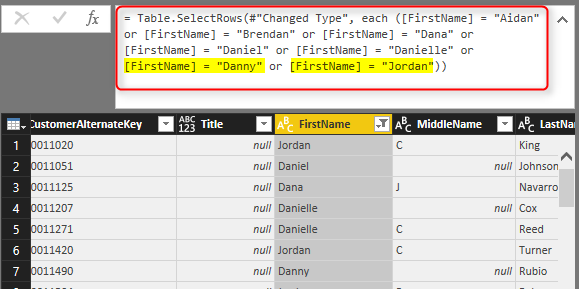
Power BI or Power Query in Excel (or Get Data and Transform as the new name of it) can do many data transformations. One of these transformations is grouping rows by number of fields. If you use the graphical user interface in Power Query for Power BI or Excel you have number of options to Read more about Grouping in Power Query; Getting The Last Item in Each Group[…]

Monitor Real-time Data with Power BI Dashboards

I’ve hear this a lot in my presentations that “Does Power BI support real-time data?”, And I answer yes. In fact this feature was available long time ago with Azure Stream Analytics and Power BI, however recently some new changes happened in this area which allows Power BI dashboards to monitor real-time data changes on Read more about Monitor Real-time Data with Power BI Dashboards[…]

Bring the Power into Your Application; Power BI Embedded

Power BI which released at July 2015 targeted business analysts and power users. From that time Power BI team made massive enhancements, and with each enhancement the user market of Power BI expanded. Recently Power BI take a big step forward with bringing developers as users. Power BI Embedded is the Power BI reporting solution Read more about Bring the Power into Your Application; Power BI Embedded[…]

Storytelling with Power BI Scatter Chart

Column or Bar chart can be easily used for showing a single measure’s insight across a category. Mixed charts such as Line and Column chart can be used for showing two measure and comparing their values across a set of categories. However there are some charts that can be used to show values of three Read more about Storytelling with Power BI Scatter Chart[…]