
Banding (or binning or grouping) is a scenario that can be implemented both statically and dynamically in Power BI. Dynamic banding means selecting the bin (or band) configuration, and the banding changes based on the user selection of the slicer. Imagine that we have a count of customers by their age groups, but then we can change the number of bins that we have age groups in it. for example, instead of having 10 age groups, we split it into 20, or less. Having a slicer for configuring the number of bins, and then a DAX calculation that gives you the result of each bin is what I am going to explain in this article.
Banding, Grouping or Binning
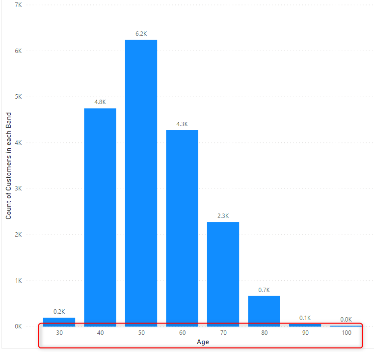
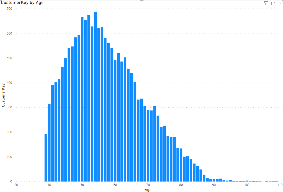
Banding (or grouping or binning), means splitting a numeric data type into buckets or groups. Let’s say, we have customers with all ages, but we want to group them in age buckets of 10. one bucket would be 1 to 10, another from 11 to 20, etc. Here is an example of those buckets in the X-Axis of a chart;
Banding can be done statically using any of the methods below;
- Using Power Query Conditional Column
- Using Grouping and Binning in Power BI
- Using DAX Calculation
Sample Dataset
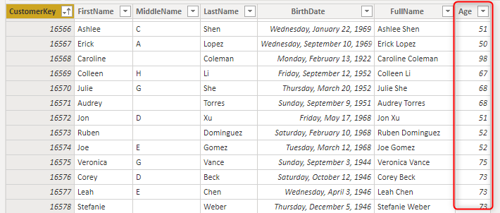
I have a DimCustomer table with a few columns about each customer, and one of the columns is Age. If you are interested to learn how the age is calculated, read my article here about calculating the age in Power Query.
Desired Dynamic Banding
However, sometimes, you need the banding to be dynamic. Dynamic banding means that user can select (through a slicer) how many buckets (or bins or bands) is needed, and then the calculation changes based on that. Here is what we need:
Now, let’s see how this is possible.
Age Band Table
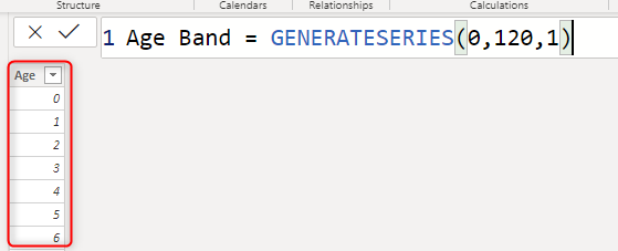
This solution is only one of the methods for implementing this scenario. There are, of course, other methods too. In this method, First I have strated with creating an Age Band table with all possible age values.
Age Band = GENERATESERIES(0,120,1)
This table is then related to the DimCustomer using the Age column;
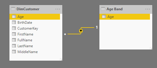
The relationship above means that I can have Age from the Age Band table as the X-Axis to filter the count of customers in the DimCustomer table;
Now for the dynamic banding, here is the list of steps:
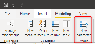
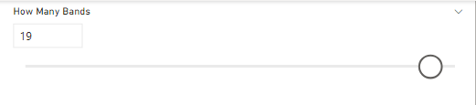
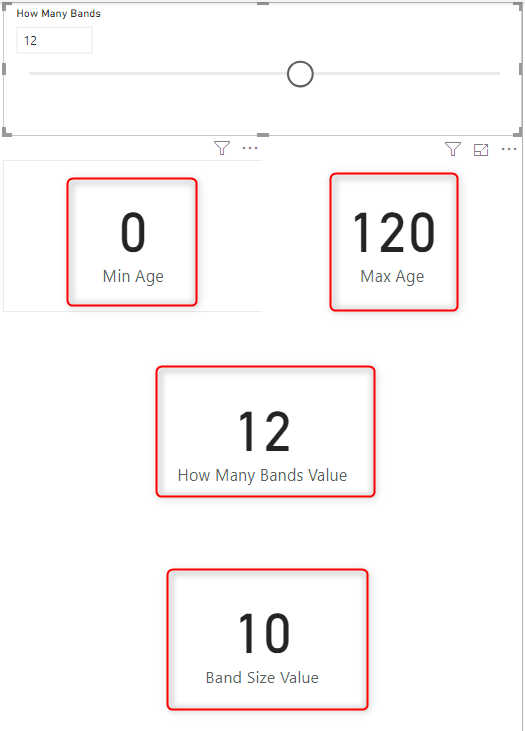
Count of Bands; What-If Parameter
Create a What-if parameter for the count of bands,
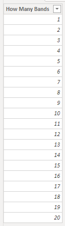
the what-if parameter to start from the minimum count of band you want (let’s say 1), to maximum (let’s say 20), and the increment value (let’s say 1). That would create a table like this:
How Many Bands = GENERATESERIES(1, 20, 1)
this is how the table looks like:
To learn more about the GENERATESeries function in DAX, read my article here.
When you add the what-if parameter, you will also have a measure using the SELECTEDVALUE as below;
How Many Bands Value = SELECTEDVALUE('How Many Bands'[How Many Bands],1)
This what-if parameter is now a slicer on your page.
DAX Measures
You can add a few measures for helping with the final calculation, or combine them all in one measure. I split it here, because it helps the process of learning. Here are my measures:
Min Age is the measure that shows the minimum age value;
Min Age = MINX(ALL('Age Band'),'Age Band'[Age])
Max Age is showing the maximum age value;
Max Age = MAXX(ALL('Age Band'),'Age Band'[Age])
Band Size Value is a measure that calculates what is the size of the band, based on the count of bands, and minimum and maximum value;
Band Size Value = INT(
        DIVIDE(
            [Max Age]-[Min Age],
            [How Many Bands Value]
            )
        )
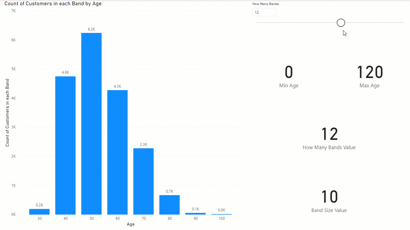
For example, if the band count (How Many Bands) in the slicer is selected 12, then the size of the band is (120-0)/12=10. Each band would be covering 10 years.
Count of Customers in Each Band
This is the measure that does the main function of our dynamic banding. This measure’s expression first finds out what is the band of the current age in the X-Axis, and calculates the count of customers for that band, but only shows the value for the band’s head (which is the age that the band starts from). Here is the expression:
Count of Customers in each Band =
var _minAge=[Min Age]
var _maxAge=[Max Age]
var _bandSize=[Band Size Value]
var _AgeBandTable=GENERATESERIES(_minAge,_maxAge,_bandSize)
var _currAge=SELECTEDVALUE('Age Band'[Age])
var _bandHead=MAXX(
    FILTER(
    _AgeBandTable,
    [Value]<=_currAge),[Value])
var _bandTail=_bandHead+_bandSize
return
if(_currAge=_bandHead,
CALCULATE(
    COUNTROWS(DimCustomer),
'Age Band'[Age]>=_bandHead && 'Age Band'[Age]<_bandTail
))
To explain new parts in this expression, here are the details:
_AgeBandTable is a virtual table of all bands, this is created dynamically;
var _AgeBandTable=GENERATESERIES(_minAge,_maxAge,_bandSize)
_currAge is giving us the Age value in the X-Axis:
var _currAge=SELECTEDVALUE('Age Band'[Age])
The _bandHead calculation is a filter of the _ageBandTable to find out the band for the selected Age;
var _bandHead=MAXX(
    FILTER(
    _AgeBandTable,
    [Value]<=_currAge),[Value])
Based on the _bandHead and size, now the Tail is calculated:
var _bandTail=_bandHead+_bandSize
The return value is the count of rows from DimCustomer when the age value is between head and tail;
if(_currAge=_bandHead,
CALCULATE(
    COUNTROWS(DimCustomer),
'Age Band'[Age]>=_bandHead && 'Age Band'[Age]<_bandTail
))
Altogether, this measure returns the count of customers in each age band that is dynamically selected by the slicer;
Count of Customers in each Band =
var _minAge=[Min Age]
var _maxAge=[Max Age]
var _bandSize=[Band Size Value]
var _AgeBandTable=GENERATESERIES(_minAge,_maxAge,_bandSize)
var _currAge=SELECTEDVALUE('Age Band'[Age])
var _bandHead=MAXX(
    FILTER(
    _AgeBandTable,
    [Value]<=_currAge),[Value])
var _bandTail=_bandHead+_bandSize
return
if(_currAge=_bandHead,
CALCULATE(
    COUNTROWS(DimCustomer),
'Age Band'[Age]>=_bandHead && 'Age Band'[Age]<_bandTail
))
And you can test the final results here. As you see, the user can dynamically choose how many bands are needed, and everything changes based on that;
In the next article, I’ll explain how you can do dynamic banding using the SIZE rather than the COUNT of buckets. Until then, have fun DAXing!
Download Sample Power BI File
Download the sample Power BI report here:
Video


Reza is author of more than 14 books on Microsoft Business Intelligence, most of these books are published under Power BI category. Among these are books such as Power BI DAX Simplified, Pro Power BI Architecture, Power BI from Rookie to Rock Star, Power Query books series, Row-Level Security in Power BI and etc.
He is an International Speaker in Microsoft Ignite, Microsoft Business Applications Summit, Data Insight Summit, PASS Summit, SQL Saturday and SQL user groups. And He is a Microsoft Certified Trainer.
Reza’s passion is to help you find the best data solution, he is Data enthusiast.
His articles on different aspects of technologies, especially on MS BI, can be found on his blog: https://radacad.com/blog.
Thanks for the wonder full video ..!
if suppose I have Barchart and I have text data in the x-axis ..because we have lot of data ..so need to scroll more to get the right data.
instead why cant we create a slicer kind of visual .for zoom in and zoom out option as you are explaining in binning and grouping ..so that we can see all the data based on slicer moment.
we already have this facility in other BI Tools …
Can you please let me know if you have any quick fix to this issue
Hi,
Zooming can be useful. there is an idea about it here, but only got 50 votes, you can go and vote for it, and evangelize it so it gets enough votes to be added into the backlog of Power BI team then 🙂
Cheers
Reza