
Power BI doesn’t have a built-in calendar visual. Although there are some custom visuals for building a calendar, however, custom visuals come with some limitations sometimes. In this article and video, I explained how you can use built-in visuals to create a calendar visualization in your report.
Video
First step: Custom Date Table
The first step towards a calendar visual is to have columns such as the DAY NAME (Saturday, Sunday, Monday ….), Start of the week Date, Year, Month, etc. You can get these much easier if you have a custom Date table. I have a full script of the Power Query date table, which you can simply copy and paste into a blank query. Download the script for the Date table from here:
If you choose your own version of the custom Date table, then ensure you have columns such as below;
- Day name
- Day of week
- Month name
- Month number
- Start of week
- Year
Sort by Column
Once you have the columns above, then ensure that you have the right column sorting. Because text columns by default are sorted alphabetically. You can use the method mentioned here to sort a column by another.
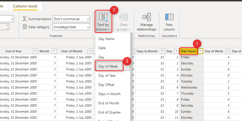
You have to select the label column (Day name), then from the Column tools menu bar, select Sort by column, and then choose Day of Week. Here you can read more information about it;
You need to;
- Sort Month name by Month number
- Sort Day name by Day of week number
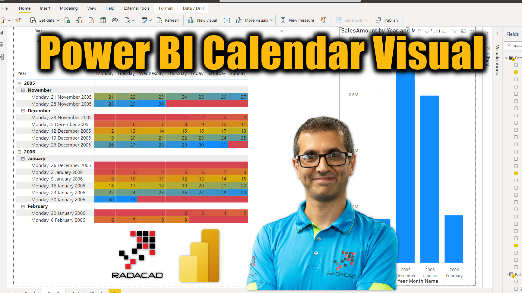
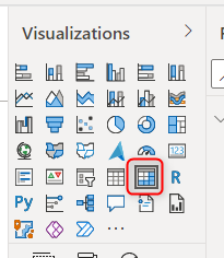
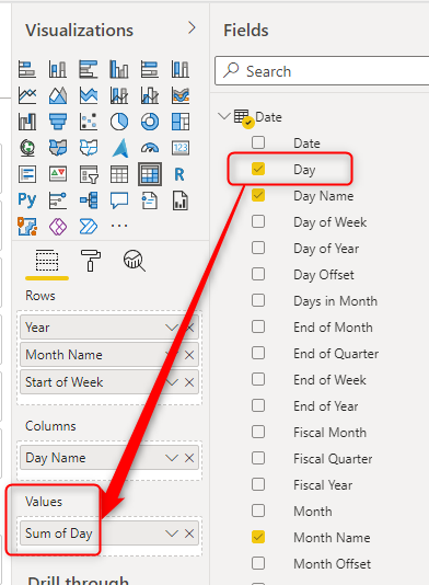
Matrix Visual
Once the setup is ready as above, then you can add a Matrix visual to your report. Matrix visual is helpful for our scenario because we can have both row headers and column headers.
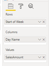
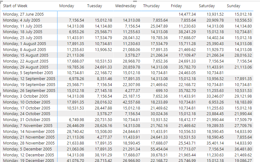
Use Day Name as Columns and Start of Week as Rows. It would be also helpful if you show value in the Values section, such as SalesAmount in my example below;
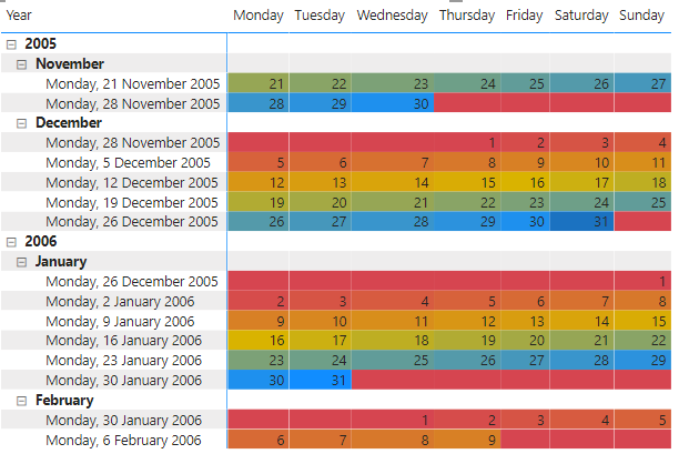
This gives you a visual like below;
You can enhance the visual by adding the Year and Month names into the Rows as higher levels of the hierarchy.
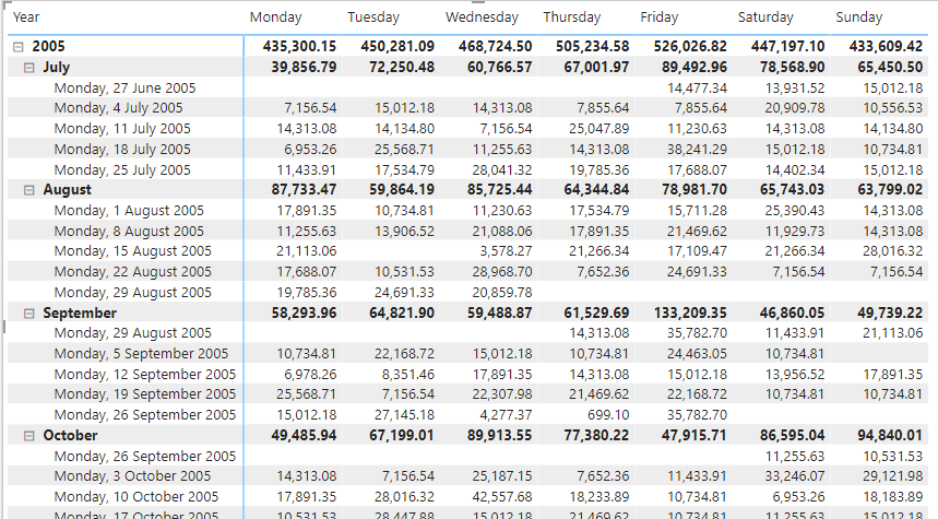
Well, here you go. This is the calendar visual, in which you can actually select an area and it filters other visuals.
- Selecting a cell filters the data for a cell
- Selecting a column filters the data for a day of week
- selecting a row filters data for a week
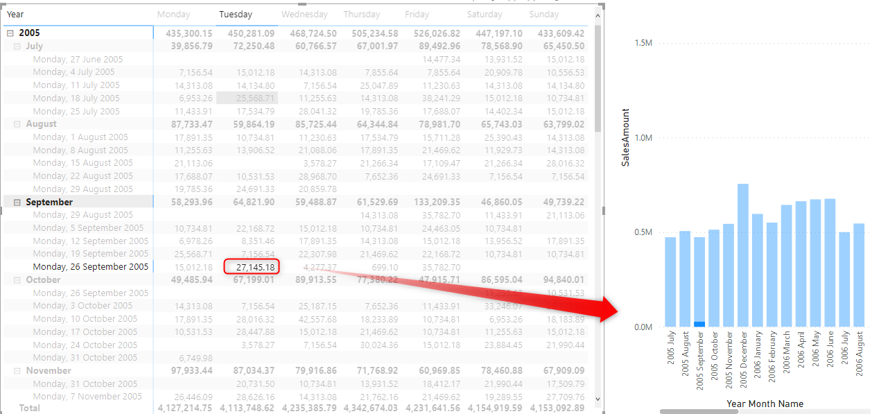
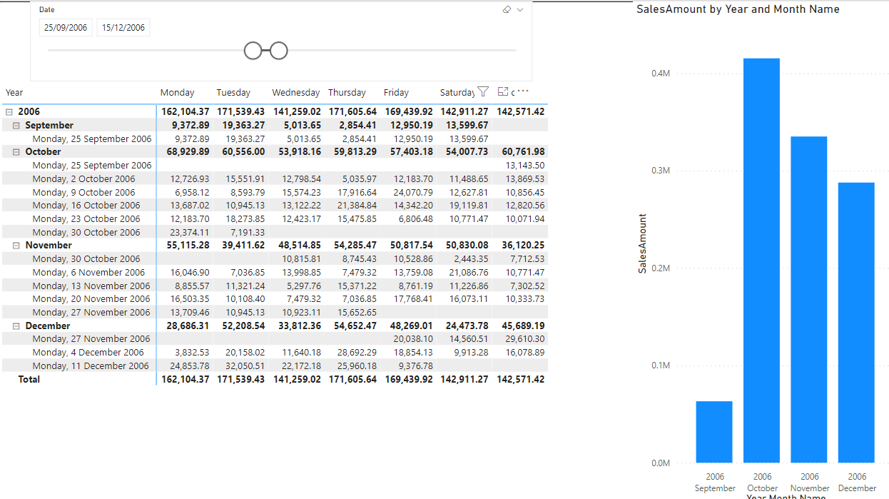
You can enhance it even more by adding a slicer for the date so that you can choose the range that is shown in the calendar visual.
Add Day in the Calendar
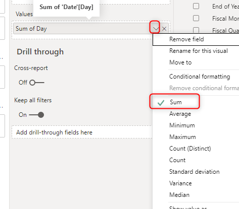
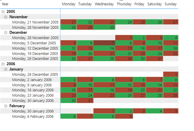
If you prefer to show the actual date in the calendar instead of sales amount or other values, then you can add Day into the Values.
However, you need to select an aggregation for it. You can choose Sum, Average, Min, or Max. The point is that when there is one day in each cell, the aggregation of that would be that day’s number anyway.
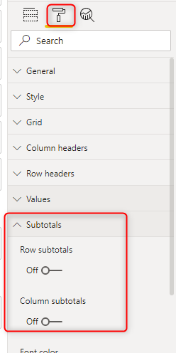
You also need to disable the subtotals because some of multiple day numbers won’t make sense anymore.
You can consider using some conditional formatting also if you want to make the calendar cells look different colors;
Learn more about conditional formatting in a visual from my article here.
You can even enhance it by using DAX measures such as below;
Color = If(ISEVEN( sum('Date'[Day]) ), "#32a852","#a84632")
so that you can have a different color for adjacent cells;
Learn more about conditional formatting using DAX in Power BI here.
Summary
The method mentioned here is only one of the many methods you can use to have a calendar visual in Power BI. This method can be enhanced (as you learned through this article) using conditional formatting and a date slicer. This helps report visualization to have a quick look at each day and the ability to filter the data down to that day. Let me know if you have any questions in the comments below.


Reza is author of more than 14 books on Microsoft Business Intelligence, most of these books are published under Power BI category. Among these are books such as Power BI DAX Simplified, Pro Power BI Architecture, Power BI from Rookie to Rock Star, Power Query books series, Row-Level Security in Power BI and etc.
He is an International Speaker in Microsoft Ignite, Microsoft Business Applications Summit, Data Insight Summit, PASS Summit, SQL Saturday and SQL user groups. And He is a Microsoft Certified Trainer.
Reza’s passion is to help you find the best data solution, he is Data enthusiast.
His articles on different aspects of technologies, especially on MS BI, can be found on his blog: https://radacad.com/blog.