
If you have a table and want to create a report of column value distribution of it in Power BI, This function helps you achieve it. I have explained previously in another blog and video, how to do this process step by step. In this article, I’ll share the code for a custom function that you can copy and paste and use in your Power BI solution and get a column value distribution table and use it in your reporting.
Video
Defining the problem: What and Why
As a Power Query developer, you can open Get Data and Transform (Power Query Editor), and click on any column, and enable the Column profile and see the distribution of values in that column.

The information above is very helpful to learn more about the column’s data, and have a better data analysis solution as a result. For users in the organization, sometimes the information above can be helpful. However, they may not be familiar with Power Query to do the actions above. They like to have a Power BI report and see the value distribution as a report.
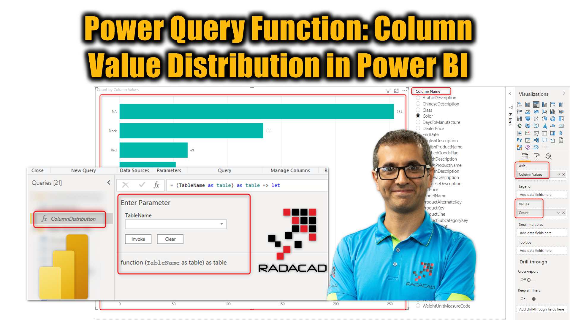
Having something like the below report will provide extreme value for some of your users to check the quality of the data.

As you can see in the screenshot above, the value distribution is added to the Power BI report as a tooltip for each column in the profiling report. I have explained in the previous article how to achieve the above report for one table. In this article and video, I’ll explain a method and a function that can be used for any table in your data model.
I do recommend reading these articles before to get the full picture of the scenario;
- Profiling data and the importance of it in Power Query
- How the profiling data can be prepared to create a report in Power BI
- How the error count of that can be added to the report
- Creating a column value distribution report in Power BI using Power Query; Step by step guide
Value distribution function
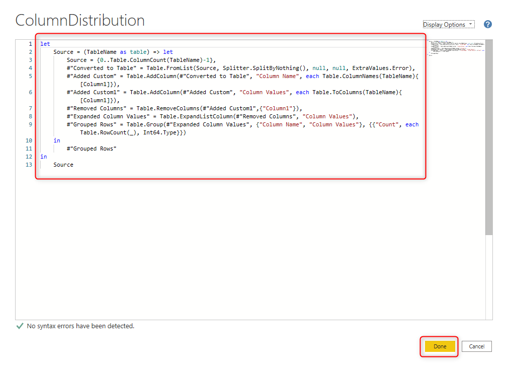
The code below is for a function that gets the table as the input and generates the value distribution of columns of it as another table;
let
     Source = (TableName as table) as table => let
         Source = {0..Table.ColumnCount(TableName)-1},
         #"Converted to Table" = Table.FromList(Source, Splitter.SplitByNothing(), null, null, ExtraValues.Error),
         #"Added Custom" = Table.AddColumn(#"Converted to Table", "Column Name", each Table.ColumnNames(TableName){[Column1]}),
         #"Added Custom1" = Table.AddColumn(#"Added Custom", "Column Values", each Table.ToColumns(TableName){[Column1]}),
         #"Removed Columns" = Table.RemoveColumns(#"Added Custom1",{"Column1"}),
         #"Expanded Column Values" = Table.ExpandListColumn(#"Removed Columns", "Column Values"),
         #"Grouped Rows" = Table.Group(#"Expanded Column Values", {"Column Name", "Column Values"}, {{"Count", each Table.RowCount(_), Int64.Type}})
     in
         #"Grouped Rows"
 in
     Source
How to use the script above?
To use the code above, you need to follow these steps:
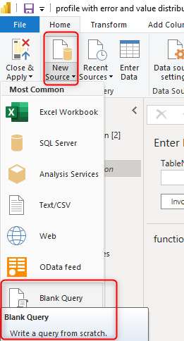
Create a blank Query by the Get Data from Blank Query.
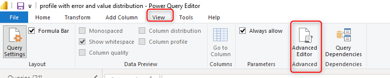
Click on your new query in the queries pane, and then from the View tab, click on Advanced Editor. This will open the M script of the code;
In the Advanced Editor window, delete everything, and copy and paste the entire code (from the above script) in there and click Done.
This should convert your query to a function. You should see the fx icon beside it, and also see the invoke function details when you click on it. To learn more about custom functions and how they work in Power BI, read my article here.
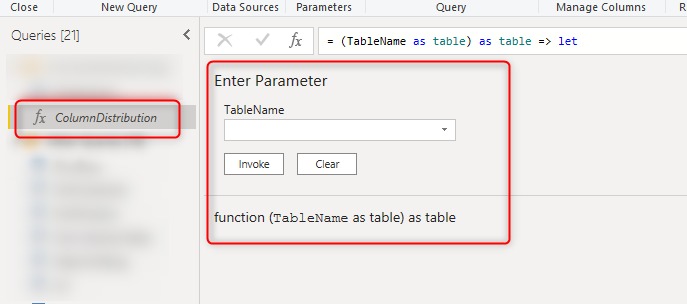
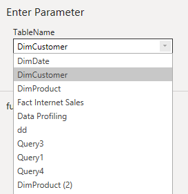
You can invoke this function for any of the tables in your Power Query editor, by simply selecting the table name in the dropdown, and then click on Invoke;
Invoking this function will generate a new table with the column value distribution result. Note that the value distribution for all columns is a time-consuming and resource-consuming process. Ensure to filter your table if you have many rows and many columns before this step.
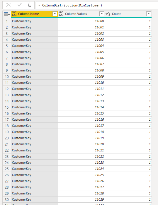
The table above is something you can use in a column value distribution report like below;
The value distribution table is now ready. All you need to do is to create a report page with it. An example report is as below;

In the report above, the “Column Values” is used as the axis of the chart, and the Count is used as the values. Also, there is a slicer based on “Column Names”. By selecting each column, you can see the value distribution of that column.
How this function works?
If you want a step-by-step guide on learning how this function produces the value distribution for all columns, read my article here for the details;
Summary
In this article, I shared a code for a function that you can easily use to generate the column value distribution in Power Query. The details of how to use the code are mentioned in this article. The details of how the code works can be found in my article here. I have to mention some very important considerations here beforehand;
- The value distribution report can be very slow for large tables. Be careful when you are using it. You may need to reduce the columns and rows beforehand.
- Profiling data is not a luxury, it is a critical element. There is no use of a beautiful report with bad data quality, data profiling is an step towards fixing data quality issues.
- If you have error values in your columns, then you may get some unexpected results in your ditribution table. I strongly recommend to check for errors first.
- Data profiling without error and exception report can’t be much of a use, consider implementing the exception reporting for errors too. I explained the method here.


Reza is author of more than 14 books on Microsoft Business Intelligence, most of these books are published under Power BI category. Among these are books such as Power BI DAX Simplified, Pro Power BI Architecture, Power BI from Rookie to Rock Star, Power Query books series, Row-Level Security in Power BI and etc.
He is an International Speaker in Microsoft Ignite, Microsoft Business Applications Summit, Data Insight Summit, PASS Summit, SQL Saturday and SQL user groups. And He is a Microsoft Certified Trainer.
Reza’s passion is to help you find the best data solution, he is Data enthusiast.
His articles on different aspects of technologies, especially on MS BI, can be found on his blog: https://radacad.com/blog.
Awesome post, Reza! I believe you are the ONLY one tackling this challenging but important data quality dashboard which provides important insights into the raw quality of a data table. I am currently working on a project which is very similar and had a few questions on how to enhance this.
My vision for my dashboard is for a user to be able to select any column in a KPI visualization (%null, duplicate count, outlier etc.) to show the distribution (either the count of labels like you have already provided in the case of categorical columns or a boxplot/histogram in the case of numerical columns) of values and also, the above selection would then return a filtered table of the original dataset which shows the rows for the selected KPI i.e. all rows where the selected column is Null.
An example of this would be: User see’s a bar chart with each column and the percent null and clicks on the column “Color” which would show the distribution bar chart (like you have already) and then also show the rows of the dataset where the “Color” column has nulls. The same would go for a numerical column but with a boxplot/histogram to show the distribution.
Thanks!
Thanks Brian
That looks like a great data quality/exploration report to make
Cheers
Reza