Append vs. Merge in Power BI and Power Query
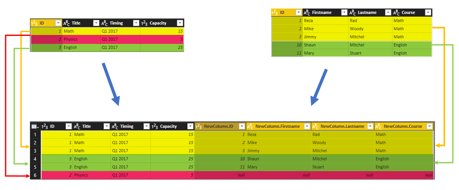
Combining two queries in Power Query or in Power BI is one of the most basic and also essential tasks that you would need to do in most of data preparation scenarios. There are two types of combining queries; Merge, and Append. Database developers easily understand the difference, but the majority of Power BI users Read more about Append vs. Merge in Power BI and Power Query[…]

