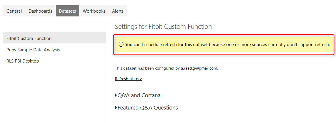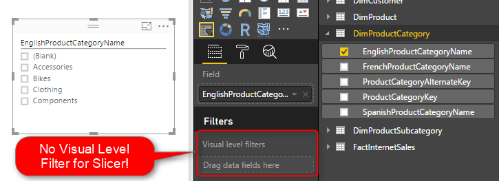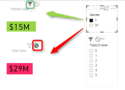
Visualization Tip: Change to Filter instead of highlight Control the Interaction in Power BI Report
Power BI reports are highly interactive, If you select a column in a column chart other charts will be highlighted. Selecting a slicer value will filter all other visuals in the report. This interactivity can be controlled easily. Despite the fact that this feature has been released in early phases of Power BI, there are Read more about Visualization Tip: Change to Filter instead of highlight Control the Interaction in Power BI Report[…]