
You may have seen many videos or blog posts so far that Power BI Desktop showed the data on the map visualization based on address, suburb, city, state, and country. Fortunately Bing Map helps a lot to search the point on the map based on address fields. However sometimes you don’t have address fields, actually in some types of the data there is no address field. As an example an earth quake most of the time happens somewhere deep in the ocean where there is no street address! All you have is latitude and longitude as the Geo graphical data. However latitude and longitude is precise enough for any GPS device to point out the exact location. Unfortunately to your surprise, at this point of the time Power BI Desktop map doesn’t support visualization only based on latitude and longitude! So this post is about how to visualize it with Power BI Desktop map easily.
Problem Definition
As I’ve mentioned there are sometimes that you have no address information but only latitude and longitude, an earth quake data is one of the most common examples of that. Here is example earth quake data that I’ve fetched from Quake Search service of GeoNet website. This website search through all earth quakes happened in New Zealand. It can also export the data as CSV file, which is the file that I’ve used. Screenshot below shows part of the data set as an example;

As you see in the screenshot there are two highlighted columns for latitude and longitude and also a column for magnitude. The file is for a year earth quake data (from September 2014 to September 2015), and it has 19K records. Wow, that’s a lot of earth quakes isn’t it? but don’t worry most of them are on minor magnitude, this file contains records with even 0.7 as magnitude! such an awesome recording of events.
Now I want to visualize this data on the Power BI Desktop Map to see whereabouts most of earth quakes are happening! If I fetch that data into Power BI through Get Data and then from CSV experience, and load it without any change in the Power BI Desktop I’ll see then in the fields section like this:

As you see Power BI considered these fields as numeric fields and summarized them in the view (you can see sigma icon besides them in screenshot above). This can be easily changed in the data tab. Select the Column and then change the Data Category under the Modeling menu to respective field (latitude or longitude).

Now go back to Report tab. This time you will see these two fields with map icons besides them.

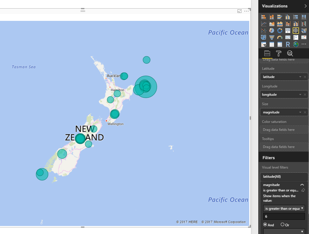
Now let’s create a Map. Map works with Latitude and Longitude (which we have fortunately), I also add magnitude as values. For chart below I’ve also showed magnitude in values, and color saturated it based on depth of the earth quake. as the data rows were too many (19K quakes), I’ve filtered to show only those that has magnitude greater than 6. Here is the result;
Map still might seems scary for you to see that many earth quakes with more than 6 magnitude in only one year, But if you wanna live in a magnificent country you should take some risk 😉
Video


Reza is author of more than 14 books on Microsoft Business Intelligence, most of these books are published under Power BI category. Among these are books such as Power BI DAX Simplified, Pro Power BI Architecture, Power BI from Rookie to Rock Star, Power Query books series, Row-Level Security in Power BI and etc.
He is an International Speaker in Microsoft Ignite, Microsoft Business Applications Summit, Data Insight Summit, PASS Summit, SQL Saturday and SQL user groups. And He is a Microsoft Certified Trainer.
Reza’s passion is to help you find the best data solution, he is Data enthusiast.
His articles on different aspects of technologies, especially on MS BI, can be found on his blog: https://radacad.com/blog.
Wow, this is a great workaround!
I’m particularly interested in spatial data on SQL Server platform. I’ve spoken on SQL Saturdays and wrote articles on this topic.
So far, I didn’t try to play with spatial data and maps on Power BI. I thought the product wasn’t suited for mapping as Reporting Services is . But now, after your post, could be the time to take some tests!
A lot of earthquakes in Italy too …
Thanks Andrea for kind words.
Would love to see your new articles on this topic 🙂
Cheers,
Reza
Thank you Reza, you really dug us out of a hole here. We were plotting distances travelled by tutors onto a map showing the location of our courses and, although we were providing the long and lat co-ordinates, Bing was unable to find all the UK postcodes as the location (despite our matching the postcodes to get the long/lat co-ordinates to start with). Your fix has moved our charts firmly out of the Arctic and made the process relatively painless.
Hi John,
Thanks for letting me know about your scenario. I’m glad that it was helpful
Cheers,
Reza
Thanks Reza – that’s perfect!
Thanks John for your kind words 🙂
Cheers,
Reza
I tried this tip, the map stills complains “More location data is required to create a filled map”
Latitude, Longitude are correct, which I verified in bing search
It is hard to figure out
Hi,
Have you tried with simple MAP instead of Filled Map to see what is the result?
Hi Reza,
I think you’ve misunderstood what the Location field is actually for when using lat/long. It just acts as a unique ID to define the grain that the data is rolled up to (aggregated) for display.
In your case concatenating lat/long makes it work just because your quakes also have a (probably) unique lat/long, but it should also work if you put your ‘public ID’ in your location field instead. AFAIK the webservice lookup only applies if you don’t have your own lat/long information. So this technique works, but not for the reason you think it does.
This confused the heck out of me to start with also, but it’s quite useful, because (given your data) it gives you two options:
– plot average magnitude for all quakes by location (what you are doing)
– plot magnitude for all quakes by quake id (potentially giving rise to multiple points in the same spot)
HTH
Reza Rad
It is really nice article and it really helped me out. Is there any way I can show custom icon/image on this map. For example I want to show the flag of country on map instead of dot or the built in icon.
Thanks
Hi Noor,
Thanks for your kind feedback.
adding custom image is not supported built-in at the moment unfortunately.
However there are some work arounds such as:
1- You can create your custom map as an image and put flag of countries in places you want to. then use Synoptic Panel custom visual and define regions on that and map region names to values in your data set.
2- create a custom visual your own with a map with this new feature (won’t be easy I believe. I haven’t built a custom visual myself yet, but it should be pretty scripting and coding expereince)
Shame, such a great article, this was working perfectly fine, but after the latest update, the map is just static, not pointing to the location, haven’t done anything extra, working on older version, upgraded and BAM… Not working anymore. Have u tried upgrading to see if yours works as well?
Hi Michelle,
Thanks for your kind feedback.
This still works for me correctly with the most up-to-date Power BI desktop version.
What do you mean by not working? does it gives you error or does it points to some other locations on the map?
Cheers,
Reza
Hi
Im trying to create a filled map for suburbs in Victoria, however Bing offers a pin – where as google offers the boundary map 🙁 any suggestions?
thanks
Nikki
Hi Nikki,
I’ve wrote another post about using Filled Map in Power BI:
http://radacad.com/power-bi-filled-map-the-good-the-bad-and-the-ugly
However you might not always get what you want with it.
Cheers,
Reza
This one doesn’t work for me: Text.From([#” latitude”])&”, “&Text.From([longitude])
What I did was this: Text.From([ latitude])&”, “&Text.From([longitude])
and I got the Point column, but still map is not zooming in.
Hi Michelle,
Thanks for your comment, Yes you are absolutely right, it there was typo in the script. I’ve fixed it now.
Regarding the zooming; When I get the map also it doesn’t zoom in, So I do zooming in myself, and then it remembers that.
Hopefully that get fixed soon in Power BI
Cheers,
Reza
Interesting, mine just doesn’t remember, it keeps zooming out every time I click on another city, I wish it would remember… dammm
Well, already sent a frown to Microsoft and the pibx and hope they will have an answer for that.
Having to have a unique location field as well as lat/long information is a limit that’s now been removed in the latest Power BI download:
https://powerbi.microsoft.com/en-us/blog/power-bi-update-lots-of-new-authoring-features-and-a-new-power-bi-desktop-update/