Decomposition Tree Visual in Power BI- Part Two

In the last blog an introduction to the Decomposition tree has been provided. In this blog, AI split of the decomposition tree will be explained. From last post, we find out how this visual is good to show the decomposition of the data based on different values. There is another split based on the how Read more about Decomposition Tree Visual in Power BI- Part Two[…]

Introduction to Decomposition Tree Visual Part One

Decomposition Tree allows you to visualize the data regarding various dimensions. It is all about the aggregation of data and drills down. In the first post about this feature, I am going to show how this works for a simple decomposition task, in the next posts, I will show you how embedded AI in this Read more about Introduction to Decomposition Tree Visual Part One[…]

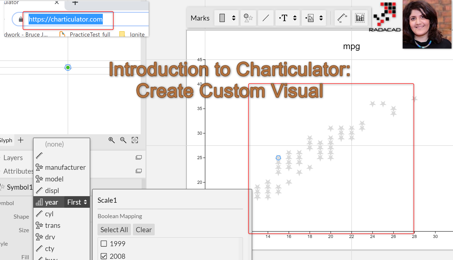
Introduction to Charticulator: Create Custom Visual – Part 1

In the last post different ways of creating custom, visuals have been explained. In this post, I will show how to use Charticulator for creating a custom visual in Power BI. As mentioned, first navigate to the below link: https://Charticulator.com Next, you need to click on the Launch Charticulator. This will navigate you to the Read more about Introduction to Charticulator: Create Custom Visual – Part 1[…]

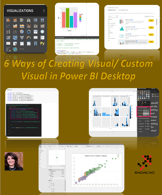
Create Visual/Custom Visual for Power BI: Different Approaches

There is always a need to extend the usage of visuals in Power BI. There are multi ways to do it first using   First Option: Using Standard Panel               Easy to use and available all the time               all tested and reliable     Read more about Create Visual/Custom Visual for Power BI: Different Approaches[…]

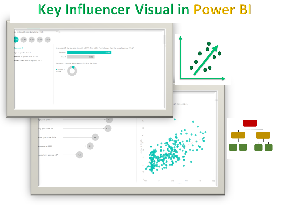
Applied more Analytics on your data with Key Influencer Visualization

In this post, I am going to demonstrate a new visualization that has been released by the AI team in Power BI in recent months. Before showing off the nice features, there are some key points about this visual. http://datascientistyuyuria.blogspot.com/2017/06/ It can be used by Data sciences, Data engineer and End users.  It is easy Read more about Applied more Analytics on your data with Key Influencer Visualization[…]

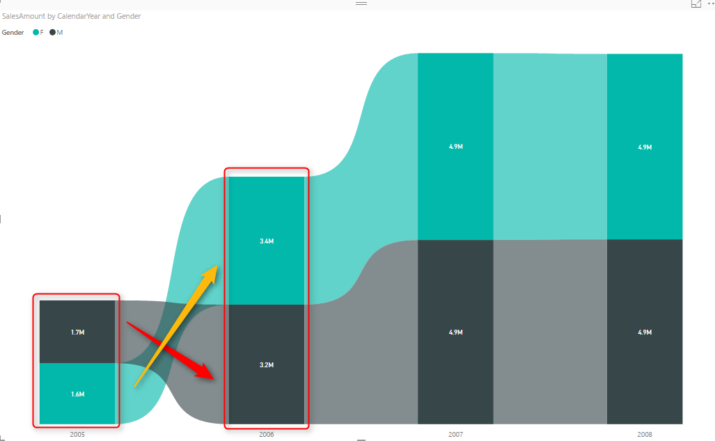
Ribbon Chart is the Next Generation of Stacked Column Chart

Earlier this month (September 2017), in the new version of Power BI Desktop, a new type of chart announced; Ribbon Chart. The very first look and feel of this chart are similar to Stacked Column Chart. The question that might come into your mind is that; why another way of showing the same thing? The Read more about Ribbon Chart is the Next Generation of Stacked Column Chart[…]

How to create Polar Charts

In this post I am going to show how to create a polar chart using R codes inside Power BI. imagin that we have below dataset about 4 main groups and their related values. I am going to show you how to draw different polar charts with different shapes. imagin that we have a bar Read more about How to create Polar Charts[…]

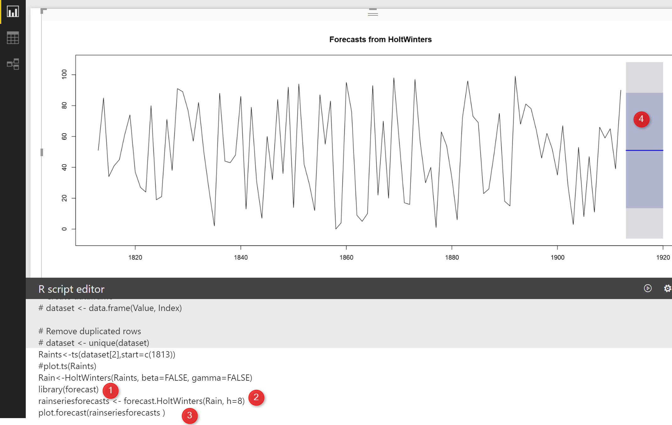
New Series of Time Series: Part 2 (Exponential Smoothing)

In the last post , I have explained the main concepts behind the timeseries. In this post, I am going to show how we can forecast for some periods. In the last post, I have mentioned that there is a possibility to have “seasonality” “Trend” and  errors (residual) in one dataset: Seasonality+Trend+Residual we call it as Read more about New Series of Time Series: Part 2 (Exponential Smoothing)[…]

Infographic Designer: Not Just Another Visual

At the time of writing this post; there are already more than 97 custom visuals posted in Office Store. The list includes many interesting custom visuals. However, Infographic Designer is one of the visuals that is not just another visual. This custom visual has some unique features that you cannot see in many other visuals. Read more about Infographic Designer: Not Just Another Visual[…]

Table with Embedded Chart in Power BI using R

Visualization is any kind of graphical representation that enable us to: Exploration, it help us to get more deep insight through huge amount of data Discovery, It also gives extra vision Analysis, it can be used to find pattern Communication, visualization help us to communicate better A few years ago Dr. Andrew Abela published a good Read more about Table with Embedded Chart in Power BI using R[…]