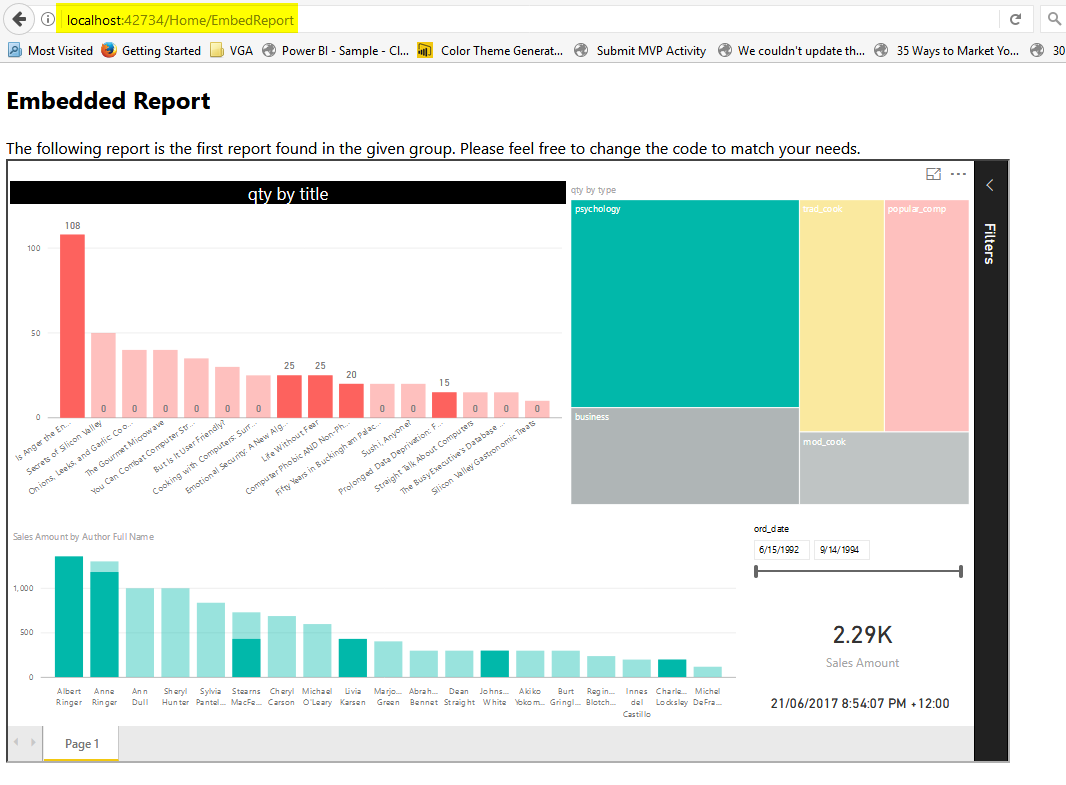
Integrate Power BI into Your Application: Part 4 – Refresh Data Set
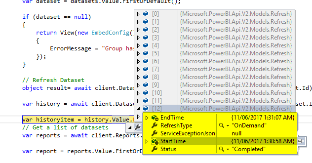
Power BI REST API is not just for embedding content or getting list of dashboards and reports. It also has many functions to work with data sets, gateways, and data sources. As one of the many exciting features of that; you can easily refresh a data set from an application. you can refresh it as Read more about Integrate Power BI into Your Application: Part 4 – Refresh Data Set[…]