
Although very simple, still I get this question very often; How can I show the total value as a data label in a stacked column chart? In this quick blog post, I’m going to show you a quick and easy method to use a combo chart and show the total as a label on top of the stacked column chart. If you like to learn more about Power BI, read Power BI book from Rookie to Rock Star.
Prerequisite
The dataset for this model is the AdventureWorksDW2012 Excel file, which you can download from here. Tables used in this example are; DimCustomer and FactInternetSales.
Problem
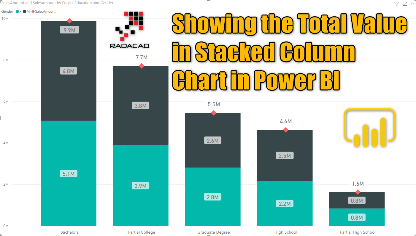
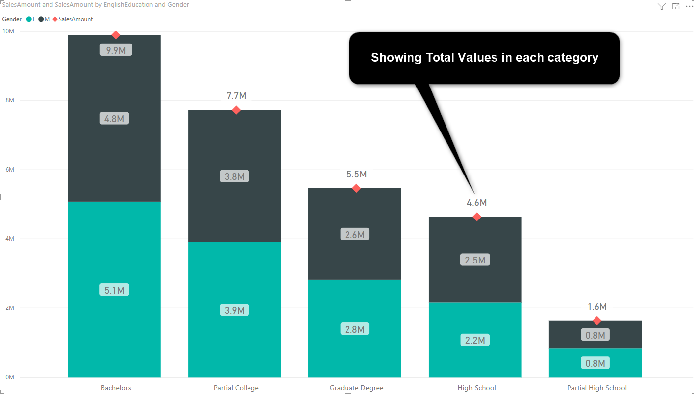
Let’s say you want to see the SalesAmount (from FactInternetSales table) sliced and diced by EnglishEducation (from the DimCustomer table), and using Gender (from the DimCustomer table) as the legend in a stacked column chart. this is an example of what it looks like;

Now, let’s say we want to add the data labels in the chart, which we can do it in the Format tab, with turning on the data label.

As you can see, there are data labels for each subcategory (means gender and education), but no data label showing the total of each education category. for example, we want to know how much was the total sales in the High School category. Now that you know the problem, let’s see a way to fix it.
Combo Chart: Line and Stacked Column Chart
One easy solution for the problem above is to use a combo chart. In Power BI world we call these charts line and column charts. In this example, we need a Line and Stacked Column Chart.

After changing the chart type to this visual, you can see that there is a Line Value property. Set it to SalesAmount. (the same field which we have in Column Values)

And don’t worry about slicing and dicing by Gender, because Gender is in Column Series, and won’t affect the Line Values at all.
Now you can see a line in the chart, showing totals of each education category;

Customize Formatting
Showing values in a line chart only make sense when the axis is a sequence. In our case, it is not, so we are going to hide the line by changing the stroke width to zero. Go to the Format tab, and under Shapes, set the Stroke width to zero.

You can also do more customization, such as showing the marker, setting the shape and size and color for the marker as below;

Here is the output of actions above;
Summary
This was a quick post to show how you can add total values to a stacked column chart. In this post, I’ve used Line and Stacked Chart and changed the stroke width of the line to zero to hide it. There are other benefits of using Line and Stacked Column Chart as well, such as showing values which are not on the same scale, I will write about that later, stay tuned!
Video


Reza is author of more than 14 books on Microsoft Business Intelligence, most of these books are published under Power BI category. Among these are books such as Power BI DAX Simplified, Pro Power BI Architecture, Power BI from Rookie to Rock Star, Power Query books series, Row-Level Security in Power BI and etc.
He is an International Speaker in Microsoft Ignite, Microsoft Business Applications Summit, Data Insight Summit, PASS Summit, SQL Saturday and SQL user groups. And He is a Microsoft Certified Trainer.
Reza’s passion is to help you find the best data solution, he is Data enthusiast.
His articles on different aspects of technologies, especially on MS BI, can be found on his blog: https://radacad.com/blog.
It’s a good solution, but the theory about datavisualization wouls say:
– use column’s for time axis
– use bar’s for categories
How would you achieve this with bar’s? PowerBI does not seem to have the correct visual?
Hi Wouter
I do not understand your question! We have both bar chart and column chart in Power BI, and you can use them for time or categories. Can you explain more what you are trying to achieve?
Cheers
Reza
Hi Reza! thank you for you manual. I have a question – is it possible to up the total value for bachelor column? you can see that all other total values are above columns but the bachelor total value inside column. I know that it is because of end of Y-axis and if we change the end value manually it would be correct but for example if i don’t know what the total value i will have in this month it won’t be possible to do it manually.
Could you please help me with this issue?
thank you,
There are two ways you can do that;
1. change the Y-Axis for both Column and Line, and set their End value is higher value so that it can have space to show that number above the column.
2. Under Data Labels, set the Customize Series On, and then select Sales Amount in the dropdown, and set the position to be Above.